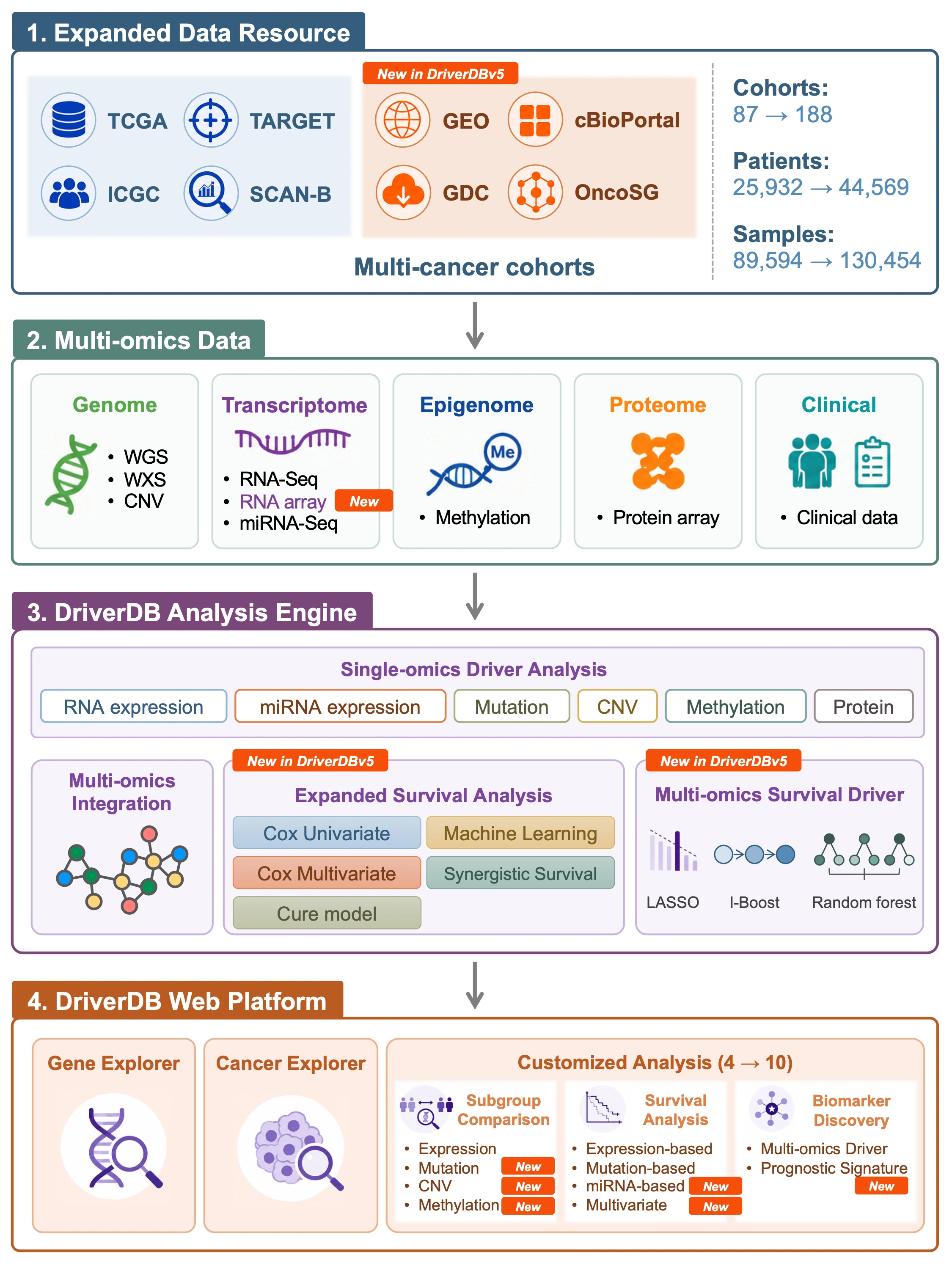
DriverDBv5: A database for human cancer driver gene research
What is DriverDB?
DriverDB is an integrative cancer omics database that combines somatic mutation, RNA expression, miRNA expression, protein expression, methylation, copy number variation (CNV), and clinical data with curated annotations and published bioinformatics algorithms for driver gene and driver event identification. Featured in the 2014, 2016, 2020, and 2024 Nucleic Acids Research Database Issues, DriverDB applies state-of-the-art computational methods to characterize cancer drivers across molecular layers.
DriverDB provides three major analytical modules:- Cancer – Summarizes driver gene predictions for a selected cancer type across multiple omics layers using published driver identification tools.
- Gene – Visualizes multi-omics features of a user-selected gene, including differential expression, mutation, CNV, methylation, survival, miRNA regulation, protein expression, and integrated multi-omics evidence.
- Customized Analysis – Allows users to perform subgroup comparisons, survival analyses, multi-omics driver exploration, prognostic signature construction, and multivariate Cox modeling based on user-defined clinical or molecular criteria.
1. Cancer
1.1 Cancer Module Overview
The Cancer module summarizes driver gene and driver event predictions for a user-selected cancer type by integrating multi-omics data — including somatic mutations, RNA expression, miRNA expression, protein expression, copy number variation (CNV), methylation, and clinical information — through published bioinformatics algorithms and curated annotation sources. This module provides a cancer-centric overview of dysregulated molecular features and highlights candidate driver genes, their regulatory mechanisms, and their functional significance across molecular layers.
For mutation, CNV, and methylation, a Survival Relevance tab evaluates whether identified driver genes are associated with patient survival using multiple analysis methods, including Cox regression, cure model, and machine learning-based approaches. For multi-omics analysis, additional machine learning results are provided, including prognostic signature identification, Kaplan–Meier survival plots, predictive performance plots, and a gene-level summary of survival associations across omics types, endpoints, and algorithms.
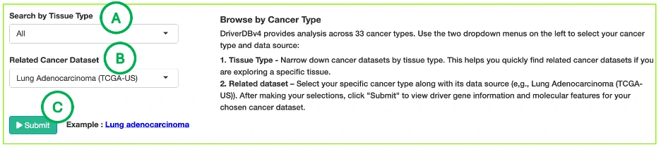
1.2 Dataset Selection: Browse by Cancer Type
DriverDBv4 provides analysis across 70 cancer datasets, including 33 TCGA cancer types and additional datasets from resources such as CPTAC and ICGC. Use the selection panel to choose the dataset you want to explore.
A. Tissue Type (Optional)
Filter available datasets by tissue origin to quickly locate cancers related to a specific anatomical site.For example, selecting Lung narrows the list to datasets such as:
- Lung Adenocarcinoma (TCGA-US)
- Lung Squamous Cell Carcinoma (TCGA-US)
- Lung Cancer – KR (ICGC-KR)
B. Related Dataset
Select the specific cancer dataset you wish to analyze. Each dataset label includes its data source (e.g., TCGA-US, ICGC-KR), allowing users to choose cohorts most relevant to their research.
C. Submit
After making your selections, click Submit to load driver gene summaries and molecular features for the chosen cancer type. All downstream tabs, including Mutation, CNV, Methylation, Survival, miRNA, and Multi-Omics, will display results based on the selected dataset.
1.3 Overview of Result Tabs
The Cancer module contains several results tabs, each summarizing driver evidence derived from a different omics layer:- Summary – integrates dysfunction and dysregulation evidence across omics layers to highlight candidate driver genes and miRNA drivers for the selected cancer type, visualized through an interactive network.
- Mutation – identifies mutation-based driver genes using multiple detection tools, and evaluates their association with patient survival through the Survival Relevance tab.
- CNV – visualizes driver genes with significant copy number gain or loss, including CNV–expression relationships, and evaluates their association with patient survival through the Survival Relevance tab.
- Methylation – highlights hypermethylation and hypomethylation driver genes and locus enrichment distributions, and evaluates their association with patient survival through the Survival Relevance tab.
- Survival – presents survival-relevant drivers and synergistic gene-pair interactions across survival endpoints and analysis methods.
- miRNA – shows regulatory interactions between differentially expressed genes and miRNA drivers.
- Multi-Omics – integrates multiple omics layers to identify cross-omics driver genes and functional patterns, and provides machine learning-based prognostic signature identification, Kaplan–Meier survival plots, predictive performance plots, and a gene-level summary of survival associations across omics types, endpoints, and algorithms.
1.4 Cancer Summary
1.4.1 Overview
The Cancer Summary tab provides an integrated overview of potential driver genes and miRNA drivers for the selected cancer type. It aggregates multi-omics driver evidence—including mutation, CNV, methylation, expression, miRNA regulation, and survival relevance—and connects them through known biological networks such as protein–protein interactions (PPIs), gene–miRNA interactions, and synergistic survival associations.
This section contains two main components:- Summary Network
- Driver Summary Table
Together, these views help users quickly identify influential driver genes, their regulatory relationships, and cross-omics support.
1.4.2 Summary Network
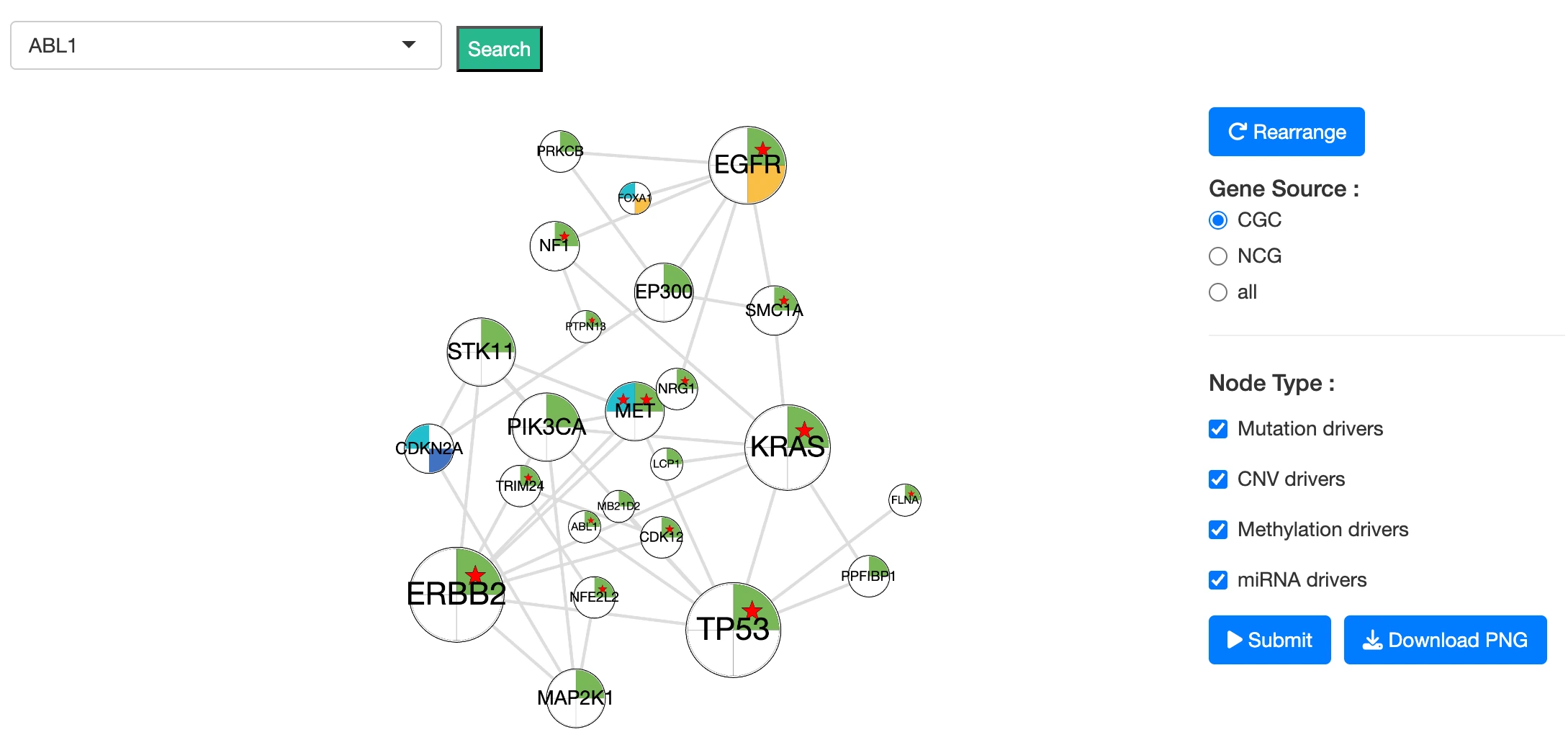
Purpose
The Summary Network visualizes relationships between driver genes and miRNA drivers in the selected cancer type, providing an integrated view of multi-omics driver events and their functional or regulatory connections.
The network integrates the following data sources:- Cancer Gene Census (CGC) and Network of Cancer Genes (NCG 6.0) annotations
- Protein-protein interactions (PPIs) from the STRING database
- miRNA–gene interactions from miRTarBase
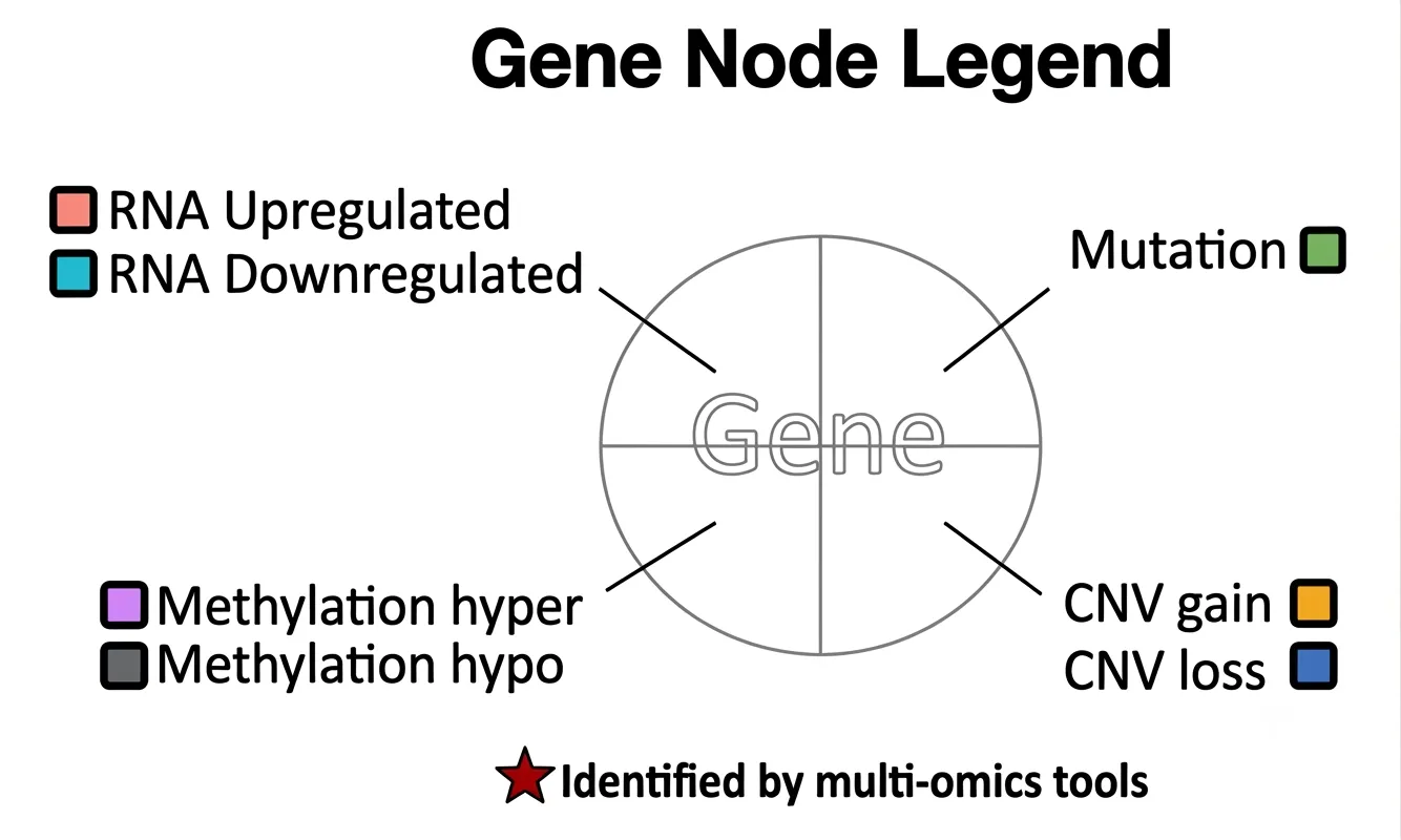
Nodes
Driver gene nodes are displayed as circular nodes divided into four quadrants, each corresponding to an omics feature:- Upper left: RNA expression status — upregulated or downregulated
- Upper right: mutation status — mutated
- Lower left: methylation status — hypermethylated or hypomethylated
- Lower right: CNV status — copy number gain or loss
Each quadrant is colored according to its omics status when that feature is altered in the selected cancer type; refer to the Node Legend for color definitions. When a quadrant's omics feature shows no significant alteration, that quadrant is white. The overall appearance of the node therefore reflects the combination of omics alterations present for that gene — a fully colored node indicates alterations across all four omics layers, while a predominantly white node indicates few or no detected alterations. A red star within a node indicates genes identified by multi-omics integration tools.
miRNA driver nodes are displayed as yellow nodes and represent miRNAs identified as regulatory or dysregulated in the selected cancer type.
Unconnected nodes are omitted from the network for clarity.
Edges
Each edge indicates a known or predicted biological relationship between two nodes.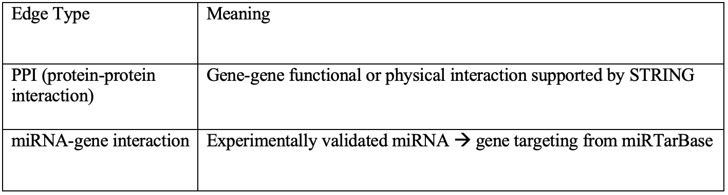
Unconnected nodes are removed to reduce visual clutter and highlight biologically relevant clusters.
Interaction Guide
The Summary Network is fully interactive:
Selecting and Highlighting- Click a node to highlight its connected genes/miRNAs and relationships
- Click blank space to return to the full network view
- Use the dropdown to jump directly to a specific gene of interest
- Gene Source: limit nodes to CGC genes, NCG genes, or all genes
- Node Type: show only mutation, CNV, methylation, or miRNA-based drivers
1.4.3 Driver Summary Table
The Driver Summary Table provides an integrated overview of potential cancer driver genes identified across the cancer projects associated with the selected cancer type. Each row represents a gene and summarizes the evidence supporting its potential driver role across multiple molecular data types and established cancer-gene databases.
The table indicates whether each gene is included in the Cancer Gene Census (CGC) or the Network of Cancer Genes 6.0 (NCG6.0), and reports driver evidence derived from mutation, copy number variation, DNA methylation, RNA expression, and miRNA regulation analyses. The RNA column shows whether the gene is upregulated or downregulated, while the miRNA column lists the miRNAs associated with regulation of the gene. The multiomics column reports the number of omics data types that identify the gene as a potential driver.
Together, these features allow users to compare candidate driver genes, assess the breadth of molecular evidence supporting each gene, and identify genes supported by multiple omics layers or curated cancer-gene resources.
Column Description:- Cancer Project: The cancer project associated with the selected cancer type from which the driver gene information is derived.
- gene: The official HGNC gene symbol of the potential driver gene.
- CGC: Indicates whether the gene belongs to the Cancer Gene Census (CGC) database, where 1 means the gene is included and 0 means it is not included.
- NCG6.0: Indicates whether the gene belongs to the Network of Cancer Genes, version 6.0 (NCG 6.0) database, where 1 means the gene is included and 0 means it is not included.
- mutation: The number of mutation-associated driver events identified for the gene.
- CNV: The copy number variation driver event identified for the gene. Values indicate the direction of change: Gain (amplification) or Loss (deletion).
- methylation: The methylation-associated driver event affecting the gene. Values indicate the methylation state: Hyper (hypermethylation) or Hypo (hypomethylation).
- RNA: Indicates whether the gene is transcriptionally Upregulated or Downregulated in the selected cancer type or dataset.
- miRNA: The list of miRNAs associated with regulation of the gene in the selected cancer project.
- multiomics: Indicates whether at least one omics data type identified the gene as a potential driver gene in the selected cancer type or dataset.
1.5 Cancer Mutation
1.5.1 Overview
The Cancer Mutation section identifies and visualizes mutation-based driver genes and their survival relevance in the selected cancer type. Results are organized into two tabs: Driver Genes and Survival Relevance.
The Driver Genes tab focuses on identifying mutation driver genes using multiple published computational tools. Driver genes are genes whose mutations are believed to confer a selective growth advantage in cancer. The degree of consensus across tools provides a measure of confidence in each gene's driver role. This tab contains two components:- Mutation Driver Summary by Tools — summarizes how many genes are identified by varying numbers of mutation driver-detection tools and lists tool support counts for each driver gene.
- Mutation Profiles of Top 30 Driver Genes — visualizes mutation patterns, impact levels, and tool support for the top 30 mutation driver genes across the patient cohort.
- Survival Gene Distribution Summary — bar charts and Venn diagrams summarizing the number and overlap of survival-related genes across four survival endpoints and four survival analysis methods.
- Survival Gene Summary Table — lists survival-related genes with their survival associations across endpoints and analysis methods, including log2 hazard ratios and machine learning identification status.
- Synergistic Survival Analysis — evaluates whether pairs of genes or molecular features show combined survival effects, identifying cross-omics interactions where the combined hazard ratio exceeds that of either individual feature alone.
Together, the Driver Genes and Survival Relevance tabs help users identify which genes are supported as mutation drivers by computational tools, which are associated with patient survival, and which show synergistic survival effects in combination with other molecular features.
1.5.2 Driver genes
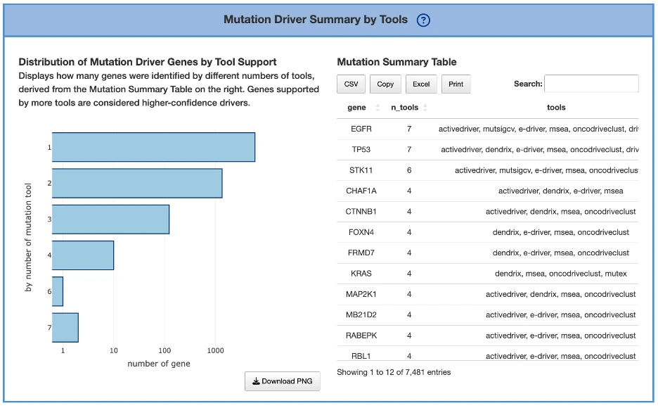
Mutation Driver Summary by ToolsPurpose
This panel summarizes how many genes are identified by varying numbers of mutation driver–detection tools.
Stronger consensus across tools indicates stronger evidence supporting a gene’s driver role.
Components
Distribution of Mutation Driver Genes by Tool Support (Left Plot)- Displays a bar plot showing the number of genes supported by 1, 2, 3… up to all mutation tools.
- Each bar represents how many driver genes were identified by that number of tools.
- Higher bars at larger tool counts indicate stronger multi-tool agreement.
Mutation Summary Table (Right Table)
- Located to the right of the plot.
- Lists the tool support count for each mutation driver gene.
The tools detail in FAQ4. - The plot on the left is derived from this table.
Mutation Profiles of Top 30 Driver Genes
Purpose
This section visualizes mutation patterns for the top 30 mutation driver genes, helping users examine:- Mutation burden per gene
- Mutation impact distribution
- How mutations are distributed across patients
- Multi-tool support for each top gene
It contains two interactive components.
Components
Mutation Impact Distribution of Top 30 Driver Genes (Left Plot)The plot displays mutation data across the top 30 driver genes, with each row representing a different driver gene and each column representing an individual patient or sample. Each cell within the plot indicates whether that particular sample carries a mutation in the corresponding gene, and if so, the predicted impact level of that mutation—categorized as either high impact, moderate impact, or low impact.
Additional Elements:
- Left panel (A): total mutation percentage per gene.
- Top bar chart (B): total mutation count per patient.
- Right bar chart (C): total mutation count per gene
Tool Support for Top 30 Driver Genes (Right Plot)
The plot displays a bar chart where each bar represents a gene, with the height of the bar indicating the number of mutation tools that identified that gene as a mutation driver. Genes that are supported by a greater number of tools suggest higher-confidence driver roles, as consensus across multiple computational methods provides stronger evidence for their functional importance in cancer development.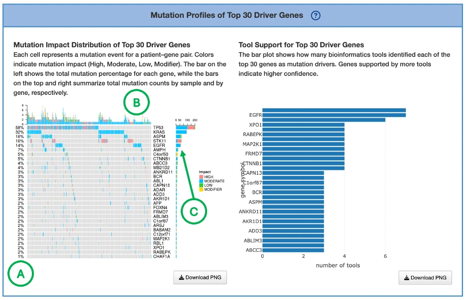
1.5.3 Survival relevance
Overall Summary
The bar charts and Venn diagrams summarize the number and overlap of survival-related genes identified from the selected omics data across four survival endpoints and four survival analysis methods.
The four survival endpoints include overall survival (OS), progression-free interval (PFI), disease-specific survival (DSS), and disease-free interval (DFI). The four survival analysis methods include Cox univariate regression, Cox multivariate regression adjusted for clinical covariates, cure model analysis, and machine learning (ML)-based analysis. The ML-based analysis includes LASSO, Random Forest, and I-Boost; a gene is counted as survival-related by ML if it is identified by at least one of the three algorithms. For more information about these methods, please refer to FAQ4.
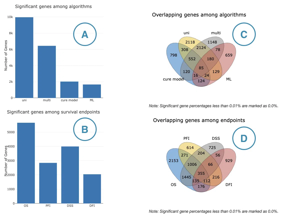
- Number of significant survival-related genes by analysis method
This bar chart shows the number of significant survival-related genes identified by each survival analysis method. It allows users to compare how many genes each method identifies and assess whether results are consistent or method-dependent. The x-axis represents the analysis method and the y-axis represents the number of significant genes. Hover over each bar to view the exact count. - Number of significant survival-related genes by survival endpoint
This bar chart shows the number of significant survival-related genes associated with each survival endpoint. It allows users to compare the breadth of survival associations across OS, PFI, DSS, and DFI. The x-axis represents the survival endpoint and the y-axis represents the number of significant genes. Hover over each bar to view the exact count. - Overlap of significant survival-related genes among analysis methods
This Venn diagram shows the overlap of significant survival-related genes identified across the four survival analysis methods. Genes appearing in overlapping regions are identified by multiple methods, suggesting more robust survival associations. Hover over each region to view the number and percentage of genes in that subset. - Overlap of significant survival-related genes among survival endpoints
This Venn diagram shows the overlap of significant survival-related genes across the four survival endpoints. Genes appearing in overlapping regions are associated with multiple endpoints, suggesting broader prognostic relevance. Hover over each region to view the number and percentage of genes in that subset.
Survival gene summary table
The Survival Gene Summary table lists survival-related genes identified in the selected cancer type based on the selected omics data type: RNA, mutation, copy number variation (CNV), or methylation. Results are organized into four tabs corresponding to the four survival endpoints: overall survival (OS), progression-free interval (PFI), disease-specific survival (DSS), and disease-free interval (DFI).
Each endpoint-specific table includes the following columns: Gene Symbol, Cox Uni, Cox Multi (Clinical), Cure Model, Machine Learning, and Number of Algorithms.
For Cox Uni, Cox Multi (Clinical), and Cure Model, values represent log2 hazard ratios, where log2 transformation is applied to center the scale symmetrically around zero for easier comparison of risk directions. Positive values are shown in red, indicating higher risk, while negative values are shown in blue, indicating lower risk. Stronger color intensity represents a larger absolute log2 hazard ratio. Blank cells indicate that the gene did not reach statistical significance or was not tested under that method.
For Machine Learning, genes identified by at least one of the three machine learning algorithms — LASSO, Random Forest, or I-Boost — are marked with '+'. A blank cell indicates the gene was not identified as survival-related by any of the three methods.
The Number of Algorithms column indicates how many of the four analysis methods — Cox Univariate, Cox Multivariate (Clinical), Cure Model, and Machine Learning — identified the gene as survival-related, on a scale of 1 to 4. Higher values suggest more consistent evidence of survival relevance across methods. Users can reorder the table by clicking on any column name. See FAQ4 for algorithm descriptions and references.
Synergistic survival analysis
The Synergistic Survival Analysis section evaluates whether pairs of genes or molecular features show combined survival effects within the user-selected cancer type. The analysis supports cross-omics interactions among RNA expression, mutation, copy number variation (CNV), and methylation, depending on the selected omics type and available data. Currently, synergistic survival analysis is available for overall survival (OS) only.
Users can filter the results by selecting a gene set, including All, CGC, or NCG, and by selecting the hazard ratio direction, including All, HR > 1, or HR < 1. The gene set resources include the Cancer Gene Census (CGC) and the Network of Cancer Genes (NCG 6.0).
The result table lists detailed information for each synergistic survival interaction, including cancer type, interaction type, gene symbols, omics levels, hazard ratio, and adjusted p-value. The adjusted p-value is used to determine significant synergistic interactions, whereas the Kaplan–Meier plots display the corresponding unadjusted log-rank p-values for visualization. Users can reorder the table by clicking on any column name. Selecting or toggling a gene–omic pair in the table generates the corresponding Kaplan–Meier survival plots below.
The Kaplan–Meier plots display survival differences among patient groups defined by the selected cross-omics interaction. The left plot shows the unadjusted Kaplan–Meier survival curves, while the right plot shows adjusted survival curves generated using ggadjustedcurves() from the survminer package, when available. The gene symbols, omics layers, and survival analysis values are shown above each plot. The x-axis represents survival time from the initial cancer diagnosis, with survival curves displayed for the first 5 years of follow-up, and the y-axis represents survival probability. Users can hover over the curves to view detailed survival information and click the legend to show or hide individual curves.
Synergistic interactions are identified based on the combined survival effect of two survival-related molecular features from different omics layers. A synergistic pair is reported when the combined hazard ratio is greater than 1.5-fold compared with each individual omics feature and the log-rank p-value is less than 0.05.
Patient group stratification
Patient groups are defined according to the combined omics states of the two paired features. The grouping method depends on the omics type:
- RNA expression: patients are grouped into high- and low-expression groups using the median cutoff.
- Mutation: patients are grouped by mutation status: mutated or wild-type.
- CNV: patients are grouped by copy number status — gain, loss, or neutral (no copy number variation) — based on iGC.
- Methylation: patients are grouped using beta-value median stratification.
Abbreviation definitions
The group labels in the Kaplan–Meier plots represent the combined omics states of two genes or molecular features. The order of gene 1 and gene 2 follows the interaction type shown in the table.
- high_mut: high RNA expression in gene 1; mutated in gene 2
- high_wt: high RNA expression in gene 1; wild-type in gene 2
- low_mut: low RNA expression in gene 1; mutated in gene 2
- low_wt: low RNA expression in gene 1; wild-type in gene 2
- high_gain: high RNA expression in gene 1; copy number gain in gene 2
- high_loss: high RNA expression in gene 1; copy number loss in gene 2
- high_none: high RNA expression in gene 1; neutral copy number in gene 2
- low_gain: low RNA expression in gene 1; copy number gain in gene 2
- low_loss: low RNA expression in gene 1; copy number loss in gene 2
- low_none: low RNA expression in gene 1; neutral copy number in gene 2
- high_meth: high RNA expression in gene 1; methylation detected in gene 2
- high_unmeth: high RNA expression in gene 1; no methylation detected in gene 2
- low_meth: low RNA expression in gene 1; methylation detected in gene 2
- low_unmeth: low RNA expression in gene 1; no methylation detected in gene 2
- mut_gain: mutated in gene 1; copy number gain in gene 2
- mut_loss: mutated in gene 1; copy number loss in gene 2
- mut_none: mutated in gene 1; neutral copy number in gene 2
- wt_gain: wild-type in gene 1; copy number gain in gene 2
- wt_loss: wild-type in gene 1; copy number loss in gene 2
- wt_none: wild-type in gene 1; neutral copy number in gene 2
- mut_meth: mutated in gene 1; methylation level in gene 2
- mut_unmeth: mutated in gene 1; no methylation detected in gene 2
- wt_meth: wild-type in gene 1; methylation detected in gene 2
- wt_unmeth: wild-type in gene 1; no methylation detected in gene 2
- gain_meth: copy number gain in gene 1; methylation detected in gene 2
- gain_unmeth: copy number gain in gene 1; no methylation detected in gene 2
- none_meth: neutral copy number in gene 1; methylation detected in gene 2
- none_unmeth: neutral copy number in gene 1; no methylation detected in gene 2
- loss_meth: copy number loss in gene 1; methylation detected in gene 2
- loss_unmeth: copy number loss in gene 1; no methylation detected in gene 2
1.6 Cancer CNV
1.6.1 Overview
The Cancer CNV section visualizes genes exhibiting significant copy number variation (CNV) gain or loss in the selected cancer type, and evaluates whether CNV status of genes is associated with patient survival. Results are organized into two tabs: CNV Drivers and Survival Relevance.
At the top of the tab, users may choose between two CNV driver–detection modes:- iGC (single-tool mode): displays CNV drivers predicted by the iGC algorithm.
- iGC ∩ DIGGIT (two-tool intersection mode): displays only genes identified as CNV drivers by both iGC and DIGGIT, providing a more stringent, consensus-based driver set.

Switching between modes allows users to compare tool-specific versus multi-tool consensus CNV drivers. The selected mode applies across both tabs.
The CNV Drivers tab summarizes CNV driver evidence across patient samples, chromosomes, and pathway enrichments, helping users explore CNV-expression relationships and CNV-driven biological mechanisms. This tab contains three components:- Visualization of Top 30 CNV Driver Genes — displays CNV gain and loss patterns, mutation impact distribution, and tool support for the top 30 CNV driver genes across the patient cohort.
- Locus Enrichment — summarizes the chromosomal distribution of CNV driver genes, helping users identify regions of recurrent copy number alteration.
- CNV Driver Gene Summary Table — lists CNV driver genes with supporting evidence including CNV status, tool support, and related annotations.
- Survival Gene Distribution Summary — bar charts and Venn diagrams summarizing the number and overlap of survival-related genes across four survival endpoints and four survival analysis methods.
- Survival Gene Summary Table — lists survival-related genes with their survival associations across endpoints and analysis methods, including log2 hazard ratios and machine learning identification status.
- Synergistic Survival Analysis — evaluates whether pairs of genes or molecular features show combined survival effects, identifying cross-omics interactions where the combined hazard ratio exceeds that of either individual feature alone.
Together, the CNV Drivers and Survival Relevance tabs help users identify which genes show significant copy number alterations supported by computational tools, which are associated with patient survival, and which show synergistic survival effects in combination with other molecular features.
1.6.2 Driver genes
Visualization of Top 30 CNV Driver GenesThis panel presents CNV gain, loss, and neutral patterns for the top 30 CNV driver genes in the selected cancer type.
CNV Gain and Loss Distribution of Top 30 Genes (Top Chart)
The plot displays a bar chart summarizing the percentage of samples exhibiting copy number variation (CNV) changes across the top 30 CNV driver genes, with each bar color-coded to show CNV gain (pink), CNV loss (green), and no CNV change (blue). Users can hover over any bar segment to view the exact percentages of gain, loss, and neutral CNV states for each gene. Genes with high gain percentages may represent potential oncogenes, while those with high loss percentages may be tumor suppressor candidates, whereas genes with balanced or low CNV changes may indicate lower CNV-driven relevance in cancer development.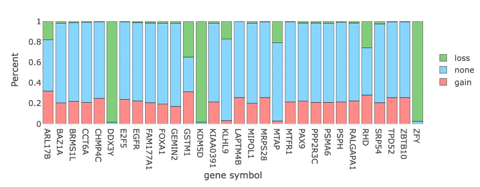
CNV Patterns of Top 30 Genes Across Cancer Samples (Bottom Heatmap)
The heatmap displays copy number variation (CNV) data with rows representing the top 30 CNV driver genes and columns representing individual patient samples, where each cell is color-coded to indicate CNV gain (pink), CNV loss (green), or no CNV event (blue). Additional summary panels provide complementary information: the left panel (A) shows total CNV gain/loss percentages per gene, the top bar chart (B) displays total CNV events per sample, and the right bar chart (C) presents total CNV events per gene. Rows dominated by green or pink indicate consistent CNV-driven alterations in specific genes, while samples with tall bars in the top chart may represent CNV-heavy tumor genomes, and genes showing both high CNV frequency and strong tool support from the summary table emerge as strong CNV driver candidates.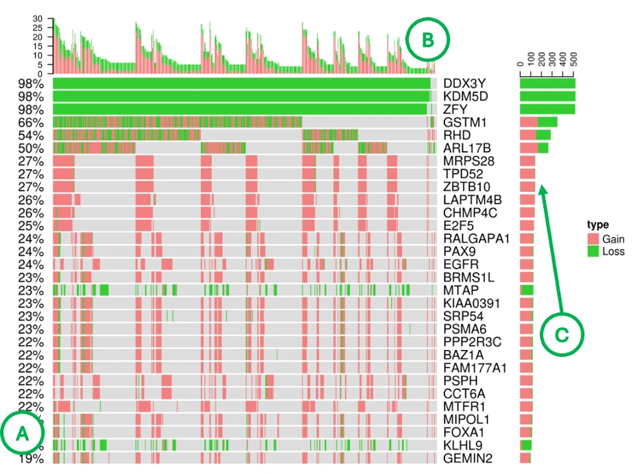
Locus Enrichment
This section explores chromosomal distribution and functional enrichment of CNV-associated genes.
Chromosomal Locus Enrichment of CNV-Associated Genes (Left Plot)
The plot displays each gene as a red dot positioned according to its chromosomal coordinates across the genome, with hovering over any dot revealing detailed information including the chromosome, position, gene symbol, and correlation value between CNV and expression. Dense clusters of dots indicate chromosomal regions enriched for CNV events, while genes showing high CNV–expression correlation may reflect dosage-sensitive drivers where copy number changes directly influence gene expression levels and potentially contribute to cancer development.
Locus Enrichment Summary Table (Right Table)
The table displays pathways or functional categories that are enriched among CNV-affected genes, helping users identify biological processes potentially disrupted by copy number variation events. Enrichment of pathways such as cell cycle regulation, DNA repair, or receptor tyrosine kinase (RTK) signaling may highlight key CNV-driven mechanisms underlying cancer development and progression.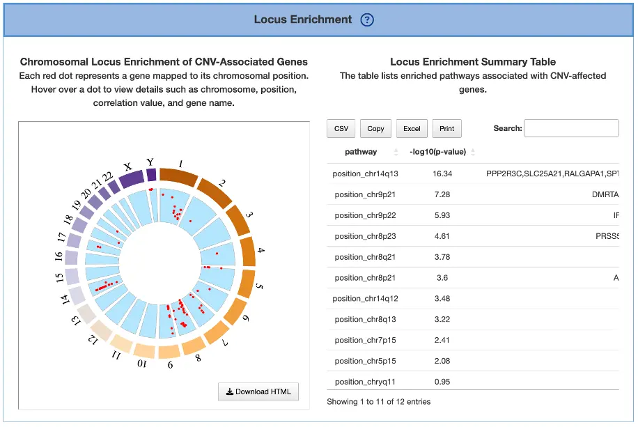
CNV Driver Gene Summary Table
This table provides gene-level CNV statistics, including significance metrics, sample proportions, CNV amplitude, and CNV–expression associations, offering a comprehensive overview of copy number variation patterns across genes. Genes with significant gain or loss (low p-value or FDR) and high sample proportions represent strong CNV candidates, while positive CNV–expression correlations indicate copy-number–driven expression changes where genomic alterations directly influence gene expression levels. Combining this table with the heatmap helps confirm consistent CNV patterns across patients and strengthens the evidence for identifying clinically relevant CNV-driven genes.
1.6.3 Survival relevance
Overall Summary
The bar charts and Venn diagrams summarize the number and overlap of survival-related genes identified from the selected omics data across four survival endpoints and four survival analysis methods.
The four survival endpoints include overall survival (OS), progression-free interval (PFI), disease-specific survival (DSS), and disease-free interval (DFI). The four survival analysis methods include Cox univariate regression, Cox multivariate regression adjusted for clinical covariates, cure model analysis, and machine learning (ML)-based analysis. The ML-based analysis includes LASSO, Random Forest, and I-Boost; a gene is counted as survival-related by ML if it is identified by at least one of the three algorithms. For more information about these methods, please refer to FAQ4.
- Number of significant survival-related genes by analysis method
This bar chart shows the number of significant survival-related genes identified by each survival analysis method. It allows users to compare how many genes each method identifies and assess whether results are consistent or method-dependent. The x-axis represents the analysis method and the y-axis represents the number of significant genes. Hover over each bar to view the exact count. - Number of significant survival-related genes by survival endpoint
This bar chart shows the number of significant survival-related genes associated with each survival endpoint. It allows users to compare the breadth of survival associations across OS, PFI, DSS, and DFI. The x-axis represents the survival endpoint and the y-axis represents the number of significant genes. Hover over each bar to view the exact count. - Overlap of significant survival-related genes among analysis methods
This Venn diagram shows the overlap of significant survival-related genes identified across the four survival analysis methods. Genes appearing in overlapping regions are identified by multiple methods, suggesting more robust survival associations. Hover over each region to view the number and percentage of genes in that subset. - Overlap of significant survival-related genes among survival endpoints
This Venn diagram shows the overlap of significant survival-related genes across the four survival endpoints. Genes appearing in overlapping regions are associated with multiple endpoints, suggesting broader prognostic relevance. Hover over each region to view the number and percentage of genes in that subset.
Survival gene summary table
The Survival Gene Summary table lists survival-related genes identified in the selected cancer type based on the selected omics data type: RNA, mutation, copy number variation (CNV), or methylation. Results are organized into four tabs corresponding to the four survival endpoints: overall survival (OS), progression-free interval (PFI), disease-specific survival (DSS), and disease-free interval (DFI).
Each endpoint-specific table includes the following columns: Gene Symbol, Cox Uni, Cox Multi (Clinical), Cure Model, Machine Learning, and Number of Algorithms.
For Cox Uni, Cox Multi (Clinical), and Cure Model, values represent log2 hazard ratios, where log2 transformation is applied to center the scale symmetrically around zero for easier comparison of risk directions. Positive values are shown in red, indicating higher risk, while negative values are shown in blue, indicating lower risk. Stronger color intensity represents a larger absolute log2 hazard ratio. Blank cells indicate that the gene did not reach statistical significance or was not tested under that method.
For Machine Learning, genes identified by at least one of the three machine learning algorithms — LASSO, Random Forest, or I-Boost — are marked with +. A blank cell indicates the gene was not identified as survival-related by any of the three methods.
The Number of Algorithms column indicates how many of the four analysis methods — Cox Univariate, Cox Multivariate (Clinical), Cure Model, and Machine Learning — identified the gene as survival-related, on a scale of 1 to 4. Higher values suggest more consistent evidence of survival relevance across methods. Users can reorder the table by clicking on any column name. See FAQ4 for algorithm descriptions and references.
Synergistic survival analysis
The Synergistic Survival Analysis section evaluates whether pairs of genes or molecular features show combined survival effects within the user-selected cancer type. The analysis supports cross-omics interactions among RNA expression, mutation, copy number variation (CNV), and methylation, depending on the selected omics type and available data. Currently, synergistic survival analysis is available for overall survival (OS) only.
Users can filter the results by selecting a gene set, including All, CGC, or NCG, and by selecting the hazard ratio direction, including All, HR > 1, or HR < 1. The gene set resources include the Cancer Gene Census (CGC) and the Network of Cancer Genes (NCG 6.0).
The result table lists detailed information for each synergistic survival interaction, including cancer type, interaction type, gene symbols, omics levels, hazard ratio, and adjusted p-value. The adjusted p-value is used to determine significant synergistic interactions, whereas the Kaplan–Meier plots display the corresponding unadjusted log-rank p-values for visualization. Users can reorder the table by clicking on any column name. Selecting or toggling a gene–omic pair in the table generates the corresponding Kaplan–Meier survival plots below.
The Kaplan–Meier plots display survival differences among patient groups defined by the selected cross-omics interaction. The left plot shows the unadjusted Kaplan–Meier survival curves, while the right plot shows adjusted survival curves generated using ggadjustedcurves() from the survminer package, when available. The gene symbols, omics layers, and survival analysis values are shown above each plot. The x-axis represents survival time from the initial cancer diagnosis, with survival curves displayed for the first 5 years of follow-up, and the y-axis represents survival probability. Users can hover over the curves to view detailed survival information and click the legend to show or hide individual curves.
Synergistic interactions are identified based on the combined survival effect of two survival-related molecular features from different omics layers. A synergistic pair is reported when the combined hazard ratio is greater than 1.5-fold compared with each individual omics feature and the log-rank p-value is less than 0.05.
Patient group stratification
Patient groups are defined according to the combined omics states of the two paired features. The grouping method depends on the omics type:
- RNA expression: patients are grouped into high- and low-expression groups using the median cutoff.
- Mutation: patients are grouped by mutation status: mutated or wild-type.
- CNV: patients are grouped by copy number status — gain, loss, or neutral (no copy number variation) — based on iGC.
- Methylation: patients are grouped using beta-value median stratification.
Abbreviation definitions
The group labels in the Kaplan–Meier plots represent the combined omics states of two genes or molecular features. The order of gene 1 and gene 2 follows the interaction type shown in the table.
- high_mut: high RNA expression in gene 1; mutated in gene 2
- high_wt: high RNA expression in gene 1; wild-type in gene 2
- low_mut: low RNA expression in gene 1; mutated in gene 2
- low_wt: low RNA expression in gene 1; wild-type in gene 2
- high_gain: high RNA expression in gene 1; copy number gain in gene 2
- high_loss: high RNA expression in gene 1; copy number loss in gene 2
- high_none: high RNA expression in gene 1; neutral copy number in gene 2
- low_gain: low RNA expression in gene 1; copy number gain in gene 2
- low_loss: low RNA expression in gene 1; copy number loss in gene 2
- low_none: low RNA expression in gene 1; neutral copy number in gene 2
- high_meth: high RNA expression in gene 1; methylation detected in gene 2
- high_unmeth: high RNA expression in gene 1; no methylation detected in gene 2
- low_meth: low RNA expression in gene 1; methylation detected in gene 2
- low_unmeth: low RNA expression in gene 1; no methylation detected in gene 2
- mut_gain: mutated in gene 1; copy number gain in gene 2
- mut_loss: mutated in gene 1; copy number loss in gene 2
- mut_none: mutated in gene 1; neutral copy number in gene 2
- wt_gain: wild-type in gene 1; copy number gain in gene 2
- wt_loss: wild-type in gene 1; copy number loss in gene 2
- wt_none: wild-type in gene 1; neutral copy number in gene 2
- mut_meth: mutated in gene 1; methylation level in gene 2
- mut_unmeth: mutated in gene 1; no methylation detected in gene 2
- wt_meth: wild-type in gene 1; methylation detected in gene 2
- wt_unmeth: wild-type in gene 1; no methylation detected in gene 2
- gain_meth: copy number gain in gene 1; methylation detected in gene 2
- gain_unmeth: copy number gain in gene 1; no methylation detected in gene 2
- none_meth: neutral copy number in gene 1; methylation detected in gene 2
- none_unmeth: neutral copy number in gene 1; no methylation detected in gene 2
- loss_meth: copy number loss in gene 1; methylation detected in gene 2
- loss_unmeth: copy number loss in gene 1; no methylation detected in gene 2
1.7 Cancer Methylation
1.7.1 Overview
The Cancer Methylation section visualizes genes exhibiting significant hypermethylation or hypomethylation in the selected cancer type, and evaluates whether methylation status of genes is associated with patient survival. Results are organized into two tabs: Methylation Drivers and Survival Relevance.
At the top of the section, users may choose between two methylation driver-detection modes:- MethylMix (single-tool mode): displays methylation drivers predicted by MethylMix alone, which classifies genes as hypermethylated or hypomethylated by comparing their methylation distributions to a reference normal tissue.
- MethylMix ∩ ELMER (two-tool intersection mode): displays only genes identified as methylation drivers by both MethylMix and ELMER, where ELMER further identifies CpG probes whose methylation levels are inversely associated with nearby gene expression. This intersection mode highlights high-confidence methylation drivers supported by both algorithms.
Switching between modes allows users to compare single-tool versus consensus methylation drivers. The selected mode applies across both tabs.
The Methylation Drivers tab provides an overview of methylation driver distributions across patient samples and chromosomal locations, helping users explore methylation-expression relationships and identify epigenetically driven gene dysregulation. This tab contains three components:- Visualization of Top 30 Methylation Driver Genes — displays hypermethylation and hypomethylation patterns and tool support for the top 30 methylation driver genes across the patient cohort.
- Locus Enrichment — summarizes the chromosomal distribution of methylation driver genes, helping users identify regions of recurrent epigenetic alteration.
- Methylation Driver Gene Summary Table — lists methylation driver genes with supporting evidence including methylation status, tool support, and related annotations.
- Survival Gene Distribution Summary — bar charts and Venn diagrams summarizing the number and overlap of survival-related genes across four survival endpoints and four survival analysis methods.
- Survival Gene Summary Table — lists survival-related genes with their survival associations across endpoints and analysis methods, including log2 hazard ratios and machine learning identification status.
- Synergistic Survival Analysis — evaluates whether pairs of genes or molecular features show combined survival effects, identifying cross-omics interactions where the combined hazard ratio exceeds that of either individual feature alone.
Together, the Methylation Drivers and Survival Relevance tabs help users identify which genes show significant epigenetic alterations supported by computational tools, which are associated with patient survival, and which show synergistic survival effects in combination with other molecular features.
1.7.2 Driver genes
Visualization of Top 30 Methylation Driver GenesThis panel summarizes the methylation status of the top 30 methylation driver genes and shows how hypermethylation/hypomethylation patterns appear across samples.
Methylation Status of Top 30 Genes (Top Bar Chart)
The plot displays a bar chart summarizing the proportion of samples showing hypermethylation (pink), hypomethylation (green), and no methylation change (blue) across the top 30 methylation driver genes, with each bar representing a single gene. Users can hover over any bar to view the exact percentages of hyper-, hypo-, and unmethylated samples for that gene. Genes with high hypermethylation may involve promoter silencing or epigenetic downregulation that reduces gene expression, while genes with high hypomethylation may indicate enhancer activation or derepression leading to increased expression, whereas balanced patterns may suggest context-specific or mixed methylation states that vary across different tumor samples or subtypes.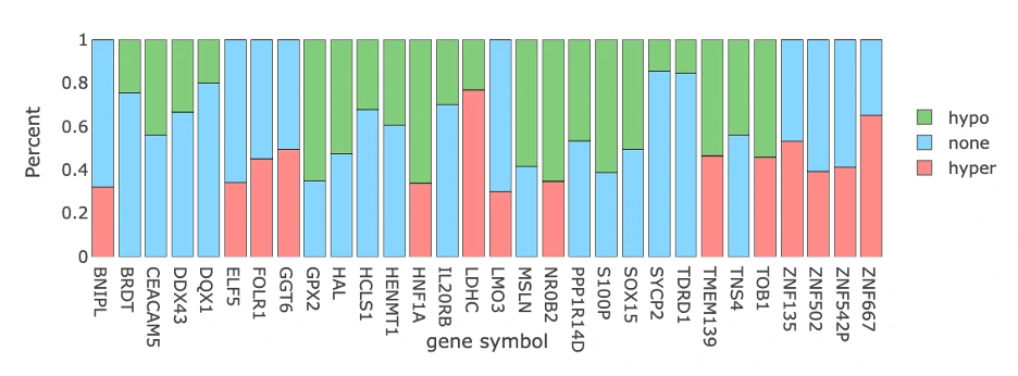
Methylation Patterns Across Cancer Samples (Bottom Heatmap)
The heatmap displays methylation data with rows representing the top 30 methylation driver genes and columns representing individual patient samples, where cell colors indicate hypermethylation (pink) or hypomethylation (green). Additional summary bars provide complementary information: the left panel (A) shows total methylation percentage per gene, the top bar chart (B) displays total methylation events per sample, and the right bar chart (C) presents total methylation events per gene. Genes with predominantly pink rows are consistently hypermethylated across patients, while those with predominantly green rows show consistent hypomethylation, and tall bars in the top chart indicate samples with high methylation burden. Comparison with expression data through correlation analysis helps identify methylation-driven expression changes, revealing epigenetic mechanisms that influence gene activity in cancer.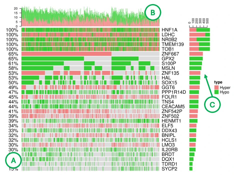
Locus Enrichment
This section maps methylation-associated genes to their chromosomal positions and evaluates pathway enrichment.
Chromosomal Locus Enrichment of Methylation-Associated Genes (Left Plot)
The plot displays each methylation-associated gene as a red dot positioned according to its chromosomal coordinates across the genome, with hovering over any dot revealing the chromosome, genomic position, gene symbol, and correlation value between methylation and expression. Clusters of dots may indicate epigenetically altered chromosomal regions where multiple genes experience coordinated methylation changes, while positive correlation values suggest that methylation changes strongly influence gene expression, such as hypermethylation leading to downregulation or hypomethylation resulting in upregulation. Genes with high correlation values may represent functional methylation drivers where epigenetic modifications play a critical role in regulating gene activity and contributing to cancer phenotypes.
Locus Enrichment Summary Table (Right Table)
The table displays pathways enriched among methylation-affected genes, helping users identify biological processes impacted by epigenomic dysregulation in cancer. Enrichment in pathways such as DNA repair, immune regulation, or cell differentiation may indicate core mechanisms that are altered via methylation changes, revealing how epigenetic modifications contribute to tumor development, progression, and immune evasion.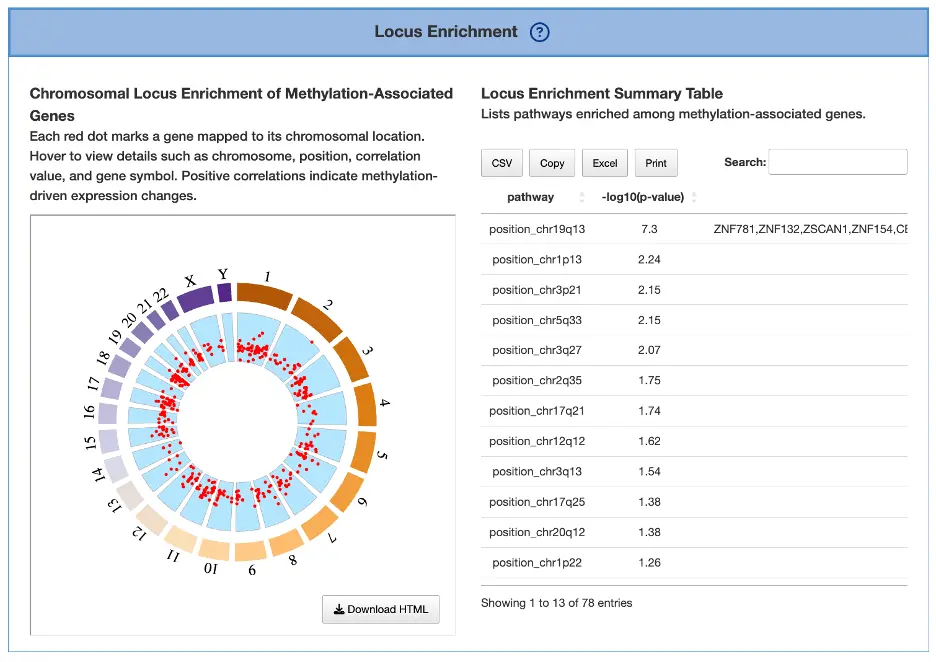
Methylation Driver Gene Summary Table
This table summarizes methylation statistics for each gene identified as a methylation driver in the selected cancer type, integrating results from MethylMix and ELMER outputs and including methylation proportions, probe-level data, and correlations with gene expression. Strong hyper- or hypomethylation percentages combined with significant adjusted p-values indicate robust methylation drivers, while a strong negative correlation typically suggests promoter hypermethylation reducing expression and a positive correlation may indicate intragenic methylation effects that enhance gene activity. Genes showing consistent patterns across both tools (MethylMix ∩ ELMER) represent high-confidence methylation drivers, as convergent evidence from multiple computational methods strengthens the reliability of epigenetic alterations as key regulatory mechanisms in cancer.
1.7.3 Survival relevance
Overall Summary
The bar charts and Venn diagrams summarize the number and overlap of survival-related genes identified from the selected omics data across four survival endpoints and four survival analysis methods.
The four survival endpoints include overall survival (OS), progression-free interval (PFI), disease-specific survival (DSS), and disease-free interval (DFI). The four survival analysis methods include Cox univariate regression, Cox multivariate regression adjusted for clinical covariates, cure model analysis, and machine learning (ML)-based analysis. The ML-based analysis includes LASSO, Random Forest, and I-Boost; a gene is counted as survival-related by ML if it is identified by at least one of the three algorithms. For more information about these methods, please refer to FAQ4.
- Number of significant survival-related genes by analysis method
This bar chart shows the number of significant survival-related genes identified by each survival analysis method. It allows users to compare how many genes each method identifies and assess whether results are consistent or method-dependent. The x-axis represents the analysis method and the y-axis represents the number of significant genes. Hover over each bar to view the exact count. - Number of significant survival-related genes by survival endpoint
This bar chart shows the number of significant survival-related genes associated with each survival endpoint. It allows users to compare the breadth of survival associations across OS, PFI, DSS, and DFI. The x-axis represents the survival endpoint and the y-axis represents the number of significant genes. Hover over each bar to view the exact count. - Overlap of significant survival-related genes among analysis methods
This Venn diagram shows the overlap of significant survival-related genes identified across the four survival analysis methods. Genes appearing in overlapping regions are identified by multiple methods, suggesting more robust survival associations. Hover over each region to view the number and percentage of genes in that subset. - Overlap of significant survival-related genes among survival endpoints
This Venn diagram shows the overlap of significant survival-related genes across the four survival endpoints. Genes appearing in overlapping regions are associated with multiple endpoints, suggesting broader prognostic relevance. Hover over each region to view the number and percentage of genes in that subset.
Survival gene summary table
The Survival Gene Summary table lists survival-related genes identified in the selected cancer type based on the selected omics data type: RNA, mutation, copy number variation (CNV), or methylation. Results are organized into four tabs corresponding to the four survival endpoints: overall survival (OS), progression-free interval (PFI), disease-specific survival (DSS), and disease-free interval (DFI).
Each endpoint-specific table includes the following columns: Gene Symbol, Cox Uni, Cox Multi (Clinical), Cure Model, Machine Learning, and Number of Algorithms.
For Cox Uni, Cox Multi (Clinical), and Cure Model, values represent log2 hazard ratios, where log2 transformation is applied to center the scale symmetrically around zero for easier comparison of risk directions. Positive values are shown in red, indicating higher risk, while negative values are shown in blue, indicating lower risk. Stronger color intensity represents a larger absolute log2 hazard ratio. Blank cells indicate that the gene did not reach statistical significance or was not tested under that method.
For Machine Learning, genes identified by at least one of the three machine learning algorithms — LASSO, Random Forest, or I-Boost — are marked with +. A blank cell indicates the gene was not identified as survival-related by any of the three methods.
The Number of Algorithms column indicates how many of the four analysis methods — Cox Univariate, Cox Multivariate (Clinical), Cure Model, and Machine Learning — identified the gene as survival-related, on a scale of 1 to 4. Higher values suggest more consistent evidence of survival relevance across methods. Users can reorder the table by clicking on any column name. See FAQ4 for algorithm descriptions and references.
Synergistic survival analysis
The Synergistic Survival Analysis section evaluates whether pairs of genes or molecular features show combined survival effects within the user-selected cancer type. The analysis supports cross-omics interactions among RNA expression, mutation, copy number variation (CNV), and methylation, depending on the selected omics type and available data. Currently, synergistic survival analysis is available for overall survival (OS) only.
Users can filter the results by selecting a gene set, including All, CGC, or NCG, and by selecting the hazard ratio direction, including All, HR > 1, or HR < 1. The gene set resources include the Cancer Gene Census (CGC) and the Network of Cancer Genes (NCG 6.0).
The result table lists detailed information for each synergistic survival interaction, including cancer type, interaction type, gene symbols, omics levels, hazard ratio, and adjusted p-value. The adjusted p-value is used to determine significant synergistic interactions, whereas the Kaplan–Meier plots display the corresponding unadjusted log-rank p-values for visualization. Users can reorder the table by clicking on any column name. Selecting or toggling a gene–omic pair in the table generates the corresponding Kaplan–Meier survival plots below.
The Kaplan–Meier plots display survival differences among patient groups defined by the selected cross-omics interaction. The left plot shows the unadjusted Kaplan–Meier survival curves, while the right plot shows adjusted survival curves generated using ggadjustedcurves() from the survminer package, when available. The gene symbols, omics layers, and survival analysis values are shown above each plot. The x-axis represents survival time from the initial cancer diagnosis, with survival curves displayed for the first 5 years of follow-up, and the y-axis represents survival probability. Users can hover over the curves to view detailed survival information and click the legend to show or hide individual curves.
Synergistic interactions are identified based on the combined survival effect of two survival-related molecular features from different omics layers. A synergistic pair is reported when the combined hazard ratio is greater than 1.5-fold compared with each individual omics feature and the log-rank p-value is less than 0.05.
Patient group stratification
Patient groups are defined according to the combined omics states of the two paired features. The grouping method depends on the omics type:
- RNA expression: patients are grouped into high- and low-expression groups using the median cutoff.
- Mutation: patients are grouped by mutation status: mutated or wild-type.
- CNV: patients are grouped by copy number status — gain, loss, or neutral (no copy number variation) — based on iGC.
- Methylation: patients are grouped using beta-value median stratification.
Abbreviation definitions
The group labels in the Kaplan–Meier plots represent the combined omics states of two genes or molecular features. The order of gene 1 and gene 2 follows the interaction type shown in the table.
- high_mut: high RNA expression in gene 1; mutated in gene 2
- high_wt: high RNA expression in gene 1; wild-type in gene 2
- low_mut: low RNA expression in gene 1; mutated in gene 2
- low_wt: low RNA expression in gene 1; wild-type in gene 2
- high_gain: high RNA expression in gene 1; copy number gain in gene 2
- high_loss: high RNA expression in gene 1; copy number loss in gene 2
- high_none: high RNA expression in gene 1; neutral copy number in gene 2
- low_gain: low RNA expression in gene 1; copy number gain in gene 2
- low_loss: low RNA expression in gene 1; copy number loss in gene 2
- low_none: low RNA expression in gene 1; neutral copy number in gene 2
- high_meth: high RNA expression in gene 1; methylation detected in gene 2
- high_unmeth: high RNA expression in gene 1; no methylation detected in gene 2
- low_meth: low RNA expression in gene 1; methylation detected in gene 2
- low_unmeth: low RNA expression in gene 1; no methylation detected in gene 2
- mut_gain: mutated in gene 1; copy number gain in gene 2
- mut_loss: mutated in gene 1; copy number loss in gene 2
- mut_none: mutated in gene 1; neutral copy number in gene 2
- wt_gain: wild-type in gene 1; copy number gain in gene 2
- wt_loss: wild-type in gene 1; copy number loss in gene 2
- wt_none: wild-type in gene 1; neutral copy number in gene 2
- mut_meth: mutated in gene 1; methylation level in gene 2
- mut_unmeth: mutated in gene 1; no methylation detected in gene 2
- wt_meth: wild-type in gene 1; methylation detected in gene 2
- wt_unmeth: wild-type in gene 1; no methylation detected in gene 2
- gain_meth: copy number gain in gene 1; methylation detected in gene 2
- gain_unmeth: copy number gain in gene 1; no methylation detected in gene 2
- none_meth: neutral copy number in gene 1; methylation detected in gene 2
- none_unmeth: neutral copy number in gene 1; no methylation detected in gene 2
- loss_meth: copy number loss in gene 1; methylation detected in gene 2
- loss_unmeth: copy number loss in gene 1; no methylation detected in gene 2
1.8 Cancer miRNA
1.8.1 Overview
The Cancer miRNA section visualizes regulatory relationships between differentially expressed (DE) genes and miRNAs in the selected cancer type. It integrates both experimentally validated interactions and computationally predicted miRNA–target relationships to help users identify miRNA regulators, target genes, and expression patterns associated with carcinogenesis. Note: When Validated is selected, interactions are shown if they are either experimentally validated (solid lines) or meet the selected minimum prediction support (dotted lines).
This section contains three components:- miRNA–Gene Interaction Network
- Visualization of Differentially Expressed Genes and miRNAs
- Gene–miRNA Correlation Summary Table
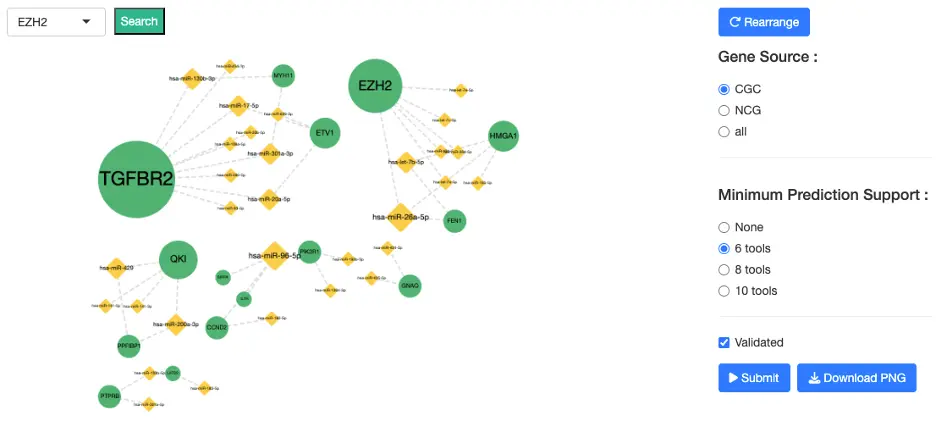
1.8.2 miRNA-Gene Interaction Network
Purpose
This interactive network displays validated and predicted interactions between genes and miRNAs, enabling users to explore regulatory mechanisms that may contribute to cancer development or progression.
Nodes
- Gene nodes represent DE or driver-relevant genes
- miRNA nodes represent DE miRNAs or miRNAs predicted/validated to regulate those genes
Edges
Two types of miRNA–gene interactions are shown:- Validated interactions
- Experimentally supported miRNA–target interactions
- Sourced from miRTarBase, where:
- 1 = supported by at least one experimental study
- 2 = supported by multiple independent studies or experimental methods
- Visible only when the 'Validated' checkbox is checked
- Predicted interactions
- Derived from 12 bioinformatics prediction tools, including: DIANA-microT, miRDB, TargetScan, RNAhybrid, miRanda, PITA, PicTar, RNA22, and others
- Users may set a minimum prediction support threshold (≥6, ≥8, or ≥10 tools)
Note: All interactions appear as dotted lines in the visualization. The distinction between validated and predicted interactions is determined by whether the 'Validated' checkbox is enabled, not by line style. Edges grow denser as evidence increases (validated + multi-tool predictions).
Interaction Guide Selecting Nodes
- Click a node to highlight all connected partners
- Click blank/white space to reset the full network
- Use the dropdown to directly locate and highlight a specific gene
- Gene Source: CGC, NCG, or All
- Minimum Prediction Support: ≥6, ≥8, or ≥10 prediction tools
- Validation Status: Show or hide validated interactions
- High-confidence regulatory interactions
- Oncogenic or tumor suppressive miRNA–gene pairs
- Experimentally supported vs computationally predicted relationships
1.8.3 Visualization of Differentially Expressed Genes and miRNAs
Purpose
This heatmap displays the expression profiles of differentially expressed (DE) genes and DE miRNAs across tumor and normal samples, allowing users to compare regulatory patterns at the expression level and examine relationships between miRNA regulators and their target genes.
Heatmap Display
The heatmap presents rows representing DE miRNAs and/or DE genes and columns representing individual patient samples, with a color scale where red indicates higher expression and blue indicates lower expression. Sample labels distinguish between TP (dark blue, tumor samples) and NT (light blue, normal samples), while clustering dendrograms show similarities among samples (top) and similarities among genes/miRNAs (right), revealing co-expression patterns and sample groupings.
Visualization Modes
Users can switch between three visualization modes: DE miRNA (displaying only DE miRNAs), DE gene (displaying only DE genes), or DE miRNA + DE gene (combined view). These modes help users examine upregulated miRNAs versus their target genes, identify opposing expression trends such as miRNA upregulation with corresponding gene downregulation, and detect co-expression clusters among miRNAs or genes that suggest coordinated regulatory mechanisms.
Interpretation Tips
Inverse expression patterns, where miRNA expression is high and target gene expression is low, may indicate miRNA-mediated repression as a functional regulatory mechanism. Co-clustering of genes or miRNAs suggests shared regulatory pathways or common biological functions, while DE miRNAs that align with network interactions identified in other analyses highlight strong regulatory candidates with potential functional significance in cancer development or progression.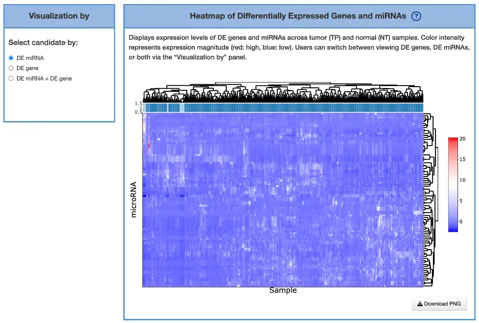
1.8.4. Gene–miRNA Correlation Summary Table
This table provides quantitative measures of gene–miRNA regulatory relationships using correlation analysis, validation data, and prediction support to assess the strength and reliability of regulatory interactions. Negative correlations often indicate miRNA-mediated repression where miRNA upregulation corresponds with target gene downregulation, while positive correlations may suggest co-regulation or indirect regulatory mechanisms involving intermediate factors. High prediction-tool support combined with validated status and strong correlation values indicate high-confidence interactions that are likely functionally relevant, and users can cross-check this table with network edges and heatmap expression patterns to confirm consistent regulatory relationships across multiple analytical approaches.
1.9 Cancer Multi-omics
1.9.1 Overview
The Cancer Multi-Omics section visualizes driver genes identified through multi-omics integration tools and evaluates their survival relevance in the selected cancer type. By combining evidence across mutations, CNV, methylation, mRNA expression, and miRNA regulation, this section highlights genes supported by multiple molecular layers and explores their biological functions, tool support, distribution across omics categories, and prognostic significance.
Users may filter results by gene set:- All: includes all identified multi-omics driver genes
- CGC: includes only genes listed in the Cancer Gene Census
- NCG 6.0: includes only genes listed in the Network of Cancer Genes

The section contains six components:
- Multi-Layer Relationship Diagram of Multi-Omics Drivers and Biological Functions — visualizes the relationships between multi-omics driver genes and their associated biological functions across molecular layers.
- Distribution of Multi-Omics Drivers Across Omics Layers — summarizes how driver genes are distributed across mutation, CNV, methylation, mRNA expression, and miRNA regulation layers.
- Cross-Tool Comparison of Multi-Omics Driver Detection — compares driver gene identification across multiple integration tools, helping users assess the degree of consensus.
- Machine Learning Result Table — summarizes significant prognostic signatures identified by LASSO, Random Forest, and I-Boost across omics data types and survival endpoints, with hazard ratios, confidence intervals, and patient group sizes.
- Signature Results — displays the prognostic signature, Kaplan–Meier survival plot, and predictive performance plot for a user-selected algorithm and survival endpoint combination.
- Multi-Omics Survival Gene Summary — provides an overview of survival-related genes identified across omics types, endpoints, and algorithms, including bar charts summarizing gene distributions and a detailed gene table.
1.9.2 Multi-Layer Relationship Diagram of Multi-Omics Drivers and Biological Functions
This section presents a diagram illustrating hierarchical relationships from the cancer type → omics layers → multi-omics driver genes → Gene Ontology (GO) functions, showing how integrative driver events connect molecular alterations to biological processes. A summary table below the diagram lists detailed gene-specific and GO-specific results.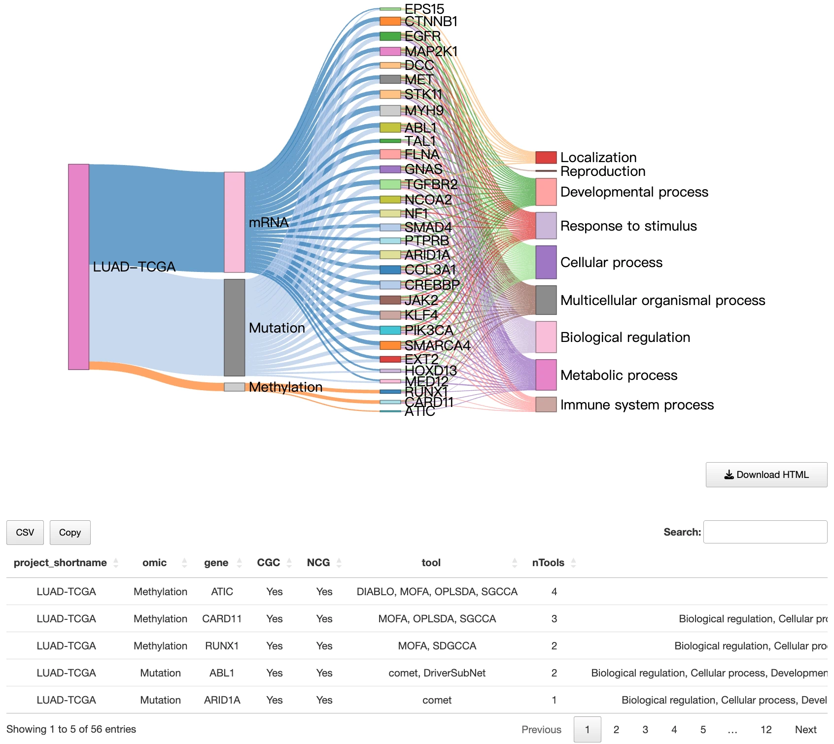
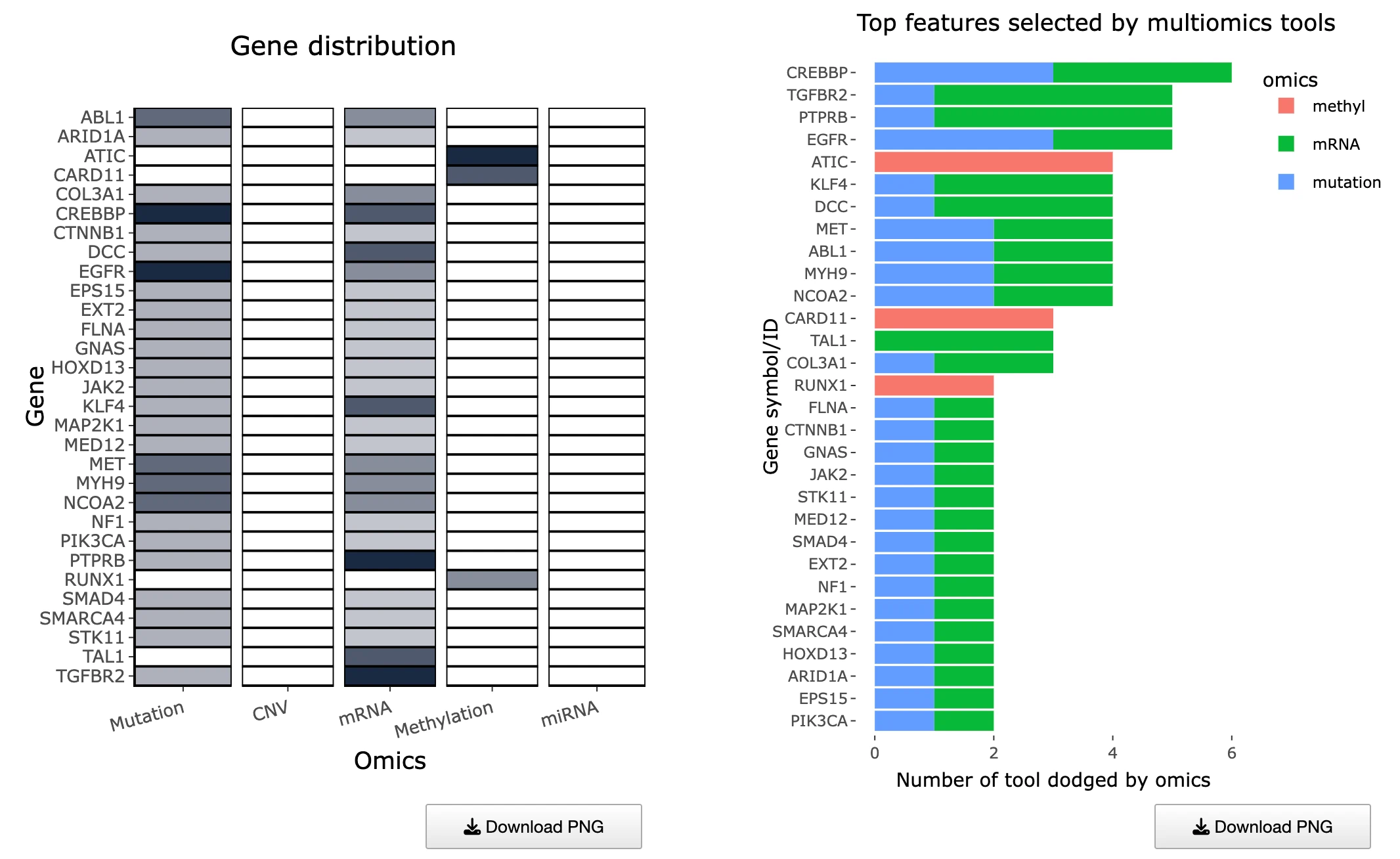
1.9.3 Distribution of Multi-Omics Drivers Across Omics Layers
Purpose
This section summarizes how many tools identify each gene as a multi-omics driver and how those drivers are distributed across omics categories.
It consists of two complementary plots:- Left Heatmap – Tool Support per Gene and Omics Layer
- Right Bar Chart – Top Genes by Multi-Omics Tool Support
Tool Support Across Omics Layers (Left Heatmap)
This heatmap displays tool support across omics layers, with rows representing multi-omics driver genes, columns representing different omics layers, and cells showing the number of tools that identified each gene within that specific omic layer, where hovering over any cell reveals the exact number of supporting tools. Darker cells indicate stronger multi-tool evidence for that particular omic layer, suggesting robust detection across computational methods, while genes with support across multiple omics layers may represent high-confidence integrative drivers that are dysregulated through multiple molecular mechanisms. Missing or light-colored cells suggest omics-specific drivers where the gene shows alterations predominantly in one molecular layer rather than across multiple platforms.
Top Genes by Support Count (Right Bar Chart)
This bar chart displays an ordered list of genes ranked by the total number of supporting tools, with the x-axis showing tool counts and the y-axis displaying gene symbols, where bar colors differentiate the omics categories contributing to each gene's overall support. Users can hover over any bar to view the number of tools per omic layer contributing to each gene's score, providing detailed breakdowns of evidence sources. Genes with the longest bars are most consistently supported across computational tools and represent the strongest driver candidates, while multicolored bars indicate multi-layered evidence across different omics platforms suggesting integrative dysregulation, and single-color bars represent omics-specific drivers that show alterations predominantly within one molecular layer.
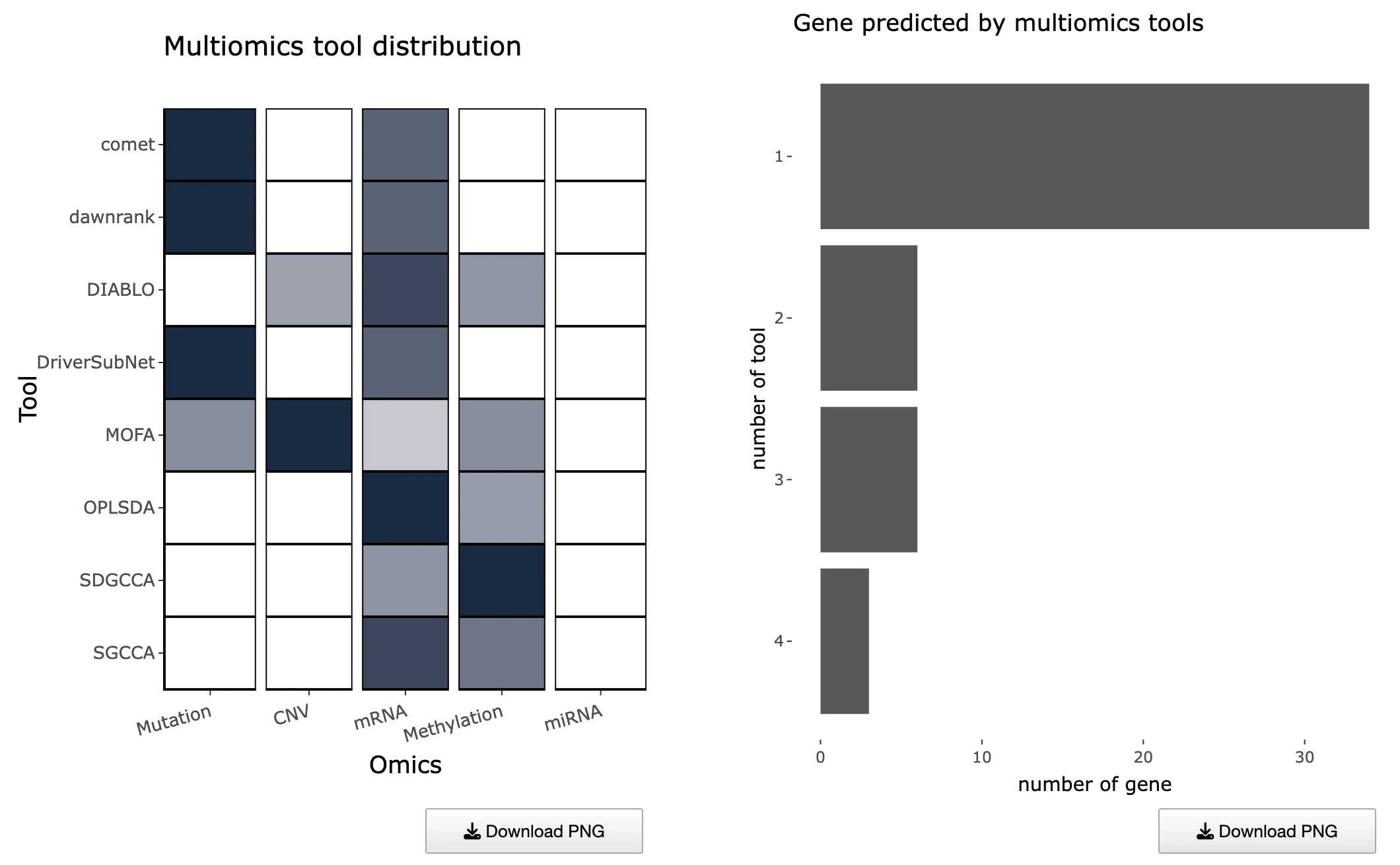
1.9.4 Cross-Tool Comparison of Multi-Omics Driver Detection
Purpose
This section compares the coverage and consistency of different multi-omics driver-identification tools across omics layers.
It contains:- Left Heatmap – Tool vs. Omics Layer Coverage
- Right Bar Chart – Gene Counts by Tool Support Level
Proportion of Genes Identified by Each Tool (Left Heatmap)
This heatmap displays multi-omics identification tools on the y-axis and omics layers on the x-axis, with each cell showing the proportion of genes identified by a specific tool for a given omic layer, where hovering reveals exact proportion values. High-proportion cells reveal tool specialization or sensitivity toward certain omics categories, indicating that some tools are particularly effective at detecting drivers within specific molecular layers, while tools with balanced proportions across multiple omics may provide more integrative coverage and capture dysregulation across diverse biological mechanisms.
Gene Counts by Tool Support Level (Right Bar Chart)
This bar chart displays the distribution of tool support across genes, with the x-axis showing the number of tools supporting a gene and the y-axis showing the number of genes at each support level, where hovering reveals the exact count of genes supported by each tool count. A right-skewed distribution, where more genes are supported by many tools, indicates strong cross-tool consensus and robust identification of driver genes across computational methods, while a left-skewed distribution suggests tool divergence where few genes are consistently detected across platforms. Genes supported by more tools typically represent high-confidence multi-omics drivers, as convergent evidence from multiple analytical approaches strengthens their credibility as functionally relevant cancer-associated genes.
1.9.5 Machine Learning Results
The machine learning result table summarizes significant prognostic signatures identified by machine learning algorithms for the selected cancer type. Each row represents a significant result for a specific survival endpoint and algorithm combination. Results are organized across four omics data types — RNA expression, mutation, CNV, and methylation — each available in a separate tab.
The table includes the following columns:- Endpoint: the survival endpoint evaluated, including overall survival (OS), disease-specific survival (DSS), disease-free interval (DFI), or progression-free interval (PFI).
- Algorithm: the machine learning algorithm that identified the signature — LASSO, Random Forest, or I-Boost.
- HR: the hazard ratio comparing survival outcomes between the high- and low-risk groups defined by the composite signature score. Values greater than 1 indicate higher risk in the high-risk group; values less than 1 indicate lower risk.
- L95 / U95: the lower and upper bounds of the 95% confidence interval for the hazard ratio, reflecting the precision of the risk estimate.
- Log-rank p-value: the p-value from the log-rank test evaluating whether the survival difference between the high- and low-risk groups is statistically significant.
- Patients in high-risk: the number of patients assigned to the high-risk group based on the composite signature score.
- Patients in low-risk: the number of patients assigned to the low-risk group based on the composite signature score.
Users can reorder the table by clicking on any column name. Selecting a row displays the corresponding Kaplan–Meier survival plot and predictive performance plot in the Signature Results panel below.
1.9.6 Signature Results
The Signature Results panel displays the prognostic signature identified by the selected machine learning algorithm and survival endpoint for the selected cancer type. Users can select a machine learning algorithm — LASSO, Random Forest, or I-Boost — and a survival endpoint from the left menu. The corresponding signature gene table, Kaplan–Meier survival plot, and predictive performance plot are displayed on the right. For detailed algorithm descriptions and reference links, please refer to FAQ4.
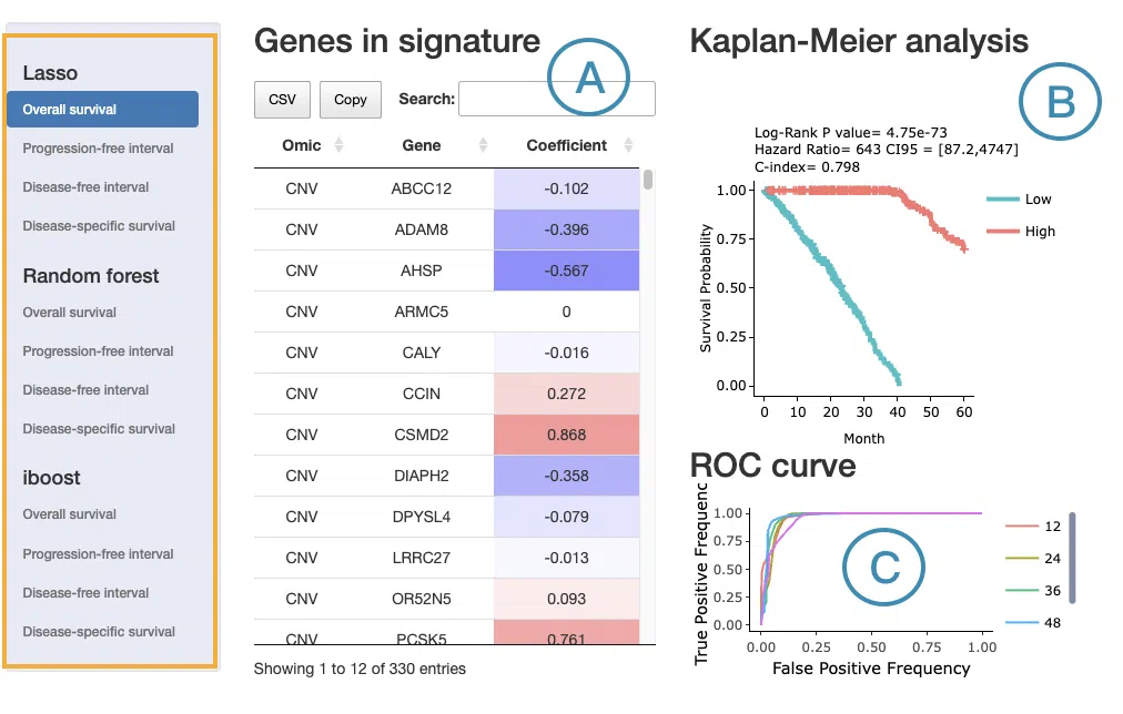
- Signature gene table
The signature gene table lists all molecular features included in the selected prognostic signature. The table always includes the following columns:- Omic: the omics data type from which the feature is derived — RNA expression, mutation, CNV, or methylation. When the signature includes features from multiple omics layers, each feature's source is identified here.
- Gene: the gene symbol of the molecular feature.
- LASSO: the Coefficient column shows the weight assigned to each feature. A positive coefficient indicates that a higher feature value is associated with worse survival (higher risk), shown in red; a negative coefficient indicates that a higher feature value is associated with better survival (lower risk), shown in blue. The interpretation of feature value depends on the omics type — for example, expression level in RNA data, mutation presence versus wild-type in mutation data, copy number level in CNV data, or methylation level in methylation data.
- Random Forest: the Depth column indicates how early a feature appears in the decision trees, with shallower depth reflecting stronger discriminative power. The Relative Frequency column reflects how consistently the feature is used as a splitting variable across all trees, expressed as a proportion. The relative frequency column is color-coded according to its value.
- I-Boost: the Coefficient column is interpreted the same way as in LASSO — positive values in red indicate higher risk and negative values in blue indicate lower risk.
- Kaplan–Meier survival plot
The Kaplan–Meier plot displays survival differences between patient groups stratified by their composite signature score, computed from the combined weighted contributions of all features in the signature regardless of omics type. Patients are divided into two groups based on the median signature score of the cohort:- High: patients with a signature score above the median, indicating higher overall risk
- Low: patients with a signature score below the median, indicating lower overall risk
- Predictive performance plot
For LASSO and Random Forest, ROC curves evaluate the predictive performance of the signature at different survival time points. The x-axis represents the false-positive rate and the y-axis represents the true-positive rate. Users can hover over the curves to view the false-positive rate, true-positive rate, and cutoff value at each point. ROC curves for different survival times can be shown or hidden by clicking the corresponding legend labels.
For I-Boost, a cumulative hazard plot is displayed instead of ROC curves. This plot shows the cumulative hazard over time for the high- and low-risk groups. Higher cumulative hazard values indicate a greater accumulated risk of the survival event occurring up to that time point. The x-axis represents survival time from initial cancer diagnosis and the y-axis represents cumulative hazard. Users can hover over the curves to view detailed information, and curves can be shown or hidden by clicking the corresponding legend labels.
1.9.7 Multi-Omics Survival Gene Summary
The Multi-Omics Survival Gene Summary panel provides an overview of survival-related genes identified by LASSO, Random Forest, and I-Boost across omics data types and survival endpoints for the selected cancer type.
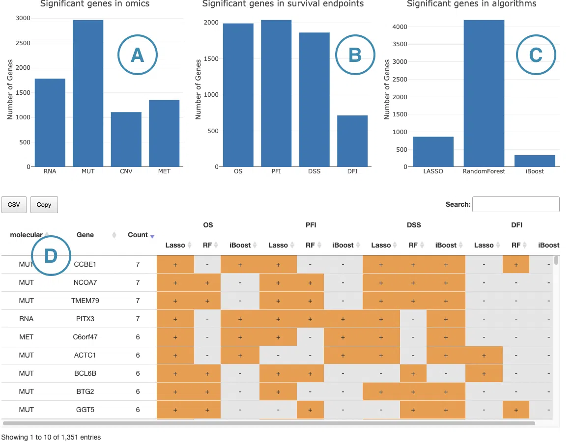
Bar charts
The three bar charts at the top summarize the distribution of significant survival-related genes from different perspectives. Hover over each bar to view the exact gene count.
(A) Significant genes by omics type: Shows the number of significant survival-related genes identified from each omics data type — RNA expression, mutation (MUT), CNV, and methylation (MET). This chart helps users assess which omics layer contributes the most survival-related features in the selected cancer type.
(B) Significant genes by survival endpoint: Shows the number of significant survival-related genes associated with each survival endpoint — OS, PFI, DSS, and DFI. This chart helps users compare the breadth of survival associations across endpoints.
(C) Significant genes by algorithm: Shows the number of significant survival-related genes identified by each machine learning algorithm — LASSO, Random Forest, and I-Boost. This chart helps users assess whether results are consistent across algorithms or driven predominantly by one method.
Survival gene table (D)
The table below the bar charts lists all survival-related genes identified across omics types, endpoints, and algorithms. Each row represents a unique omics-gene combination, so a gene identified across multiple omics types appears as separate rows.
The table includes the following columns:
Molecular: the omics data type from which the feature is derived — RNA expression, mutation (MUT), CNV, or methylation (MET).
Gene: the gene symbol of the molecular feature.
Count: the total number of + marks in that row, reflecting how many endpoint-algorithm combinations identified the gene as survival-related. Higher counts indicate more consistent survival relevance across endpoints and algorithms.
Endpoint columns: each survival endpoint — OS, PFI, DSS, and DFI — is represented as a column group with three sub-columns corresponding to LASSO, Random Forest, and I-Boost. A + indicates that the gene was identified as survival-related by that algorithm under that endpoint. A blank cell indicates the gene was not identified under that combination.
2. Gene
2.1 Gene Module Overview
The Gene module provides a comprehensive, multi-omics overview of a user-selected gene across multiple cancer types. By integrating expression, mutation, CNV, methylation, survival analysis, miRNA regulation, protein expression, and multi-omics driver evidence, this module helps users understand how a gene behaves across the cancer landscape and how its molecular alterations may relate to patient outcomes.
2.2 Input Selection
To begin, choose how you want to search for the gene:Search Mode
- Gene Name – Enter the official HGNC gene symbol (e.g., TP53)
- Ensembl ID – Enter the Ensembl gene identifier (e.g., ENSG00000141510)
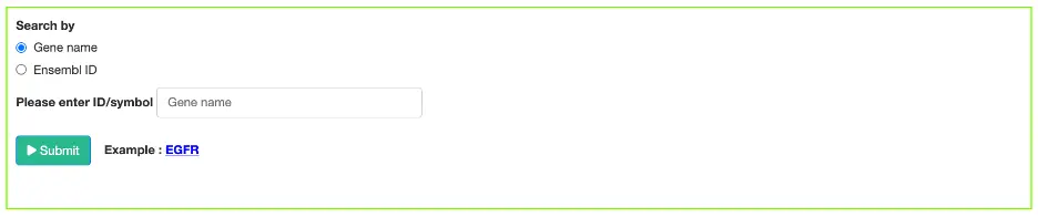
After entering the gene, click Submit to generate all downstream results.
2.3 Overview of Result Tabs
The Gene module contains several results tabs, each summarizing multi-omics evidence and functional insights for a selected gene across different cancer types:- Summary – Provides an overview of multi-omics evidence for the selected gene across projects, cohorts, and tissues. Bar plots and boxplots summarize global cross-cohort results, including RNA, CNV, methylation, mutation, and miRNA findings. The heatmap displays tissue-specific project-level results based on the tissue or organ selected from the body diagram.
- RNA – Displays gene expression patterns across projects and cohorts of selected organ/tissue, allowing users to view results by sample type, including all sample categories, as well as by mutation class or tumor stage. Users can explore tissue- or organ-specific expression patterns across different cancer projects and cohorts, along with survival analysis based on the user-selected gene.
- Mutation –Provides mutation-focused results for the selected gene through three tabs: mutation rate, mutation percentage, and exon distribution. The mutation rate and mutation percentage tabs include heatmaps showing hotspot mutation regions (HMRs) across multiple cancer types, where mutation frequency is calculated based on mutation count relative to sample count. Cancer project-specific mutation rate bar charts and survival analysis results are also provided.
- CNV – Visualizes copy-number alterations affecting the gene, including amplification and deletion frequencies across cancer types, CNV–expression correlations, and survival analysis based on copy-number status for the user-selected gene.
- Methylation – Highlights methylation status at the gene locus, including promoter hyper- or hypomethylation patterns, methylation–expression relationships, and survival analysis based on methylation status for the user-selected gene.
- miRNA – Shows regulatory interactions between the gene and miRNAs, including experimentally validated and predicted miRNA–target relationships.
- Protein – Displays protein-level expression data, post-translational modifications, and protein–protein interactions relevant to the gene product.
- Multi-Omics – Integrates evidence across all omics layers to reveal comprehensive functional patterns, cross-omics correlations, and the gene's role in oncogenic processes.
2.4 Gene Summary
Gene Overview
The Gene Overview page provides a high-level overview of multi-omics evidence for the selected gene across projects, cohorts, and tissues. These visualizations help users quickly identify where the gene shows notable molecular changes, how consistently those changes appear across cohorts, and whether tissue-specific patterns are present.
The summary bar plots and boxplots provide global cross-cohort summaries for the selected gene, while the heatmap shows project-level results for the selected tissue or organ. Bar plots summarize the proportion of projects or cohorts with significant categorical results, such as RNA, CNV, and methylation. Boxplots summarize count-based results, such as mutation driver tool counts and miRNA counts.
Detailed information on the computational algorithms and tools used in DriverDBv5 can be found in FAQ4.
Color definitions, statistical cutoffs, and asterisk criteria are described in the next Visualization Color & Asterisk Reference section.
Select a tissue or organ from the body diagram to update the heatmap and view tissue-specific results across RNA, mutation, CNV, methylation, and miRNA.
Visualization Color & Asterisk Reference
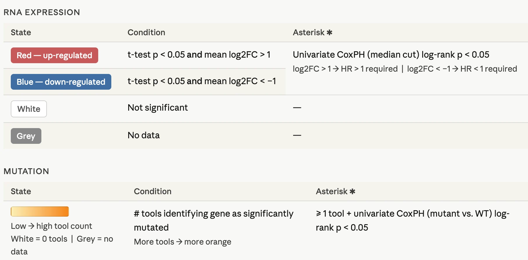
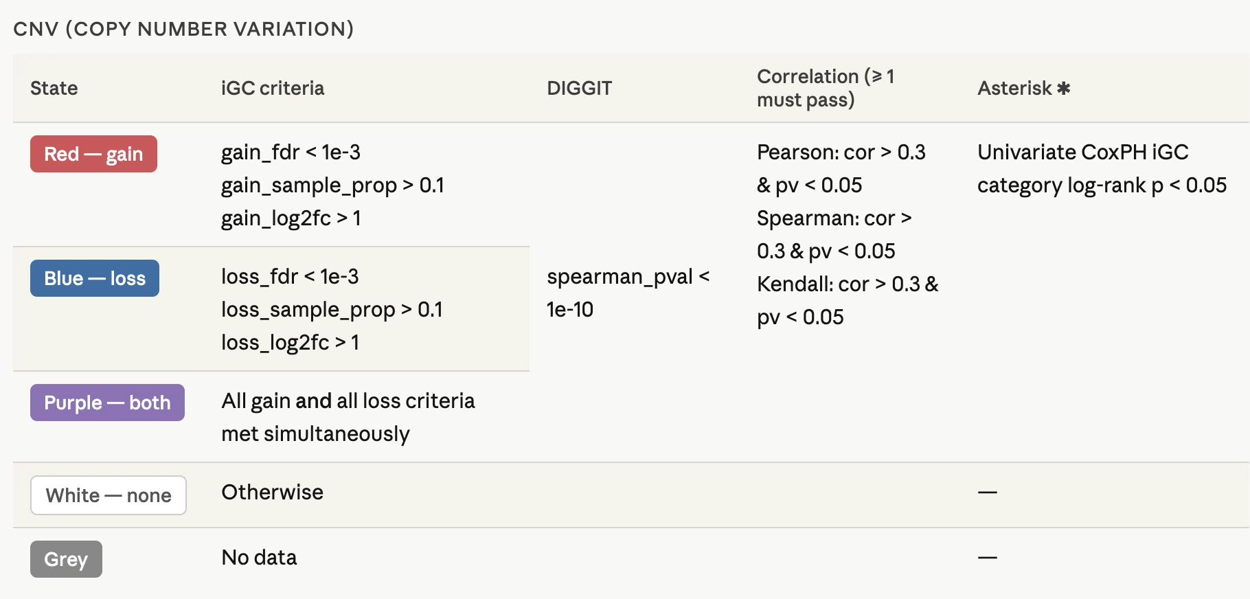
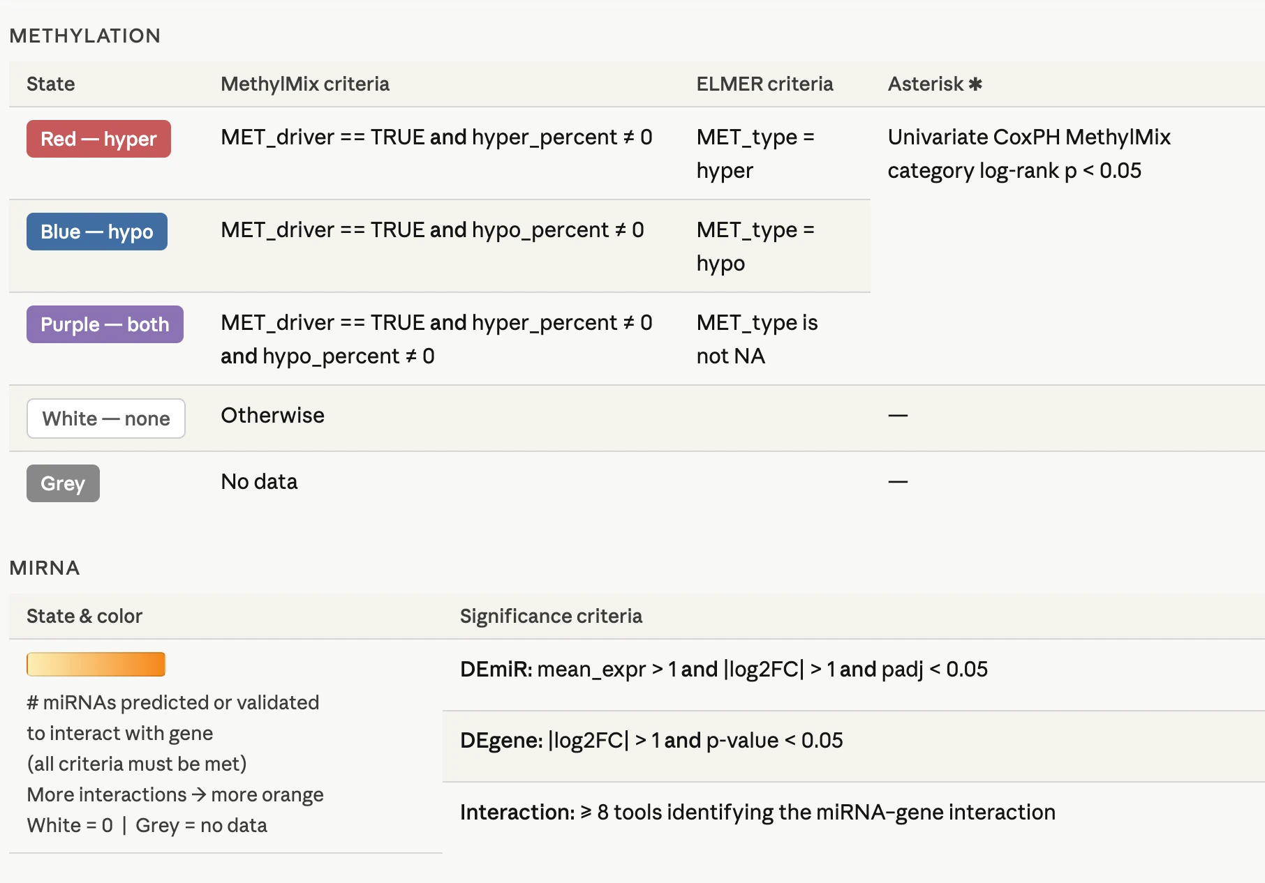
2.5 Gene RNA
2.5.1 Overview
The RNA panel visualizes expression patterns and survival associations for the selected gene across multiple cancer types.
Users can explore RNA expression results using three grouping options: sample type, mutation class, and tumor stage. Each grouping option includes both a Pan-Cancer View and a Cancer-Specific View, allowing users to compare expression patterns across cancer types or examine expression details within a selected cancer type.
When results are grouped by sample type, users can click on tissues or organs in the body diagram to display relevant expression results. This view summarizes RNA expression z-scores — standardized expression values indicating how far a sample's expression deviates from the mean across samples — across matching cancer projects. For mutation class and tumor stage views, results are displayed according to the selected grouping category and are not affected by the body diagram selection.
In the Cancer-Specific View, results are shown as boxplots embedded within violin plots, where the boxplot summarizes the median and interquartile range and the violin shape illustrates the full distribution of expression values across samples.
Each of the three grouping options includes a dedicated Survival Map and Survival Analysis section. These evaluate whether RNA expression of the selected gene is associated with patient survival using the same patient grouping — high versus low expression — regardless of which grouping option is selected. As a result, the survival results are consistent across the three grouping options and reflect the overall expression level of the gene rather than the specific grouping metric displayed above. Survival results are available for TCGA cohorts only.
Each grouping option section is organized as follows:- Pan-Cancer View — displays RNA expression z-scores across all available cancer types, grouped by the selected grouping option, with body diagram navigation available for the sample type view.
- Cancer-Specific View — displays the expression distribution of the selected gene within a selected cancer type as boxplots embedded within violin plots, allowing detailed examination of expression patterns across groups.
- Survival Map — summarizes survival associations of the selected gene's RNA expression across cancer types and survival endpoints.
- Survival Analysis — provides detailed survival analyses evaluating the association between RNA expression and patient prognosis using multiple analysis methods.
2.5.2 Expression by Sample Type
This tab displays expression across all available sample types (e.g., NT, TP, TM, TRBM, TBM).
Organ-specific Project Expression by Sample Type
This panel displays z-score expression distributions of the selected gene across all projects/cohorts of a selected organ/tissue (x-axis), grouped and colored by sample type.Users can:
- Select or click a tissue or organ to view relevant cancer projects for the selected gene
- Toggle sample-type groups
- Hover for sample metadata
- Hover near box areas for distribution summaries
- NT — Solid Tissue Normal
- NB - Blood Derived Normal
- TAP — Additional New Primary
- TB — Primary Blood-Derived Cancer
- TBM — Metastatic Blood-Derived Cancer
- TM — Metastatic
- TP — Primary Solid Tumor
- TR — Recurrent Solid Tumor
- TRBM — Recurrent Blood-Derived Metastatic
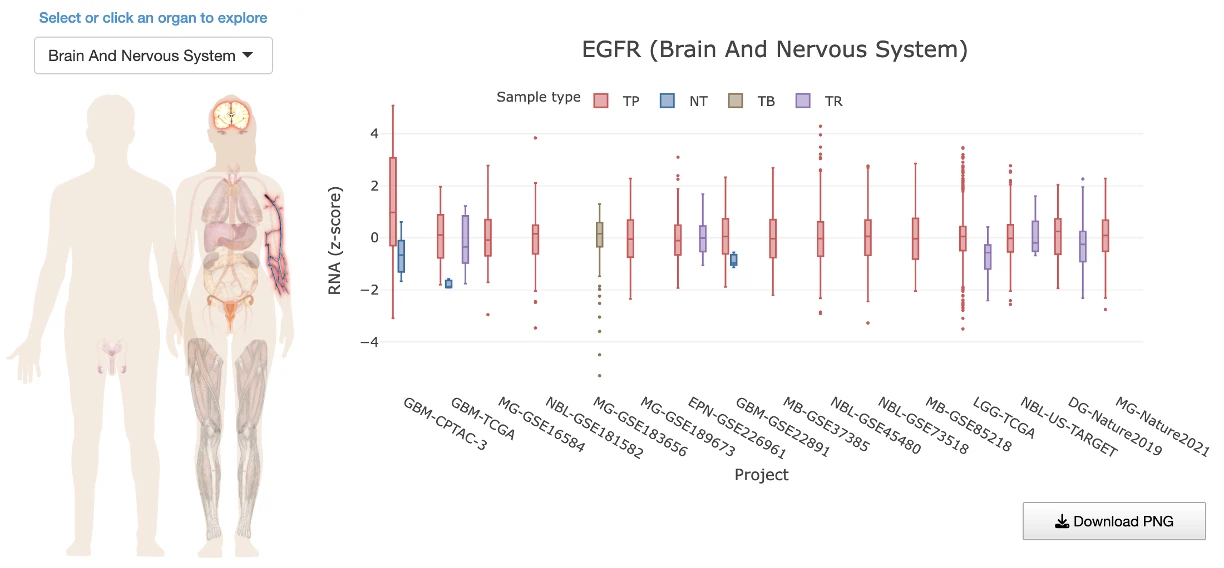
Cancer-Specific View: Expression by Sample Type
Shows gene expression distributions of the selected gene within a specific cancer project, grouped by sample type.Users first select an organ or tissue from the left panel (A), which filters the available cancer projects to those associated with the selected organ or tissue. Users then select a specific cancer project from the filtered list (B). Once a project is selected, the corresponding project description (C) is displayed at the top, followed by violin plots with embedded boxplots (D) showing the expression distribution of the selected gene across available sample types within that project. A summary table (E) is displayed below the plots, reporting pairwise comparisons between sample types including p-values that indicate whether gene expression differs significantly between the compared groups.
Expression values are shown using the normalized expression metric available for the selected project (for example, log-transformed TPM, z-score, or intensity values), which may vary across datasets.
Use the sample type controls to show or hide specific groups. Hover over individual dots to view sample-level details, or hover over the violin or boxplot areas to view distribution statistics, including the maximum, upper fence, Q3, median, Q1, lower fence, and minimum.
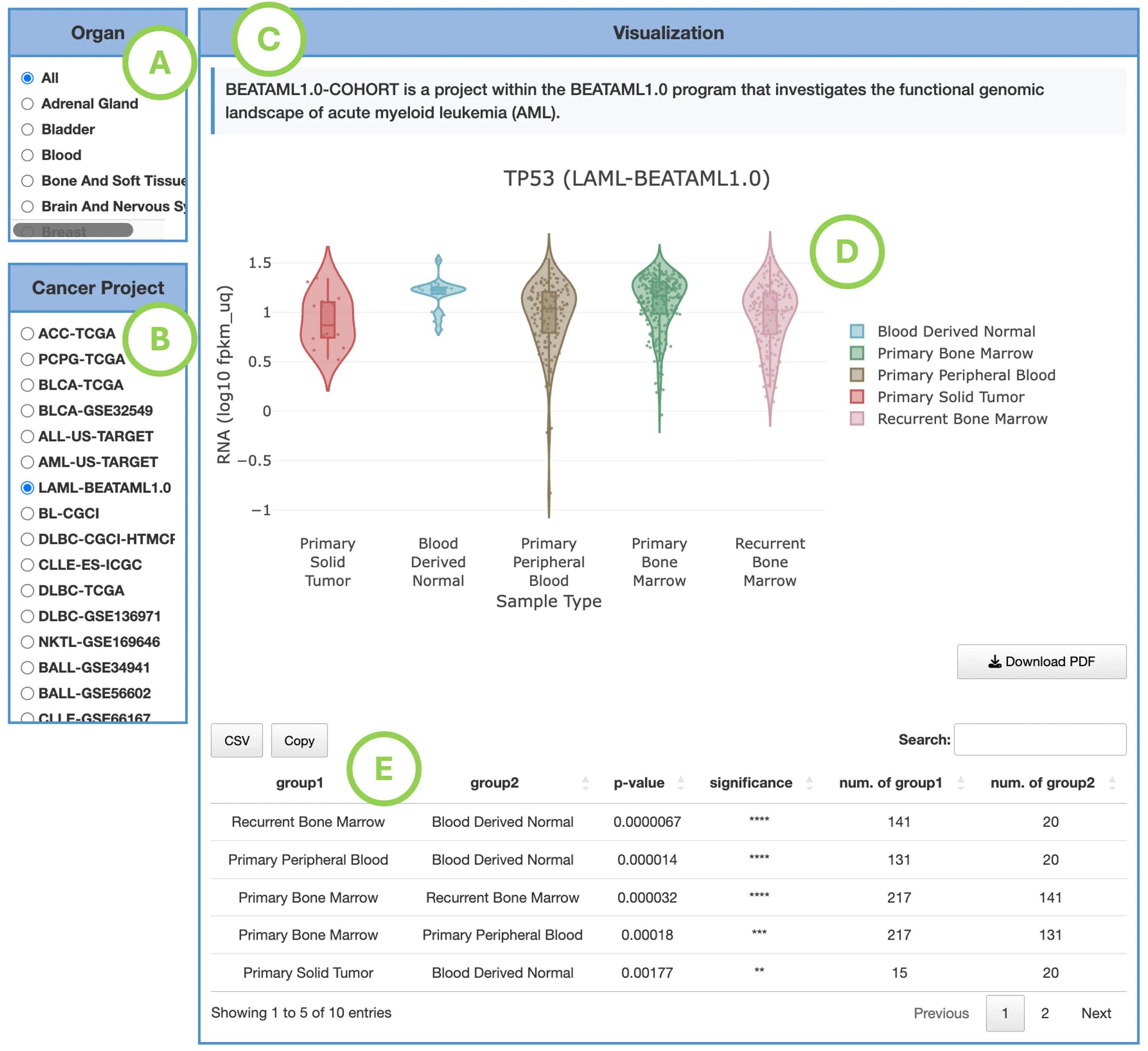
2.5.3 Expression by Mutation Class
This tab evaluates expression levels across mutation impact categories, including:- High
- Moderate
- Low
- Modifier
- Normal Tissue
- Tumors without Mutation
Pan-Cancer View: Expression by Mutation Class
Boxplots display TPM expression across cancer types, grouped by mutation class.
User can:- Toggle mutation classes
- Hover for sample metadata
- Hover near box areas for summary statistics
- Expression differences between “High Impact” vs “No Mutation” may indicate mutation-driven regulatory effects.
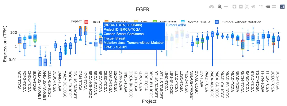
Cancer-Specific View: Expression by Mutation Class
Shows log₁₀(TPM) expression distributions of the selected gene within a specific cancer project, grouped by mutation class.
Users first select an organ or tissue from the left panel (A), which filters the available cancer projects to those associated with the selected organ or tissue. Users then select a specific cancer project from the filtered list (B). Once a project is selected, the corresponding project description (C) is displayed at the top, followed by violin plots with embedded boxplots (D) showing the expression distribution of the selected gene across available mutation classes within that project. A summary table (E) is displayed below the plots, reporting pairwise comparisons between mutation classes including p-values that indicate whether gene expression differs significantly between the compared groups.
The log₁₀(TPM) transformation is applied to expression values to reduce the influence of outliers and improve visualization across samples with widely varying expression levels.
Use the sample type controls to show or hide specific groups. Hover over individual dots to view sample-level details, or hover over the violin or boxplot areas to view distribution statistics, including the maximum, upper fence, Q3, median, Q1, lower fence, and minimum.
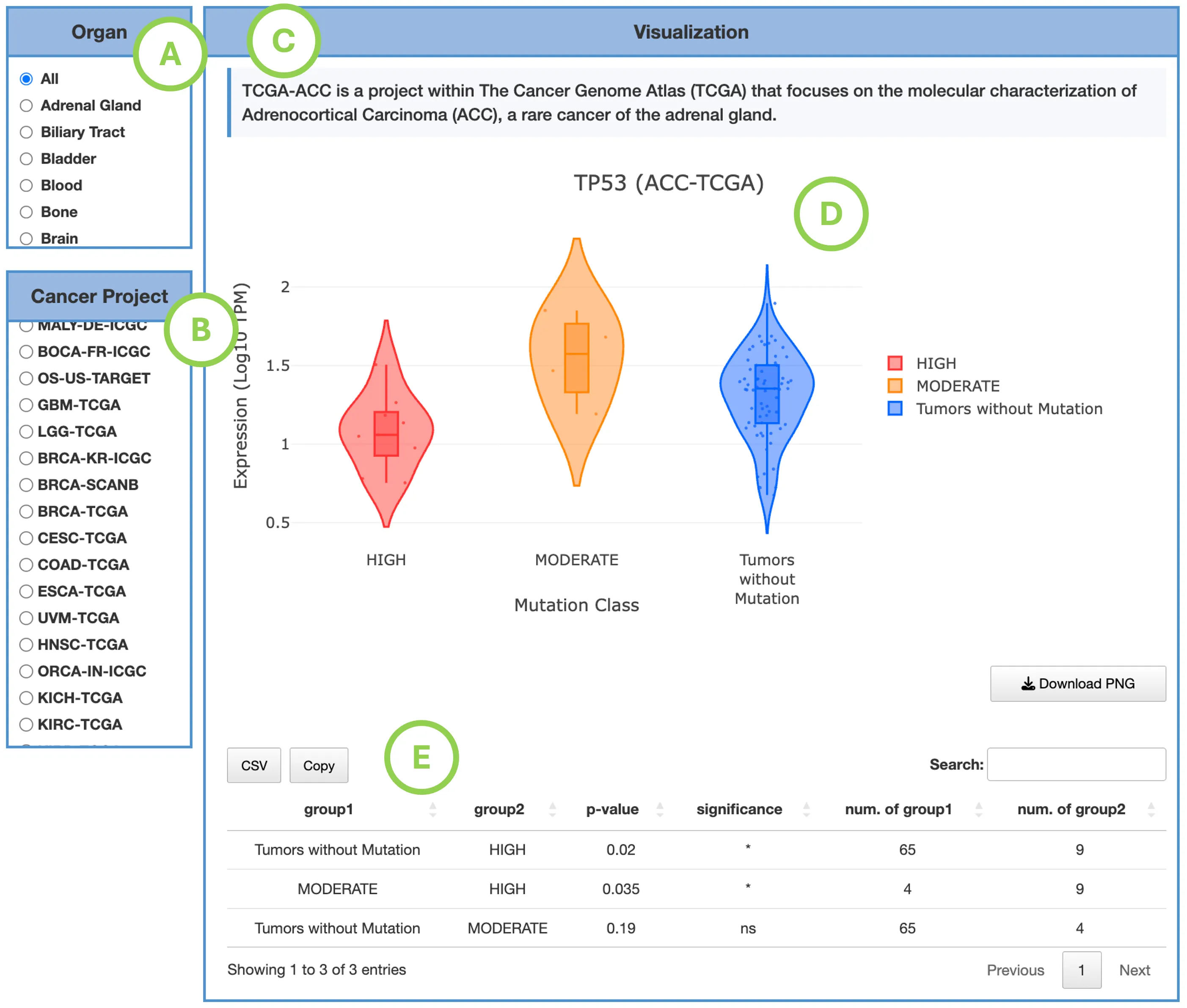
2.5.4 Expression by Tumor Stage
This tab examines expression variation across clinical tumor stages (I–IV).
Pan-Cancer View: Expression by Tumor Stage
Boxplots show TPM expression across cancer types, grouped by tumor stage.Users can:
- Toggle stages
- Hover for metadata and distribution summaries
- Stage-associated patterns may reflect biological roles in progression or severity.
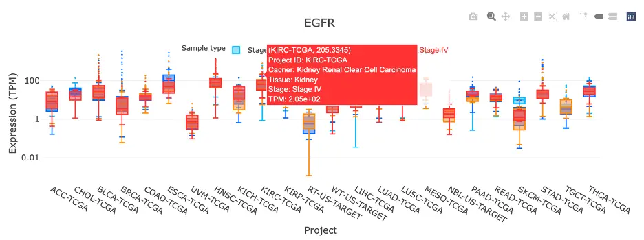
Cancer-Specific View: Expression by Tumor Stage
Shows log₁₀(TPM) expression distributions of the selected gene within a specific cancer project, grouped by tumor stage.
Users first select an organ or tissue from the left panel (A), which filters the available cancer projects to those associated with the selected organ or tissue. Users then select a specific cancer project from the filtered list (B). Once a project is selected, the corresponding project description (C) is displayed at the top, followed by violin plots with embedded boxplots w the plots, reporting pairwise comparisons between tumor stages including p-values that indicate whether gene expression differs significantly between the compared groups.
The log₁₀(TPM) transformation is applied to expression values to reduce the influence of outliers and improve visualization across samples with widely varying expression levels.
Use the sample type controls to show or hide specific groups. Hover over individual dots to view sample-level details, or hover over the violin or boxplot areas to view distribution statistics, including the maximum, upper fence, Q3, median, Q1, lower fence, and minimum.
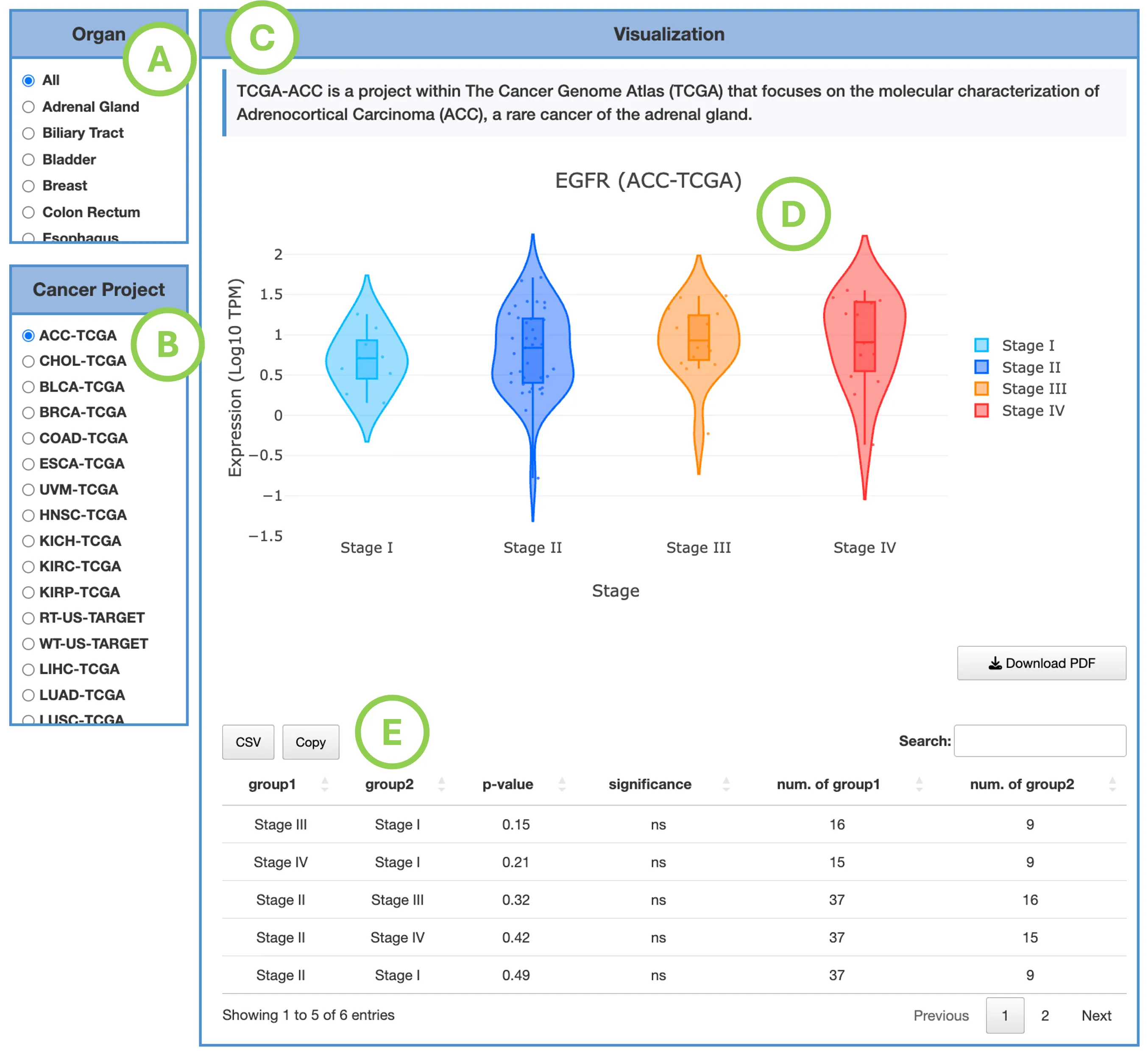
2.5.5 Survival Map & Survival Analysis
Each omics module includes dedicated Survival Map and Survival Analysis sections that evaluate the prognostic relevance of the selected gene using the molecular data available in that module. Depending on the module, the analysis may be based on RNA expression, mutation, copy number variation (CNV), or DNA methylation.
Detailed information on interpreting the survival results for all omics modules, including the Survival Map and Survival Analysis panels, is provided in Gene-Survival.
2.6 Gene Mutation
2.6.1 Overview
The Mutation interface visualizes mutation patterns and statistics of the selected gene across multiple cancer types, with mutations mapped along the protein sequence and aligned with functional protein domains.
Users can explore three mutation-level summaries: Mutation Rate, Mutation Percent, and Exon Distribution. Mutation Rate reflects the frequency of mutations per sample, while Mutation Percent reflects the proportion of samples carrying at least one mutation in the selected gene. Exon Distribution summarizes how mutations are distributed across the exonic regions of the gene. Each summary includes both a Pan-Cancer View and a Cancer-Specific View, allowing users to compare mutation patterns across cancer types or examine mutation details within a selected cancer type. Mutation hotspots — positions where mutations cluster more frequently than expected — can be identified by examining the distribution of mutations along the protein coordinates.
Each of the three mutation summaries includes a dedicated Survival Map and Survival Analysis section. These evaluate whether mutation status of the selected gene is associated with patient survival using the same patient grouping — mutated versus wild-type — regardless of which mutation summary is selected. As a result, the survival results are consistent across the three summaries and reflect the overall mutation status of the gene rather than the specific mutation-level metric displayed above. Survival results are available for TCGA cohorts only.
Each mutation summary section is organized as follows:- Pan-Cancer View — displays the selected mutation metric across all available cancer types, mapped along protein coordinates and aligned with functional protein domains.
- Cancer-Specific View — displays the selected mutation metric within a selected cancer type, allowing detailed examination of mutation patterns and hotspots.
- Survival Map — summarizes survival associations of the selected gene's mutation status across cancer types and survival endpoints.
- Survival Analysis — provides detailed survival analyses evaluating the association between mutation status and patient prognosis using multiple analysis methods.
This structure is consistent across all three mutation summaries: Mutation Rate, Mutation Percent, and Exon Distribution.
2.6.2 Mutation Rate
Pan-Cancer View: Mutation Rate Heatmap
This view integrates multiple coordinated panels to show where mutations occur along the protein and how frequently they appear across cancer types, using mutation rate as the metric.
ComponentsA. Pan-Cancer Mutation Hotspot Heatmap
This heatmap displays projects as rows and protein positions as columns, with cell color indicating the mutation rate at each specific position. Users can hover over cells to view the cancer type, protein position, and mutation rate, allowing them to identify protein regions with recurrent mutation hotspots across multiple cancer types.
B. Protein Region Impact Bar PlotThis plot aggregates mutation rates per protein region, with bars stacked by impact level (High, Moderate, or Low) to show the relative contribution of different mutation severities. Hovering over bar segments reveals the region name, impact category, and mutation rate, demonstrating which functional regions of the protein accumulate the highest mutation load.
C. Dataset-Level Mutation Burden Bar PlotThis bar chart displays the overall mutation rate per dataset or cancer type, with bars stacked by mutation impact level to show the distribution of mutation severities. Users can hover to view the dataset, tissue type, impact level, and mutation rate, providing a quick comparison of which cancers have the heaviest mutation burden for the selected gene.
D. Dataset & Tissue LegendThis companion panel lists the tissue type, project ID, and cancer type for each dataset included in the analysis, with each color corresponding to a specific tissue type to help users interpret the color-coding used throughout the visualization.
E. Protein Domain Annotation TrackThis track shows annotated protein domains from Pfam or InterPro databases, displaying the domain name, protein coordinate range, and functional description (accessible via hover). This annotation aligns functional domains with mutation hotspots, helping users understand whether mutations cluster in functionally important regions of the protein.
F. Exon Annotation TrackThis track displays exon boundaries aligned to protein coordinates, with each exon shown as a distinct colored block to illustrate the genomic structure underlying the protein sequence and how mutations map to specific exons.
G&H. LegendsTwo legends accompany the visualization: a mutation rate legend providing a continuous color scale for heatmap intensity, and an impact legend showing categorical colors for High, Moderate, and Low mutation impacts to help users interpret the color-coding throughout all components.
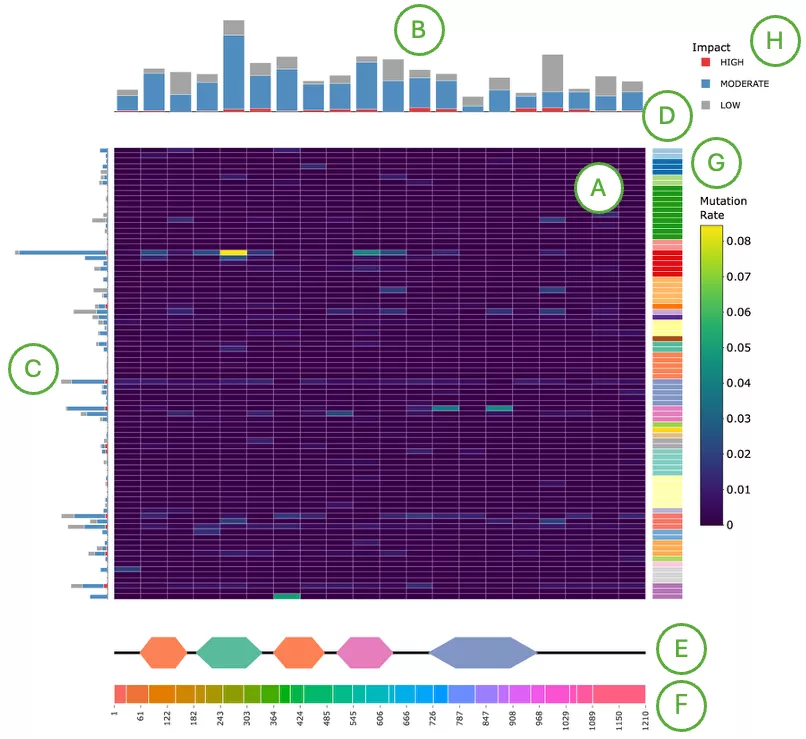
Cancer-Specific View: Mutation Rate Bar Chart
Displays the mutation rate of the selected gene across protein positions within a selected cancer project, with mutations categorized by predicted impact level.
Users first select an organ or tissue from the left panel (A), which filters the available cancer projects to those associated with the selected organ or tissue. Users then select a specific cancer project from the filtered list (B). Once a project is selected, the corresponding project description (C) is displayed at the top, followed by the bar chart (D), where each bar represents a protein position and the height reflects the proportion of samples carrying a mutation at that position, expressed as a rate.
Mutation impacts are stacked within each bar into three categories — High, Moderate, and Low — to illustrate the impact composition at each protein position. This allows users to identify not only mutation-enriched regions along the protein sequence but also whether mutations at those positions are predominantly high-impact or low-impact.
Use the legend (E) to show or hide specific impact categories for focused comparisons. Hover over individual bars to view the protein position, mutation rate, impact category, and cancer project.
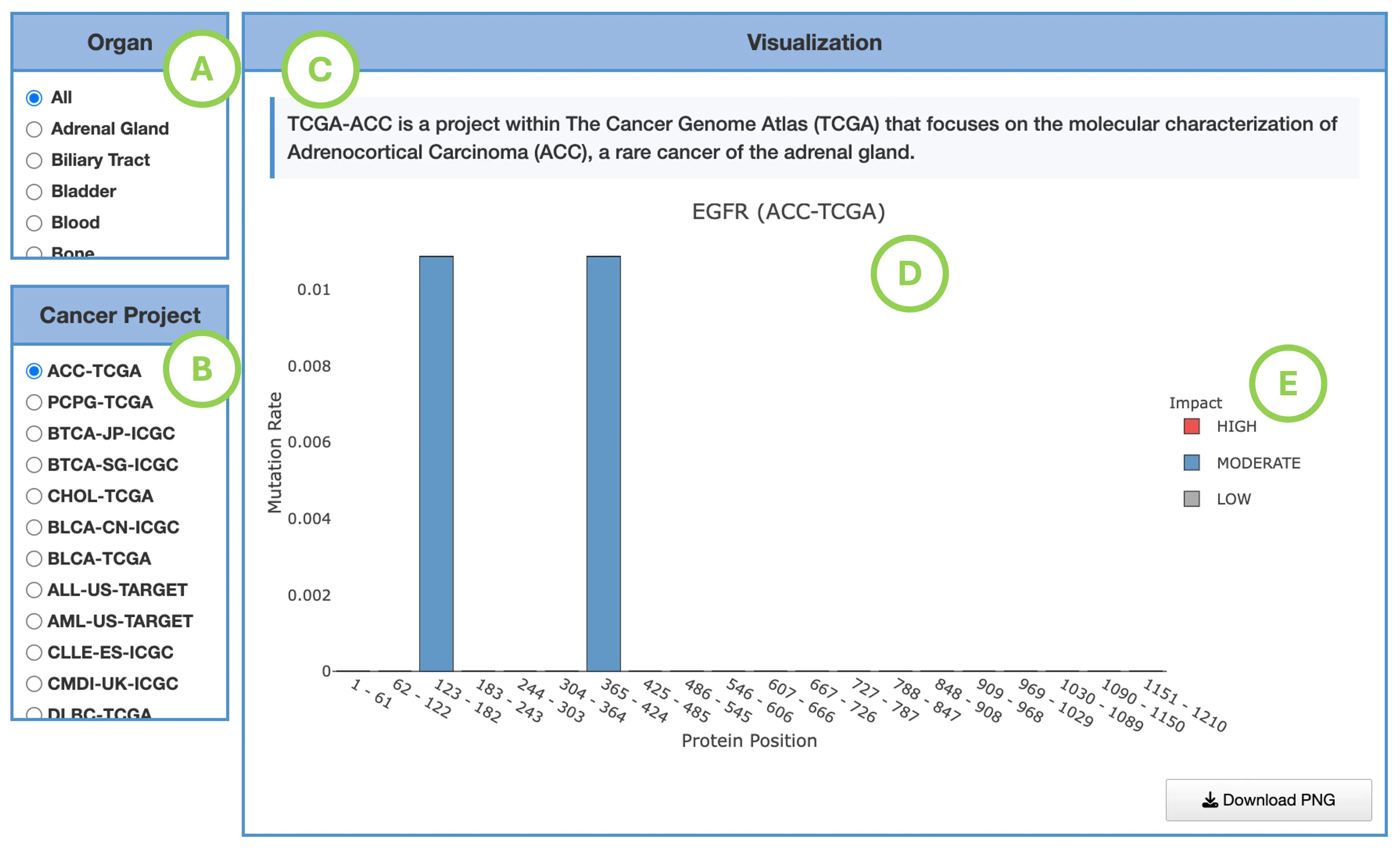
2.6.3 Mutation Percent
Pan-Cancer View: Mutation Percent Heatmap
This visualization is structurally identical to the Mutation Rate view but uses mutation percentage—the proportion of mutated samples in each dataset—rather than mutation rate.
ComponentsA. Pan-Cancer Mutation Hotspot Heatmap
This heatmap displays projects as rows and protein positions as columns, with cell color indicating the mutation percentage at each specific position. Users can hover over cells to view the cancer type, protein position, and mutation percentage, revealing which protein positions are most frequently mutated across patient samples in different cancer types.
B. Protein Region Impact Bar Plot
This plot shows mutation percentage per protein region, with bars stacked by mutation impact level to display the relative contribution of High, Moderate, and Low impact mutations. Hovering over bar segments reveals the region name, impact level, and mutation percentage, highlighting protein regions with high prevalence of mutations among patients and indicating which functional domains are most commonly affected.
C. Dataset-Level Mutation Burden Bar Plot
This bar chart displays mutation percentage per dataset or cancer type, with bars stacked by impact level to show the distribution of mutation severities. Users can hover to view the dataset, tissue type, impact level, and mutation percentage, identifying cancer types where mutations in the gene are widespread across patient populations.
D. Dataset & Tissue Legend
Color-coded tissue and dataset identifiers for interpreting the heatmap rows.
E. Protein Domain Annotation Track
This track displays Pfam and InterPro protein domains aligned to protein coordinates, showing the domain name, coordinate range, and functional details accessible through hovering, allowing users to determine whether mutations cluster within functionally important protein domains.
F. Exon Annotation Track
This track displays exon boundaries aligned to protein structure, with each exon shown as a distinct block to illustrate how the genomic organization corresponds to the protein sequence and mutation positions.
G&H. Legends
Two legends accompany the visualization: a mutation percent legend providing a color scale for mutation proportions, and an impact legend showing colors for High, Moderate, and Low mutation impact categories to help users interpret the color-coding throughout all components.
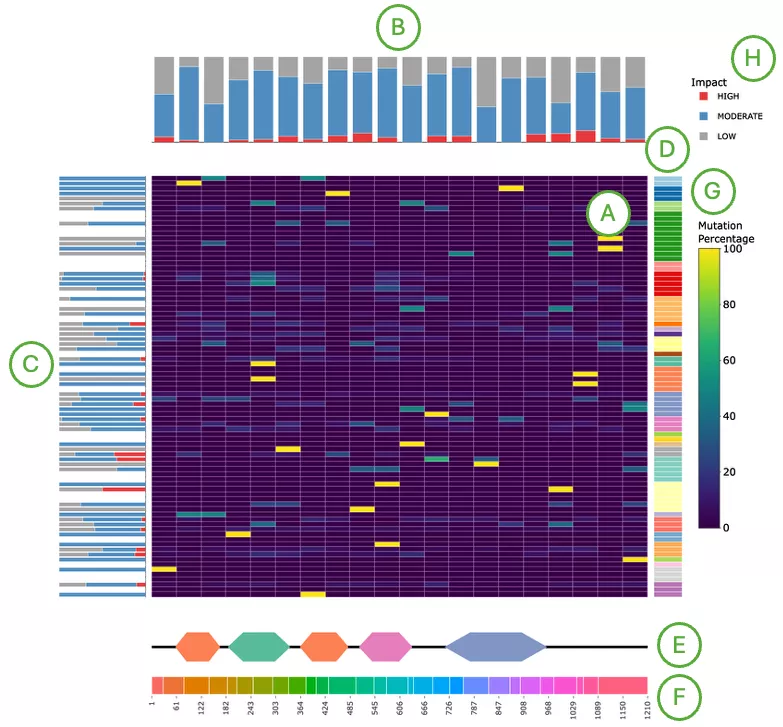
Cancer-Specific View: Mutation Percent Bar Chart
Displays the mutation percentage of the selected gene across protein positions within a selected cancer project, with mutations categorized by predicted impact level.
Users first select an organ or tissue from the left panel (A), which filters the available cancer projects to those associated with the selected organ or tissue. Users then select a specific cancer project from the filtered list (B). Once a project is selected, the corresponding project description (C) is displayed at the top, followed by the bar chart (D), where each bar represents a protein position and the height reflects the proportion of samples carrying a mutation at that position, expressed as a percentage.
Mutation impacts are stacked within each bar into three categories — High, Moderate, and Low — to illustrate the impact composition at each protein position. This allows users to identify not only mutation-enriched regions along the protein sequence but also whether mutations at those positions are predominantly high-impact or low-impact.
Use the legend (E) to show or hide specific impact categories for focused comparisons. Hover over individual bars to view the protein position, mutation percentage, impact category, and cancer project.
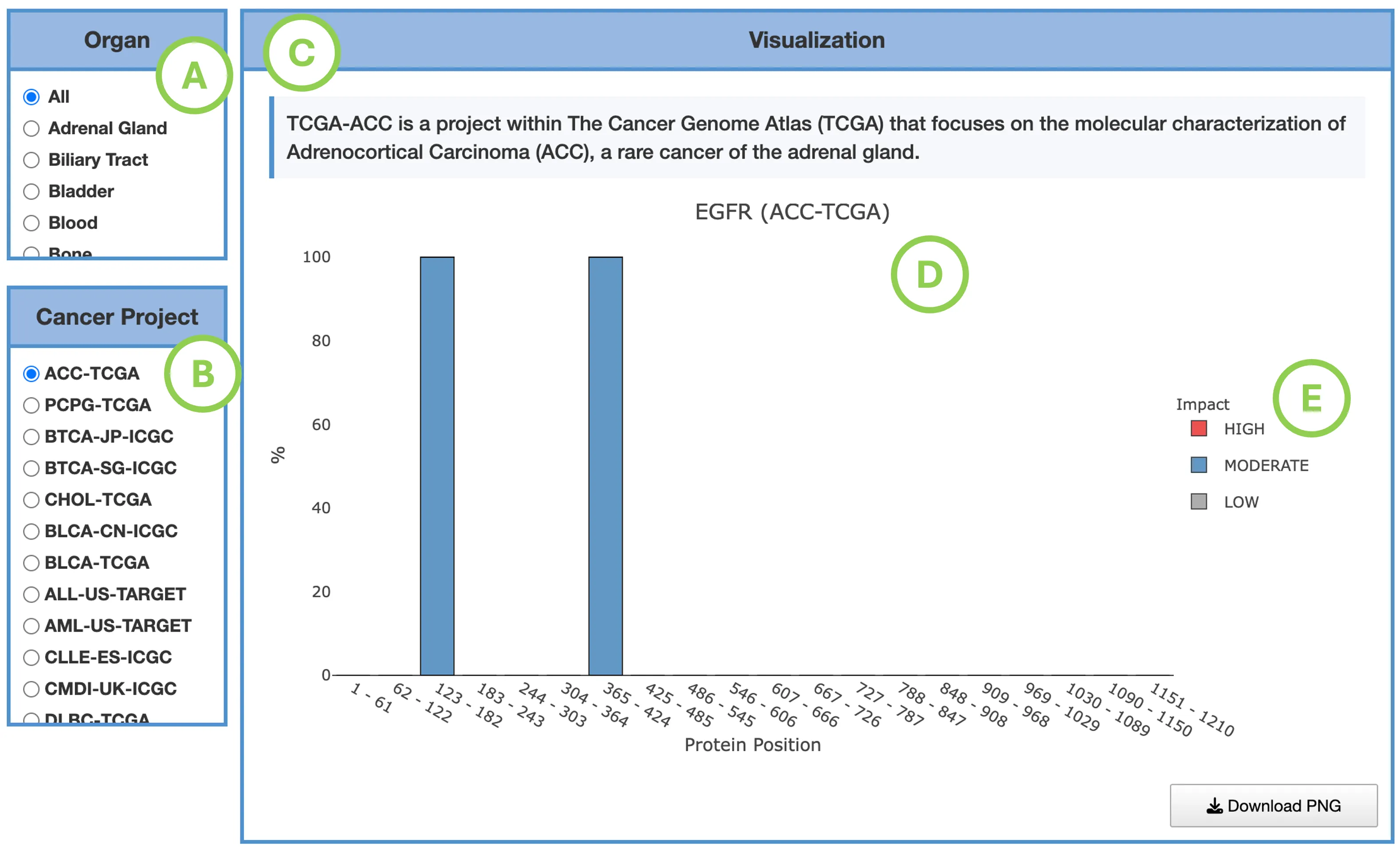
2.6.4 Exon Distribution
Pan-Cancer View: Exon Mutation Distribution
ComponentsA. Mutation Count by Exon
Shows the number of mutations per exon across all cancer types. X-axis = exon number; Y-axis = mutation count. Bars are stacked by mutation impact (High, Moderate, Low, Modifier). Hover to view exon number, impact, and mutation count.
B. Mutation Percentage by Exon
Displays the proportion of mutated samples per exon. X-axis = exon number; Y-axis = mutation percentage. Hover to view exon number, impact, and mutation percentage.
C. Protein Domain Panel
Annotated functional domains with Pfam ID, InterPro ID, position, and description. Hover for details on each domain.
D. Exon Annotation Track
Each colored block represents an exon aligned to the protein coordinate axis.
E. Impact Legend
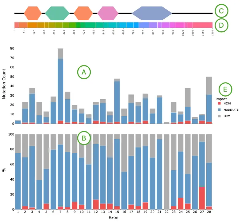
Cancer-Specific View: Exon Mutation Distribution
Displays the exon-level mutation distribution of the selected gene within a selected cancer project, with mutations categorized by predicted impact level.
Users first select the visualization metric — mutation count or mutation percentage — from panel (A) to determine whether the bar chart displays the absolute number of mutations or the proportion of samples carrying a mutation per exon. Users then select an organ or tissue from panel (B), which filters the available cancer projects to those associated with the selected organ or tissue, and select a specific cancer project from the filtered list (C).
Once selections are made, the corresponding project description (D) is displayed at the top, followed by the bar chart (E) showing the exon-level mutation distribution for the selected cancer project and metric. Each bar represents an exon, and mutations are stacked within each bar into three impact categories — High, Moderate, and Low — to illustrate the impact composition at each exon. This allows users to identify which exons harbor the highest mutation load or frequency and whether mutations within those exons are predominantly high-impact or low-impact.
Use the legend (F) to show or hide specific impact categories for focused comparisons. Hover over individual bars to view the exon number, impact category, and mutation count or percentage.
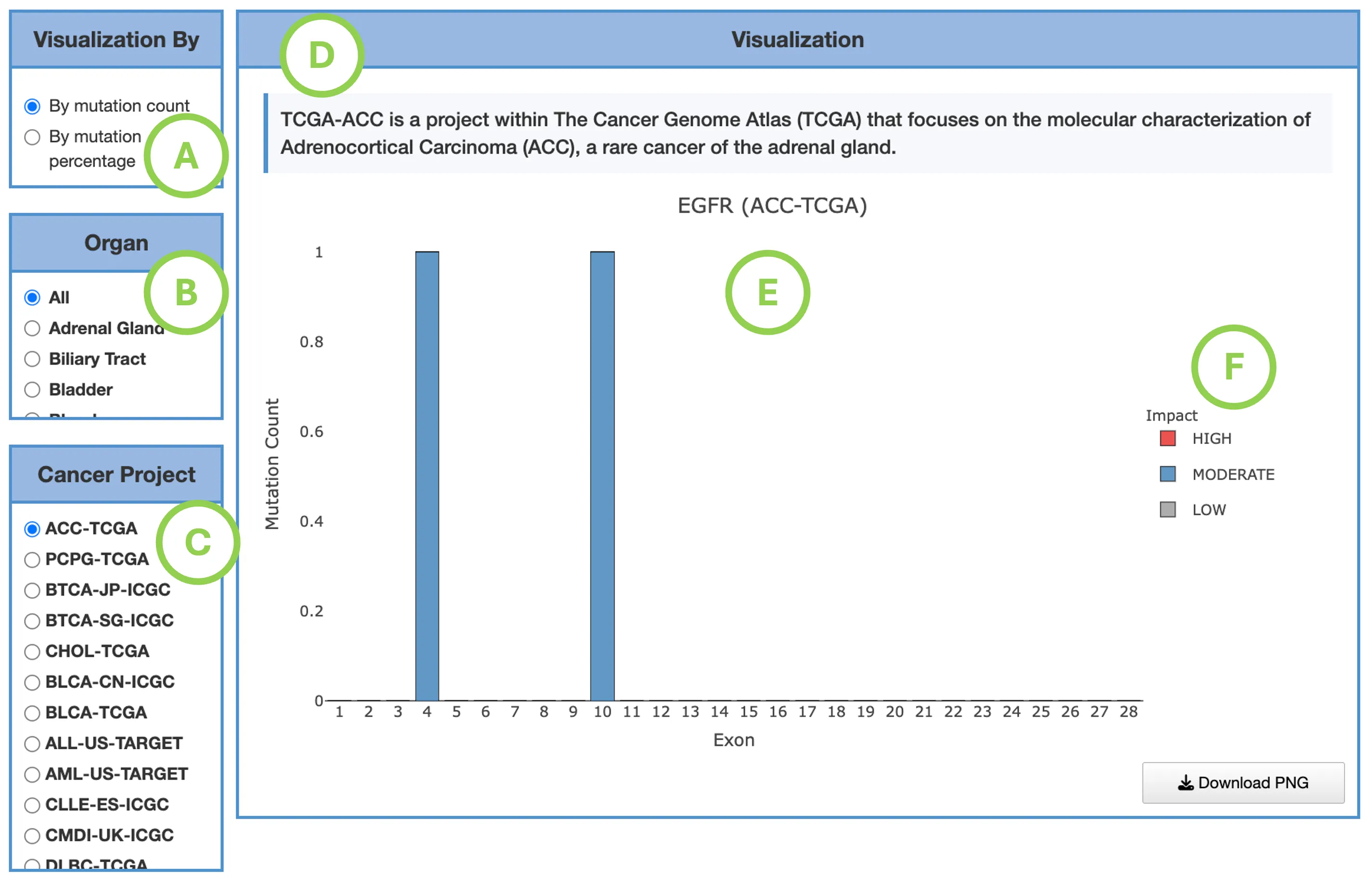
2.6.5 Survival Map & Survival Analysis
Each omics module includes dedicated Survival Map and Survival Analysis sections that evaluate the prognostic relevance of the selected gene using the molecular data available in that module. Depending on the module, the analysis may be based on RNA expression, mutation, copy number variation (CNV), or DNA methylation.
Detailed information on interpreting the survival results for all omics modules, including the Survival Map and Survival Analysis panels, is provided in Gene-Survival.
2.7 Gene CNV
2.7.1 Overview
The Copy Number Variation interface visualizes CNV patterns of the selected gene across multiple cancer types and explores how copy number changes relate to gene expression and patient survival.
This interface integrates results from two complementary CNV analysis tools that operate at different levels of analysis. iGC identifies significant copy number gains and losses for the selected gene across cancer types, providing a gene-level summary of CNV status. DIGGIT identifies genes whose copy number alterations are significantly correlated with downstream gene expression changes, inferring potential CNV driver genes — that is, genes whose copy number changes may confer a functional advantage by altering the expression of downstream targets. Together, these tools allow users to explore both the CNV status of the selected gene and its potential functional consequences.
Users can explore CNV gain or loss significance across cancer types, examine how copy number changes correlate with gene expression levels, and identify cancers where the selected gene may act as a CNV driver.
The Survival section evaluates whether copy number variation of the selected gene is associated with patient survival. Survival results include a Survival Map summarizing associations across cancer types and endpoints, and detailed survival analyses based on multiple analysis methods. Survival results are available for TCGA cohorts only.
This panel includes five sections:- Pan-Cancer View: Copy Number Variation Overview — summarizes CNV gain and loss status of the selected gene across all available cancer types.
- Cancer-Specific View: CNV Distribution and Correlation — displays CNV distributions and the relationship between copy number status and gene expression for a selected cancer type.
- CNV Summary Table — provides a structured summary of CNV details across cancer types, including iGC and DIGGIT results.
- Survival Map — summarizes survival associations of the selected gene's CNV status across cancer types and survival endpoints.
- Survival Analysis — provides detailed survival analyses evaluating the association between CNV status and patient prognosis using multiple analysis methods.
2.7.2 Pan-Cancer View: Copy Number Variation Overview
This visualization summarizes CNV gain, loss, and neutral states for the selected gene across available cancer projects, based on results from iGC and DIGGIT. The display format depends on the number of available projects: when five or more projects are available, results are shown as a bar chart; when fewer than five projects are available, results are shown as a pie chart.
For projects displayed as a bar chart, the visualization consists of three coordinated components. The CNV driver panel at the top indicates how many CNV tools support the gene as a CNV driver in each cancer type. Light grey represents identification by iGC only, while dark grey indicates identification by both iGC and DIGGIT, with darker shading suggesting higher cross-tool confidence. The main panel displays sample proportion bars for each cancer type, with bar segments color-coded to show the proportion of samples exhibiting CNV gain, CNV loss, or no CNV change. Bar height reflects the percentage of samples in each CNV state. Users can hover over any bar to view detailed information, including cancer type, CNV status, tool support information, and proportional values.
When fewer than five projects are available, the same CNV information is displayed as a pie chart instead of a bar chart. In this format, each pie segment represents the proportion of samples with CNV gain, CNV loss, or no CNV change for the selected gene. Hovering over each segment provides detailed information such as the CNV status, sample proportion, and available tool support.
Together, these views help users determine which cancer projects show frequent CNV gains or losses, whether the selected gene is supported as a CNV driver by iGC, DIGGIT, or both, and which cancers may exhibit CNV-driven expression changes.
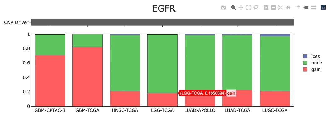
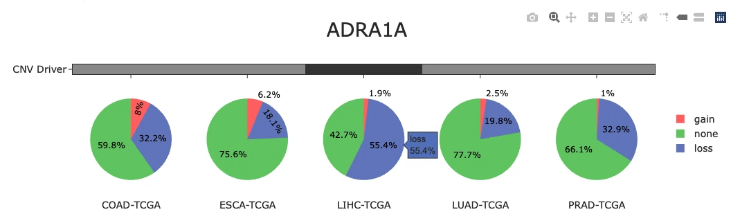
2.7.3 Cancer-Specific View: CNV Distribution and Correlation
This visualization helps users assess how copy number changes relate to gene expression levels within a selected cancer project, displaying the correlation between CNV segment mean and expression alongside group-level comparisons across CNV status categories.
Users first select an organ or tissue from panel (A), which filters the available cancer projects to those associated with the selected organ or tissue. Users then select a specific cancer project from the filtered list (B). Once a project is selected, the corresponding project description (C) is displayed at the top, followed by a 2×2 grid of visualization panels below.
D.CNV–Expression Correlation Scatter Plot
Displays the correlation between CNV segment mean (x-axis) and gene expression (y-axis, TPM on a log₁₀ scale) for individual samples, where each point represents one sample. Points are colored by CNV status — red for gain, blue for loss, green for neutral, and grey for normal. Gene expression is displayed on a log₁₀ scale to accommodate the wide dynamic range of TPM values across samples. Hover over any point to view the segment mean and expression value for that sample.
E.Expression by CNV Status Boxplot
Summarizes gene expression (TPM, log₁₀ scale) across CNV status groups — gain, loss, neutral, and normal — allowing users to compare expression levels between groups. Hover over the boxplot areas to view summary statistics, including the maximum, upper fence, Q3, median, Q1, lower fence, and minimum.
F.Segment Mean by CNV Status Boxplot
Summarizes the segment mean distribution for each CNV status category, where segment mean is calculated as log₂(copy number / 2). Values near 0 (between −0.3 and 0.3) indicate diploid or no copy number change; values above 0.3 indicate copy number gain; and values below −0.3 indicate copy number loss. Hover over the boxplot areas to view the same summary statistics as panel (E).
G.Correlation Summary Panel
Displays the correlation coefficient and p-value describing the strength and statistical significance of the relationship between CNV segment mean and gene expression. A positive correlation indicates that higher segment mean values — reflecting copy number gain — are associated with higher expression levels. A negative correlation indicates that lower segment mean values — reflecting copy number loss — are associated with lower expression levels.
H.Legend
The legend displays the CNV status color coding — red for gain, blue for loss, green for neutral, and grey for normal. Use the legend to show or hide specific CNV status groups across all panels for focused comparison.
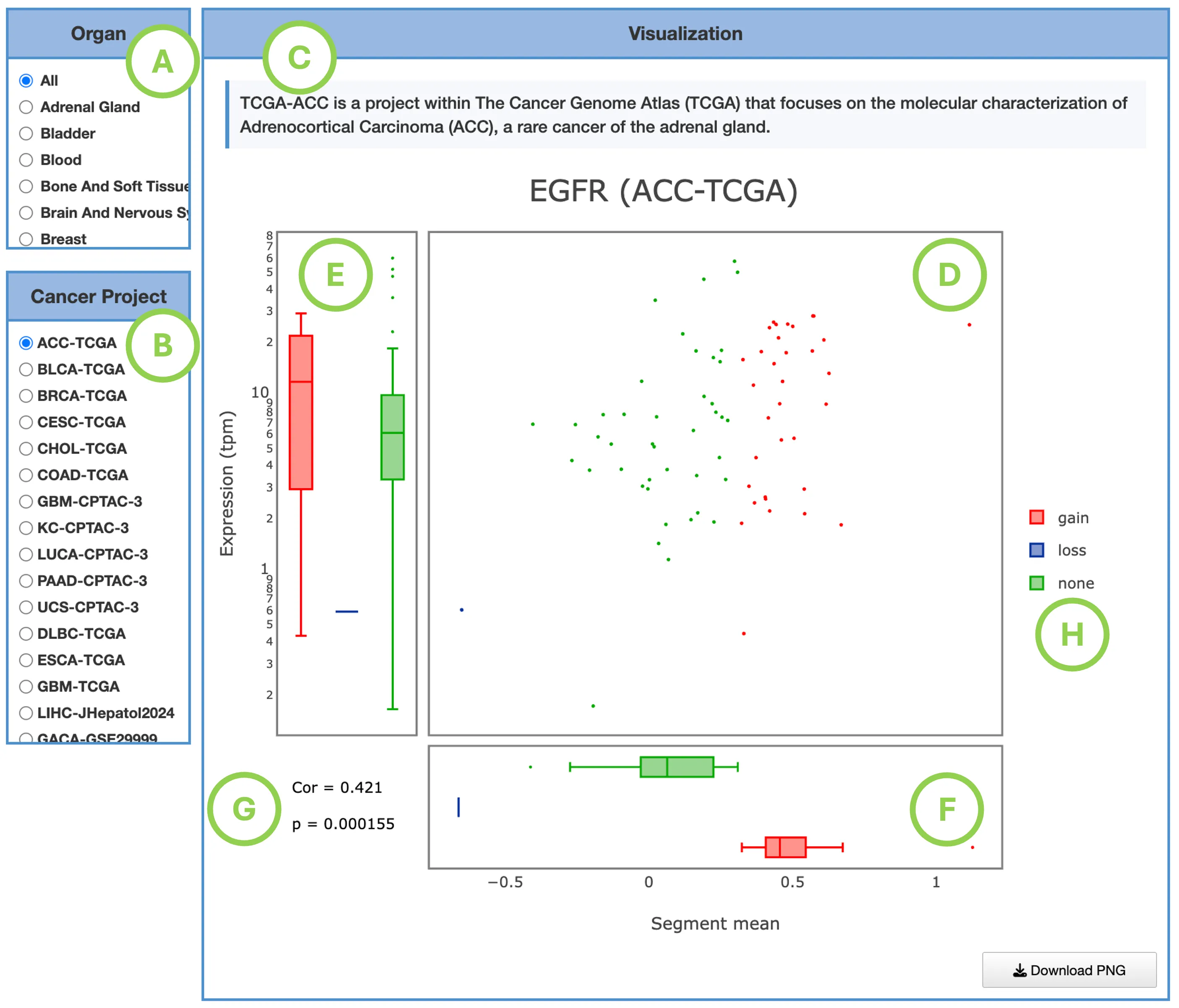
2.7.4 CNV Summary Table
This table provides detailed tool-specific CNV statistics for the selected gene across cancer types, including correlation metrics that reveal the relationship between copy number alterations and gene expression. The Spearman correlation coefficient (ρ) indicates the direction and strength of this relationship: positive ρ values suggest that CNV gains are associated with higher expression levels, while negative ρ values indicate that CNV losses correspond to lower expression, and the accompanying p-value indicates the statistical significance of these correlations, helping users identify cancer types where CNV alterations functionally drive expression changes.
2.7.5 Survival Map & Survival Analysis
Each omics module includes dedicated Survival Map and Survival Analysis sections that evaluate the prognostic relevance of the selected gene using the molecular data available in that module. Depending on the module, the analysis may be based on RNA expression, mutation, copy number variation (CNV), or DNA methylation.
Detailed information on interpreting the survival results for all omics modules, including the Survival Map and Survival Analysis panels, is provided in Gene-Survival.
2.8 Gene Methylation
2.8.1 Overview
The Methylation interface visualizes DNA methylation patterns and survival associations for the selected gene across multiple cancer types, and explores how methylation status relates to gene expression.
This interface integrates results from two complementary methylation tools that answer different questions at different levels of analysis. MethylMix classifies genes as hypermethylated or hypomethylated by comparing their methylation distributions to a reference normal tissue, providing a gene-level summary of aberrant methylation across cancer types, providing a gene-level summary of aberrant methylation across cancer types. ELMER identifies specific CpG probes whose methylation level is inversely associated with nearby gene expression changes, providing a probe-level view of functionally relevant methylation events. Together, these tools allow users to explore both the methylation state of the selected gene and its potential regulatory consequences.
The Survival section evaluates whether methylation status of the selected gene is associated with patient survival. Survival results include a Survival Map summarizing associations across cancer types and endpoints, and detailed survival analyses based on multiple analysis methods. Survival results are available for TCGA cohorts only.
This panel includes five sections:- Pan-Cancer View: Methylation Status Overview — summarizes methylation status of the selected gene across all available cancer types.
- Cancer-Specific View: Methylation Distribution and Correlation — displays methylation distributions and the relationship between methylation and gene expression for a selected cancer type.
- Methylation Summary Table — provides a structured summary of methylation details across cancer types, including MethylMix and ELMER results.
- Survival Map — summarizes survival associations of the selected gene's methylation status across cancer types and survival endpoints.
- Survival Analysis — provides detailed survival analyses evaluating the association between methylation status and patient prognosis using multiple analysis methods.
2.8.2 Pan-Cancer View: Methylation Status Overview
This visualization summarizes DNA methylation results for the selected gene across available cancer projects, integrating results from MethylMix and ELMER.
The methylation driver panel at the top indicates how many methylation tools detected the selected gene as significant in each cancer project. Lighter gray indicates that one tool detected significance, while darker gray indicates that both tools detected significance, suggesting stronger cross-tool support.
Below the driver panel, methylation states are summarized for each cancer project. The display format depends on the number of available projects: when five or more projects are available, results are shown as a bar chart; when fewer than five projects are available, results are shown as a pie chart. Colors indicate the proportion of samples classified as hypermethylated, hypomethylated, or showing no methylation change.
Users can hover over bars or pie segments to view additional details, including the cancer type, methylation status, tool-specific results from MethylMix and ELMER, and sample proportion. This view helps users identify cancer projects with prominent hypermethylation or hypomethylation patterns and assess whether methylation-driven dysregulation of the selected gene is supported by one or both methylation tools.
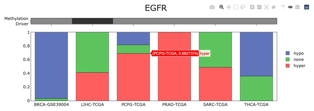
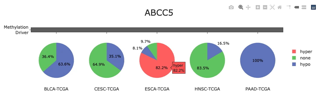
2.8.3 Cancer-Specific View: Methylation Distribution and Correlation
This visualization helps users assess how methylation status relates to gene expression levels within a selected cancer project, displaying the correlation between beta value and expression alongside group-level comparisons across methylation status categories.
Users first select an organ or tissue from panel (A), which filters the available cancer projects to those associated with the selected organ or tissue. Users then select a specific cancer project from the filtered list (B). Once a project is selected, the corresponding project description (C) is displayed at the top, followed by a 2×2 grid of visualization panels below.
D.Methylation–Expression Correlation Scatter Plot
Displays the correlation between beta value (x-axis) and gene expression (y-axis, TPM on a log₁₀ scale) for individual samples, where each point represents one sample. The beta value reflects the ratio of methylated to total probe intensity, ranging from 0 (unmethylated) to 1 (fully methylated). Points are colored by methylation status — red for hypermethylated, green for hypomethylated, blue for neutral, and grey for normal. Gene expression is displayed on a log₁₀ scale to accommodate the wide dynamic range of TPM values across samples. Hover over any point to view the beta value, expression value, and methylation status for that sample.
E.Expression by Methylation Status Boxplot
Summarizes gene expression (TPM, log₁₀ scale) across methylation status groups — hypermethylated, hypomethylated, neutral, and normal — allowing users to compare expression levels between groups. Hover over the boxplot areas to view summary statistics, including the maximum, upper fence, Q3, median, Q1, lower fence, and minimum.
F.Beta Value by Methylation Status Boxplot
Summarizes the beta value distribution for each methylation status category, allowing users to examine how beta values differ across hypermethylated, hypomethylated, neutral, and normal groups. Hover over the boxplot areas to view the same summary statistics as panel (E).
G.Correlation Summary Panel
Displays the Spearman correlation coefficient (ρ) and p-value describing the strength and statistical significance of the relationship between beta value and gene expression. A negative correlation indicates that hypermethylation is associated with lower expression, consistent with gene silencing. A positive correlation indicates that hypomethylation is associated with higher expression.
H.Legend
The legend displays the methylation status color coding — red for hypermethylated, green for hypomethylated, blue for neutral, and grey for normal. Use the legend to show or hide specific methylation status groups across all panels for focused comparison.
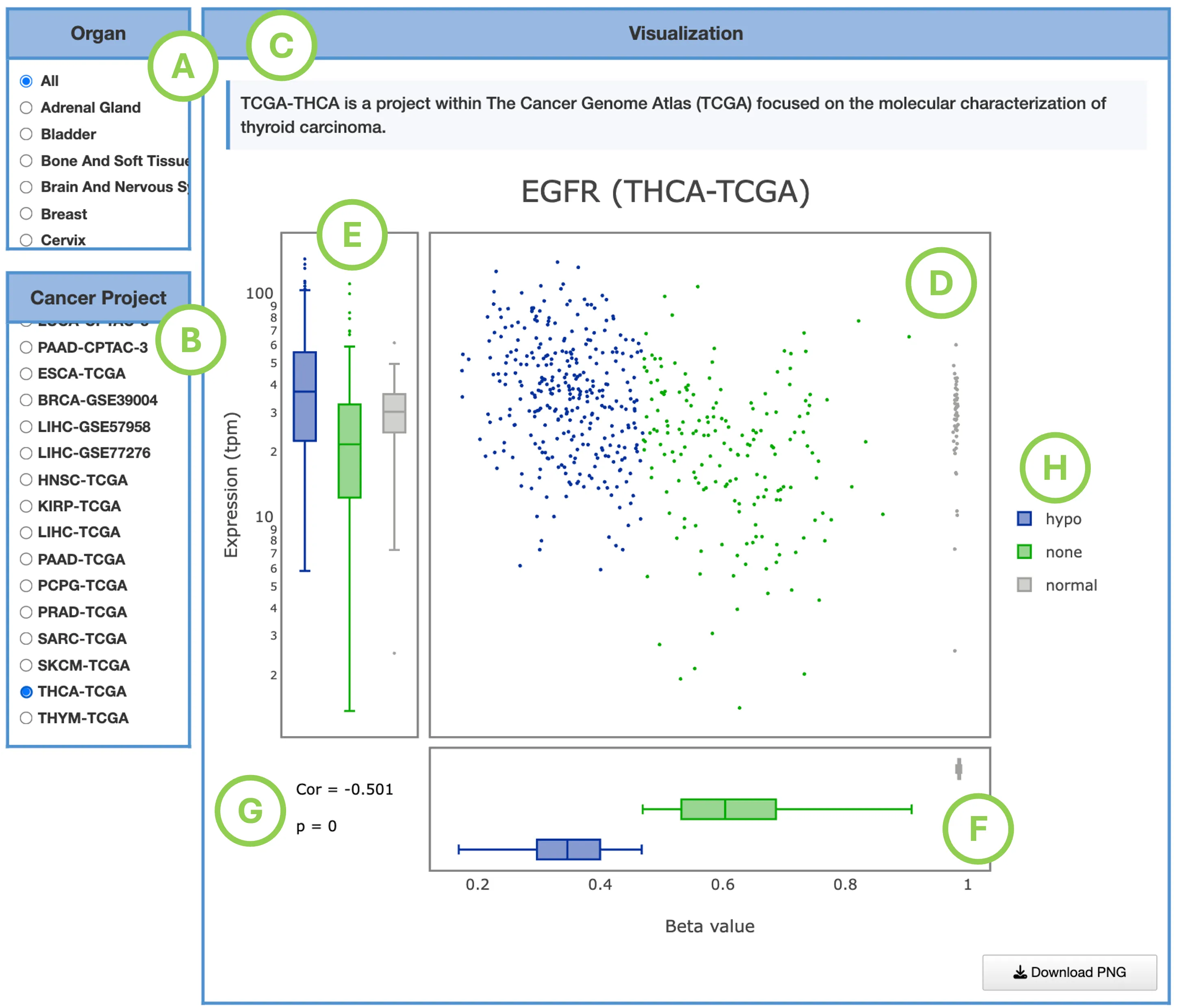
2.8.4 Methylation Summary Table
This table lists methylation statistics across cancer types, integrating results from MethylMix (gene-level) and ELMER (probe-level).
2.8.5 Survival Map & Survival Analysis
Each omics module includes dedicated Survival Map and Survival Analysis sections that evaluate the prognostic relevance of the selected gene using the molecular data available in that module. Depending on the module, the analysis may be based on RNA expression, mutation, copy number variation (CNV), or DNA methylation.
Detailed information on interpreting the survival results for all omics modules, including the Survival Map and Survival Analysis panels, is provided in Gene-Survival.
2.9 Gene miRNA
2.9.1 Overview
The Gene miRNA module visualizes and quantifies regulatory relationships between the selected gene and its associated miRNAs across multiple cancer types.
Interactions are compiled from 12 miRNA–target prediction tools and experimentally validated interactions recorded in miRTarBase, with flexible filtering to refine predicted vs. validated relationships.
- Gene–miRNA Interaction Network
- Gene–miRNA Correlation Table
2.9.2 Gene-miRNA Interaction Network
This interactive network displays predicted and experimentally validated regulatory interactions between the selected gene and miRNAs, integrating multiple data sources to provide comprehensive evidence for post-transcriptional regulation.
Data Sources
The network integrates three types of data: prediction tools (12 total) that identify interactions using multiple independent algorithms such as TargetScan, miRanda, RNAhybrid, DIANA-microT, and miRDB; validation data from miRTarBase containing experimentally confirmed interactions; and additional miRNA regulatory information from Chung et al. (Nucleic Acids Research, 2017) and YM500v3, which was used to identify negative correlations between driver genes and miRNAs in earlier DriverDB releases.
Network Representation
The network displays nodes and edges that represent genes, miRNAs, and their regulatory relationships. Nodes are color-coded with the selected gene shown in green and miRNAs predicted or validated to interact with the gene shown in yellow. All interactions are displayed as dotted lines. The type of interaction shown (validated, predicted, or both) depends on which checkboxes are enabled: experimentally validated interactions are sourced from miRTarBase, while predicted interactions are computationally derived with support based on the number of prediction tools that agree on the interaction.
Filtering Options
Users can refine the network using three filtering categories: gene source (CGC from Cancer Gene Census, NCG from Network of Cancer Genes, or all genes), minimum prediction support (≥6 tools, ≥8 tools, or ≥10 tools, where higher thresholds ensure stronger computational agreement), and a validation filter to show only validated interactions.
Interactions
The network provides interactive features including a search bar to enter gene or miRNA names and locate them within the network, node clicking to highlight only the selected node and its connected partners, and clicking empty space to reset to the full view.
Interpretation
This network allows users to identify miRNAs with high prediction support, identify miRNAs with experimental validation, explore potential regulatory repression mechanisms including interactions previously observed across cancers, and distinguish between predicted versus validated miRNA regulation of the selected gene. Together, the network provides a visual map of gene–miRNA interactions supported by both computational and experimental evidence, helping researchers understand post-transcriptional regulatory mechanisms that may influence gene expression in cancer.
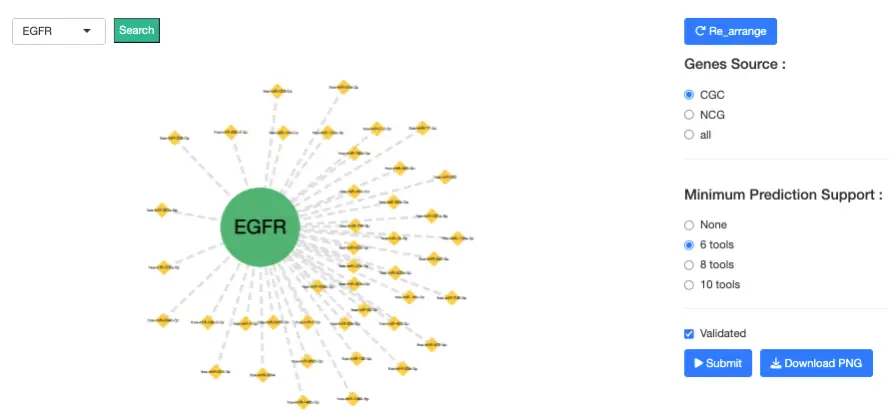
2.9.3 Gene-miRNA Correlation Table
This table provides quantitative expression-based evidence supporting each predicted or validated interaction between the selected gene and miRNAs, displaying three correlation metrics that reflect gene–miRNA co-expression patterns across samples: Pearson correlation with p-value, Spearman correlation with p-value, and Kendall correlation with p-value. Negative correlations suggest miRNA-mediated repression of the gene, which is consistent with canonical miRNA targeting mechanisms where increased miRNA expression leads to decreased target gene expression, while the accompanying p-values indicate the statistical significance of the correlation strength and help users assess the reliability of each regulatory relationship.
2.10 Gene Protein
2.10.1 Overview
The Gene Protein module visualizes protein-level variation of the selected gene across cancers and examines how protein abundance relates to mRNA expression and post-translational modifications (PTMs).
Analyses are organized into three tabs:- Clinical Stages – grouped by clinical tumor stages
- Mutation Classes – grouped by mutation impact levels
- PTM Sites – grouped by specific phosphorylation sites (e.g., pY1068, pY1173)
All analyses support interactive exploration, including sample-level tooltips, togglable groups, and mRNA–protein scatter plots.
2.10.2 Clinical Stages
This tab evaluates how protein expression and mRNA–protein associations vary across clinical tumor stages.
Protein Expression by Clinical Stage (Pan-Cancer)
Purpose:Visualizes protein expression levels of the selected gene across all TCGA cancer types, grouped by stage.
Plot Features:- Boxplots display protein abundance for each cancer type (x-axis), grouped by stage (colors).
- Legend toggling: Show or hide specific stages (e.g., Stage I, Stage II, Stage III, Stage IV).
- Hover interactions:
- Hover over dots → sample-level details (sample ID, expression, tissue).
- Hover near box areas → summary statistics (median, Q1/Q3, upper/lower fences, min/max).
- Optional PTM selection: Choose to display None, pY1068, or pY1173 to inspect PTM-specific protein patterns.
Differences across stages may indicate stage-dependent dysregulation of protein abundance.
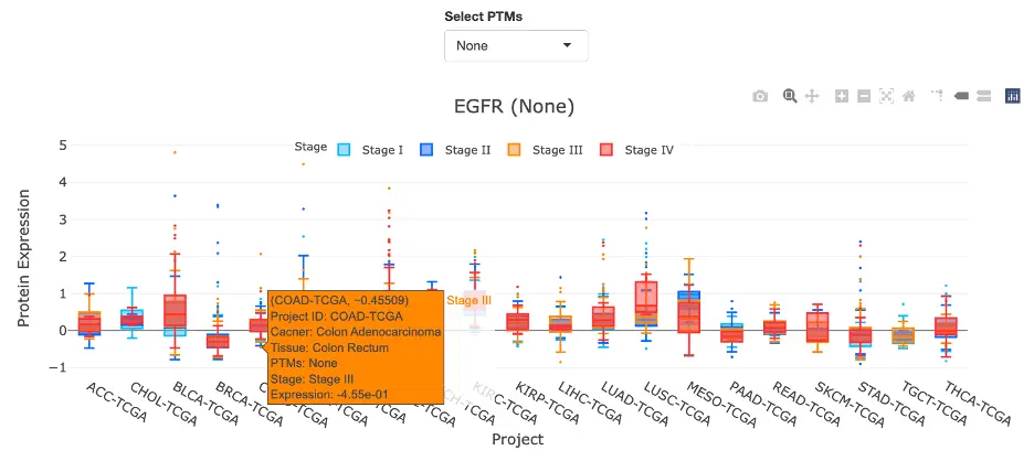
mRNA–Protein Correlation by Clinical Stage (Pan-Cancer)
Purpose:Assesses whether mRNA abundance explains protein expression patterns across cancers within each stage group.
Plot Features:- Bar chart showing Spearman correlation coefficients (ρ) between mRNA (FPKM-UQ) and protein expression across cancer types.
- Bars are grouped by clinical stage.
- Toggle individual stages via the legend.
- Hover interactions: Cancer type, stage, Spearman ρ, p-value.
- Click bar → opens a scatter plot (mRNA vs. protein), including the correlation and p-value.
- ρ > 0: mRNA and protein increase together → transcriptionally consistent regulation.
- ρ < 0: expression moves in opposite directions → post-transcriptional regulation or translational inhibition.
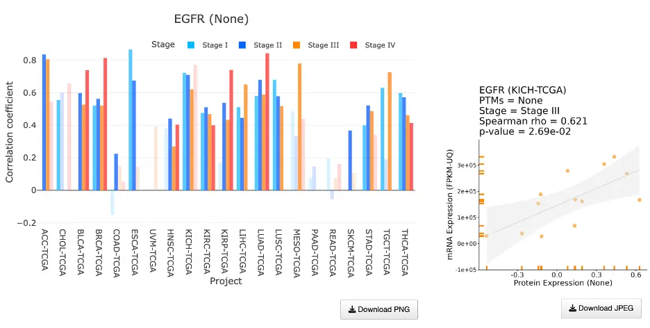
Cancer-Specific: Stage-Specific Protein Expression
This visualization shows protein expression patterns within a selected cancer type grouped by tumor stage, displaying a violin plot with stage groups (I–IV) on the x-axis and protein expression levels on the y-axis, where users can toggle stages using the legend and hover over dots to view sample-level information or hover over violin areas to see statistical summaries including median, quartiles, and fences. An accompanying statistical table compares pairs of stages with columns showing Group 1, Group 2, p-value, significance level, and sample counts, indicating whether stage-specific differences are statistically significant (p < 0.05) and helping users determine if protein expression changes progressively across disease stages or shows distinct patterns at specific stages of cancer development.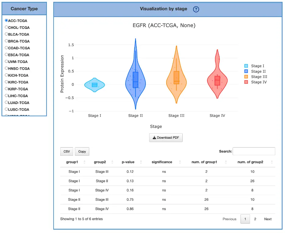
2.10.3 Mutation Classes
This tab evaluates how protein expression varies across mutation impact categories and how mutation classes influence mRNA–protein correlations.
Mutation impact groups:- High
- Moderate
- Low
- Modifier
- Normal tissue
- Tumors without mutation
Protein Expression by Mutation Class (Pan-Cancer)
Purpose:Visualizes protein expression across cancers grouped by mutation impact level.
Plot Features:- Boxplots grouped by impact class,, one set per cancer type
- Legend toggling for impact classes
- Hover for sample-level details and boxplot summary statistics
- Optional PTM filtering (None, pY1068, pY1173)
Allows users to assess whether specific impact classes (e.g., high-impact mutations) correspond to altered protein levels.
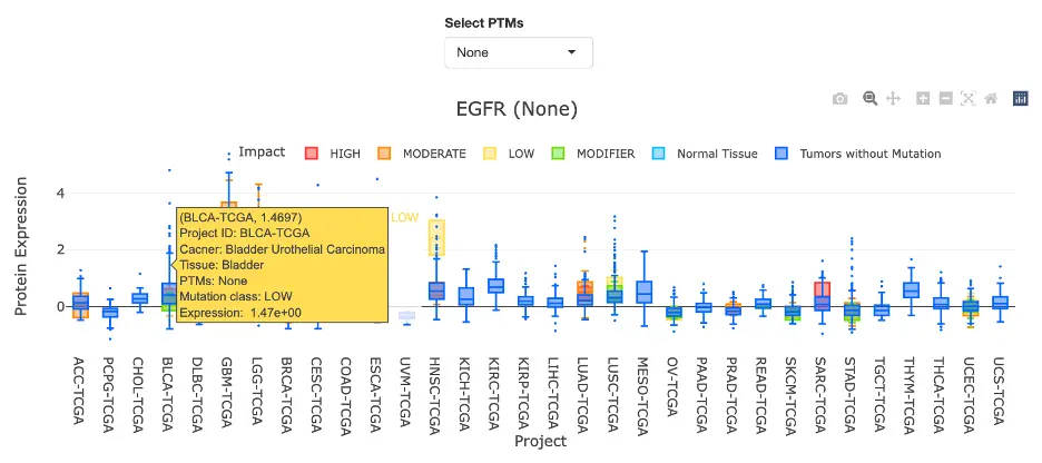
mRNA–Protein Correlation by Mutation Class (Pan-Cancer)
Purpose:Examines mRNA–protein concordance across mutation-defined sample groups.
Features:- Bar chart of Spearman ρ for each cancer type, grouped by mutation impact
- Hover for cancer type, impact class, ρ, p-value
- Click bar → opens the corresponding mRNA–protein scatter plot
- Positive ρ: protein expression tracks mRNA → transcriptionally driven response
- Negative ρ: mutation-class–specific post-transcriptional or PTM-dependent regulation
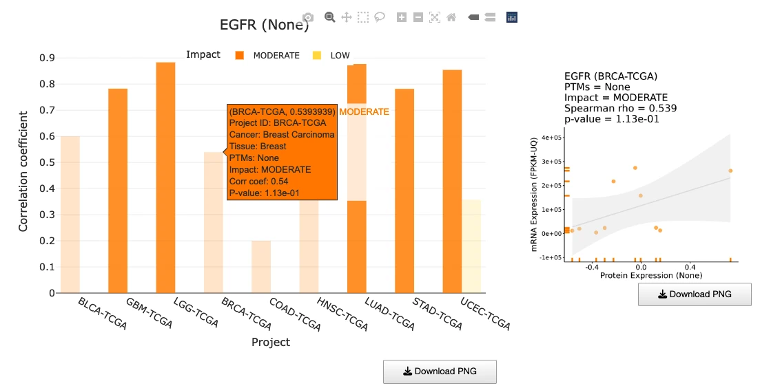
Cancer-Specific: Mutation-Impact–Specific Protein Expression
This visualization shows protein expression differences within a selected cancer type grouped by mutation class, displaying a violin plot with mutation impact class on the x-axis and protein expression levels on the y-axis, where users can hover for statistical summaries and sample information and toggle impact classes using the legend. An accompanying statistical table provides pairwise comparisons between impact classes with columns showing Group 1, Group 2, p-value, significance level, and sample counts. This analysis helps identify whether high-impact mutation carriers show altered protein levels relative to other mutation groups, revealing whether mutations influence not only gene expression at the transcript level but also at the protein level, which may have more direct functional consequences for cancer phenotypes.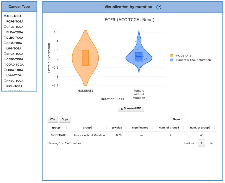
2.10.4 PTM Sites
This tab evaluates how post-translational modifications (PTMs)—specifically phosphorylation sites—modify the relationship between mRNA and protein expression.
mRNA-Protein Correlation by PTM Site (Pan-Cancer)
Purpose:Assesses how PTMs (e.g., pY1068, pY1173) influence mRNA–protein coupling across cancers.
Plot Features:- Bar chart of Spearman correlation coefficients (ρ) across cancer types
- Groups correspond to PTM sites:
- None (total protein)
- pY1068
- pY1173
- Toggle PTM sites using the legend
- Hover for Cancer type, PTM site, ρ, p-value
- Click bar → opens a PTM-specific mRNA–protein scatter plot
- Positive ρ (> 0):PTM-site–specific protein levels track mRNA → transcriptionally driven regulation
- Negative ρ (< 0):Protein/PTM levels diverge from mRNA → post-transcriptional or PTM-dependent modulation
(e.g., phosphorylation buffering, kinase pathway activation independent of transcript levels)
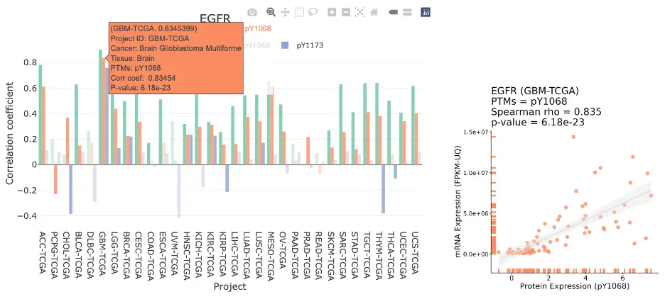
2.10.5 Survival
Purpose
This analysis evaluates whether total protein abundance or site-specific post-translational modification abundance is associated with patient survival across selected cancer cohorts.
When phosphorylation data are available, results are presented separately for:- Total protein, representing overall protein abundance.
- PTM sites, representing the abundance of individual phosphorylation sites, such as pY1068 or pY1173.
Comparing total-protein and PTM-site results can reveal site-specific prognostic associations that may not be apparent from overall protein abundance.
Analysis Workflow
Users first select one of three survival-analysis methods:- Cox Uni — univariate Cox proportional hazards analysis.
- Cox Multi (Clinical) — multivariable Cox proportional hazards analysis with clinical covariate adjustment.
- Cure Model — survival analysis designed to capture both short-term risk and long-term survival patterns.
- Cancer type: the patient cohort to nanalyze.
- Survival type: the clinical endpoint.
- Survival time: either the full available follow-up period or follow-up restricted to 5 years.
- Stratification method: median or best cutpoint.
For the Cure Model, users currently select only the cancer type. The survival endpoint is overall survival (OS), follow-up includes all available years, and abundance stratification is based on the median abundance of the analyzed protein feature.
Survival Endpoint
The available survival endpoints are:- Overall Survival (OS): time from diagnosis or study entry to death from any cause.
- Progression-Free Interval (PFI): time to disease progression, recurrence, a new primary tumor, or death, according to the endpoint definition used in the source cohort.
- Disease-Free Interval (DFI): time from completion of initial treatment or achievement of disease-free status to recurrence or a new disease event.
- Disease-Specific Survival (DSS): time to death attributed to the cancer under study; deaths from other causes are generally censored.
Endpoint availability may vary among cancer cohorts.
Follow-up Time
Users may analyze:- All time: all available follow-up data are included.
- 5 years: follow-up is restricted to the first 60 months.
For a 5-year analysis, patients who remain event-free beyond 60 months should normally be administratively censored at 60 months rather than excluded. The plot x-axis and risk estimates then represent outcomes during the first five years of follow-up.
Sample Stratification
For each total-protein or PTM-site feature, patients with valid abundance and survival data are divided into abundance groups before plotting the survival curves.
Median StratificationThe median abundance value among the eligible patients is used as the cutpoint.
- Patients above the median are assigned to the High group.
- Patients below the median are assigned to the Low group.
- Patients whose abundance equals the median must be handled consistently by the implementation, for example by assigning them to one specified group.
Median stratification is simple, reproducible, and generally produces groups of similar size. However, it may miss an association when the biologically relevant threshold is not close to the median.
Best-Cutpoint StratificationA set of candidate abundance thresholds is evaluated, and the cutpoint that produces the strongest separation between the survival groups is selected.
The optimal threshold is commonly chosen by maximizing a survival-separation statistic, such as the standardized log-rank statistic, or equivalently by minimizing the corresponding log-rank p-value within an allowed range of cutpoints.
Patients are then classified as:- High: abundance above the selected cutpoint.
- Low: abundance at or below the selected cutpoint, or according to the exact boundary rule used by the application.
Candidate cutpoints should be restricted so that neither group becomes too small. Because the same dataset is used to select and test the threshold, best-cutpoint results can overestimate effect size and statistical significance. These results should therefore be interpreted as exploratory and ideally validated in an independent cohort. If adjusted p-values are implemented for the cutpoint search, this should be stated explicitly.
Cox Uni
Cox Uni evaluates one molecular feature at a time without adjustment for clinical characteristics. The feature may be total protein abundance or the abundance of an individual PTM site.
The Cox model estimates the relative hazard for the High group compared with the Low group. A hazard ratio greater than 1 indicates a higher event rate in the High group, whereas a hazard ratio below 1 indicates a lower event rate.
Kaplan-Meier PlotThe Kaplan–Meier plot displays the observed survival probability over time for the High and Low abundance groups.
Greater separation between the curves indicates a larger difference in survival experience. The log-rank p-value tests whether the survival distributions differ between the groups.
The Kaplan–Meier plot is an unadjusted comparison and does not account for clinical covariates.
Cumulative Hazard PlotThe cumulative hazard plot displays the accumulated event hazard over time for the same High and Low groups.
A curve that rises more rapidly indicates faster accumulation of risk. Separation between the curves suggests different event rates between the abundance groups.
The cumulative hazard plot complements the Kaplan–Meier plot but should not be interpreted as the instantaneous hazard at a particular time point.
InterpretationA significant result suggests that the selected protein or PTM-site abundance is associated with the selected survival endpoint in an unadjusted analysis. It does not establish that the feature is independent of tumor stage, age, or other clinical factors.
Cox Multi (clinical)
Cox Multi fits a multivariable Cox proportional hazards model to evaluate the association between a protein or PTM feature and survival after accounting for available clinical covariates.
Depending on the cohort and data availability, covariates may include variables such as age, sex, tumor stage, grade, or other relevant clinical characteristics. The exact variables included should be listed with the results.
Kaplan-Meier PlotThe Kaplan–Meier plot displays the observed, unadjusted survival experience of the High and Low abundance groups.
Although it is shown alongside the multivariable analysis, the Kaplan–Meier curve itself does not adjust for clinical covariates. Clinical adjustment is provided by the Cox model and summarized in the forest plot.
If the application instead generates model-predicted curves from the multivariable Cox model, the figure should be labelled adjusted survival curve, rather than Kaplan–Meier plot.
Forest Plot The forest plot summarizes the hazard ratio and 95% confidence interval for:- The High-versus-Low protein or PTM abundance group.
- Each clinical covariate included in the model.
- HR > 1: higher hazard, corresponding to a worse outcome for the modeled comparison.
- HR < 1: lower hazard, corresponding to a better outcome.
- HR = 1: no estimated difference in hazard.
The dashed vertical reference line at HR = 1 represents no association. A confidence interval that crosses 1 indicates that the effect is not statistically distinguishable from no association at the corresponding confidence level.
InterpretationIf the protein or PTM abundance group remains statistically significant after clinical adjustment, the result supports an association with survival that is not explained by the clinical covariates included in the model.
This should be described as an independent association within the fitted model, rather than proof that the feature is biologically or causally independent. Residual confounding may remain, and results depend on the quality and availability of the clinical variables.
Cure Model
The cure model is intended for survival settings in which a proportion of patients may experience sustained long-term survival and no longer show the same event risk as the susceptible patient population.
Unlike a standard Cox model, a cure model can separately characterize:- Long-term survival or cure fraction: the estimated probability of belonging to the long-term event-free group.
- Short-term survival among susceptible patients: the timing or risk of events among patients who remain at risk.
The term “cure” is statistical and does not necessarily indicate confirmed clinical eradication of disease.
Survival PlotsCure-model results are displayed for total protein and, when available, separately for each PTM site.
The plots may show:- Long-term survival: differences in the estimated long-term-surviving or cured fraction between abundance groups.
- Short-term survival: differences in survival among patients considered susceptible to the event.
Separation between the High and Low curves suggests group-specific survival behavior. A plateau in the late portion of a survival curve may be consistent with a long-term-surviving fraction, although a plateau can also result from limited follow-up or few patients remaining at risk.
InterpretationDifferences in the long-term component suggest that abundance may be associated with the estimated long-term-surviving fraction. Differences in the short-term component suggest an association with event timing among susceptible patients.
Comparisons between total protein and individual PTM sites can identify site-specific long-term or short-term survival patterns that are not reflected by total protein abundance
2.11 Gene Multi-omics
2.11.1 Overview
The Gene Multi-Omics interface summarizes how multiple molecular layers—including gene expression, mutation, CNV, methylation, protein, and miRNA—converge to support the user-selected gene as a potential driver across cancers.
All results reflect outputs from multi-omics integration tools, providing a cross-layer view of biological evidence.
- Integrated Multi-Omics Overview
- Omics Connectivity Network
- List of Multi-Omics Driver Events
Each section offers complementary insights into how strongly the selected gene is supported as a multi-omics driver.
2.11.2 Integrated Multi-Omics Overview
This section aggregates driver evidence from multi-omics prediction tools and displays where (cancer types) and how (omic layers) the selected gene is supported, with visualization presented through three coordinated components that together provide a comprehensive view of multi-layered evidence.
Top-Right Bar Chart — Tool Support Across Cancers
This bar chart shows how many integration tools identified the selected gene as a driver in each cancer type, with users able to hover to view the cancer type and tool support count. Taller bars indicate stronger cross-tool agreement within that particular cancer, suggesting the gene is consistently recognized as a driver across multiple computational methods in those cancer types.
Bottom-Left Bar Chart — Tool Support Across Omics Layers
This bar chart summarizes the number of supporting tools for each omic type, including mutation, CNV, methylation, expression, and miRNA, with hover functionality displaying the omics type and tool count. This component highlights whether the gene is supported across multiple molecular mechanisms, revealing the diversity of dysregulation patterns affecting the gene.
Bottom-Right Combination Matrix — Cross-Omics Evidence
This matrix displays cancer types as rows and omics layers as columns, where each solid dot indicates that the gene is identified as significant in the corresponding omic type for that cancer dataset, with filled dots representing support by at least one integrative tool. Users can hover over dots to view cancer type, omics type, and evidence details. Dense dot patterns indicate broad multi-omics support across many cancer types, wide spread across omics columns suggests convergent dysregulation of the gene through multiple molecular mechanisms, and dense rows highlight specific cancers where the gene plays a multi-omics functional role with alterations spanning multiple biological layers.
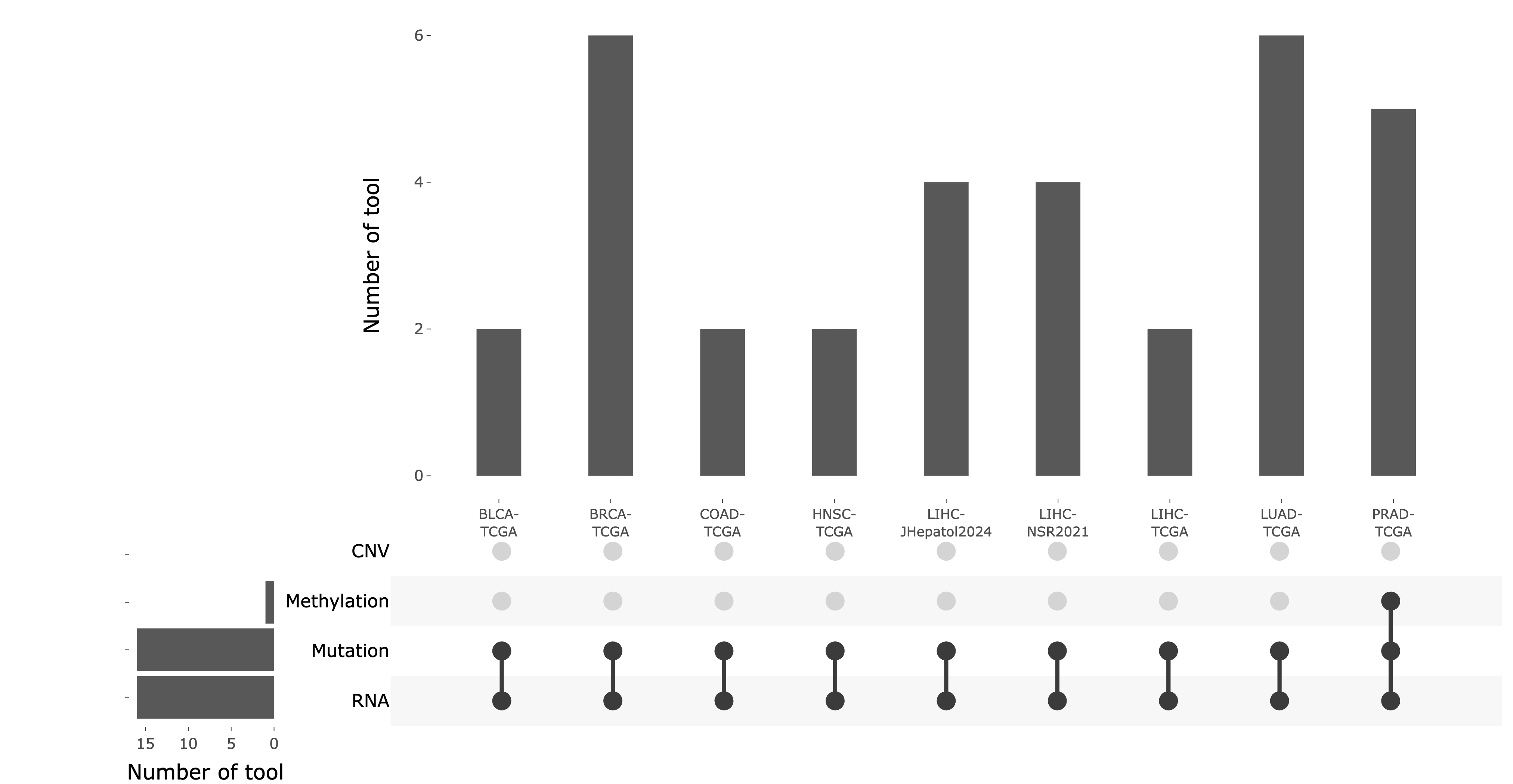
2.11.3 Omics Connectivity Network
The Omics Connectivity Network illustrates relationships between the selected gene, omics layers, and cancer projects through an interactive network view.
Nodes represent different entities, including the selected gene, omics types, and cancer projects. Edges denote associations identified by integration tools, indicating links between the gene and specific molecular alterations or cancer contexts. Cancer projects belonging to the same cancer type are displayed using the same node color, helping users recognize related datasets across projects.
Users can interact with the network by clicking or hovering over nodes to explore their connected omics layers, cancer projects, and related associations. Nodes with more connections indicate a higher degree of multi-omics influence or cross-layer integration, suggesting that the selected gene may play a broader role across multiple molecular mechanisms or cancer contexts.
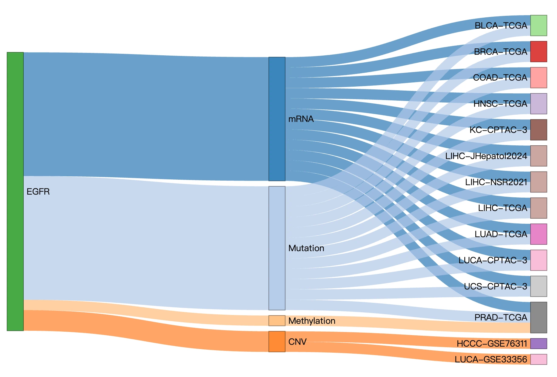
2.11.4 Multi-Omics Driver Event Table
This detailed table lists all driver events supported by multi-omics tools for the selected gene, providing comprehensive information about the molecular context and reproducibility of each driver event. High nTool values indicate strong cross-tool reproducibility where multiple computational methods independently identify the same driver event, while CGC/NCG = Yes indicates independent biological support of cancer relevance through inclusion in curated cancer gene databases. The presence of multiple omics layers for a gene demonstrates multi-layer dysfunction characteristic of driver genes, where alterations span genomic, epigenomic, and transcriptomic levels. This table allows users to quickly identify the specific omics drivers and cancer contexts in which the gene is strongly supported, enabling prioritization of the most robust and biologically relevant driver events for further investigation or therapeutic targeting.
2. Gene Survival
Survival Map
The Survival Map displays the survival impact of the selected gene across multiple cancer types and four survival endpoints: overall survival (OS), progression-free interval (PFI), disease-free interval (DFI), and disease-specific survival (DSS). The map supports multiple omics data types, including RNA expression, mutation, copy number variation (CNV), and methylation.
- Cancer type abbreviations
Cancer types are shown using abbreviations. Full cancer type names are available in the Dataset subsection of the Help page. Please note that survival analysis is performed only on TCGA datasets. In the visualizations, the -TCGA suffix is omitted from cancer type labels; therefore, when looking up full cancer type names in the Help section, please add the -TCGA suffix to the displayed cancer type abbreviation. - Survival significance and hazard ratio
Each heatmap cell represents a combination of cancer type and survival analysis method. For Cox univariate, Cox multivariate, and cure model analyses, a colored cell indicates that the selected molecular feature is significantly associated with survival based on the hazard ratio and p-value. The selected molecular feature may represent RNA expression level, mutation status, CNV status, or methylation level, depending on the selected omics type.
The color gradient represents the hazard ratio: red indicates a hazard ratio greater than 1, suggesting higher risk, while blue indicates a hazard ratio less than 1, suggesting lower risk. The direction of risk is interpreted relative to the omics-specific reference group used in the analysis — for example, high versus low RNA expression, mutated versus wild-type status, or copy number gain or loss relative to neutral status. For methylation data, the reference group depends on the grouping method: high versus low methylation level when using beta-value median stratification, or hypermethylated versus hypomethylated status when using MethylMix-based classification.
For machine learning–based results, a colored cell indicates that the selected gene was identified as survival-related by at least one of the machine learning algorithms — LASSO, Random Forest, or I-Boost. To determine which specific algorithm identified the gene, users can refer to the detailed results in the Survival Analysis section.
Hover over a colored cell to view detailed survival information, including cancer type, survival endpoint, analysis method, omics type, grouping or stratification method, hazard ratio, log-rank p-value, and cutoff or grouping value when available.
Grouping methods depend on the selected omics type. RNA expression is stratified using the best cutoff, which identifies the threshold that maximizes survival difference between groups, or the median cutoff. Mutation data are grouped by mutated versus wild-type status. CNV data are grouped using iGC or GISTIC-based copy number calls into gain, loss, or neutral categories. For methylation data, patients are grouped using beta-value median stratification, beta-value best cutoff stratification, or MethylMix-based classification.
Note that p-values for Cox univariate, Cox univariate 5-year, and machine learning analyses are calculated using the log-rank test, while p-values for Cox multivariate and Cox multivariate 5-year analyses are calculated using the Cox proportional hazards model.
- Survival analysis methods
The map includes multiple survival analysis approaches: Cox univariate regression, Cox multivariate regression adjusted for clinical covariates, cure model analysis, and machine learning–based survival analysis using LASSO, Random Forest, and I-Boost.
Available survival analysis methods vary by survival endpoint. For the OS endpoint, available results include Cox univariate regression, Cox univariate regression 5-year, Cox multivariate regression adjusted for clinical covariates, Cox multivariate regression 5-year adjusted for clinical covariates, cure model short-term effect, cure model long-term effect, and machine learning–based results. For the PFI, DFI, and DSS endpoints, available results include Cox univariate regression, Cox univariate regression 5-year, Cox multivariate regression adjusted for clinical covariates, Cox multivariate regression 5-year adjusted for clinical covariates, and machine learning–based results. Cure model results are available only for the OS endpoint.
References of all survival analysis methods, including the machine learning–based approaches, are available in FAQ4. Click a colored cell to open the corresponding Kaplan–Meier plot. If the selected cell represents a machine learning result, the detailed output opens in a new tab. For figure and table manipulation, please refer to FAQ3.
Survival Analysis
The Survival Analysis panel evaluates whether the selected gene's molecular features are associated with patient prognosis. Users first select a survival analysis type:- Cox Univariate (Cox Uni) – Evaluates the association between the selected molecular feature and patient survival without adjusting for additional clinical variables.
- Cox Multivariate (clinical) (Cox Multi) – Evaluates the association between the selected molecular feature and patient survival while adjusting for available clinical covariates, such as age, gender, stage, or other cohort-specific clinical variables.
- Cure Model – Models survival patterns while accounting for the possibility that a subset of patients may experience long-term survival or reduced risk over time. This framework supports evaluation of both short-term and long-term survival effects.
- Machine Learning – Uses supervised learning-based approaches to identify molecular features or signatures associated with prognosis. Available methods include LASSO, Random Forest, and I-Boost.
- Synergistic Survival Analysis – Evaluates whether two molecular features, potentially from different omics layers, have a combined or interaction-based prognostic effect on patient survival.
References of all survival analysis methods, including the machine learning–based approaches, are available in FAQ4.
After an analysis type is selected, the available filters and result views update accordingly.
Depending on the selected analysis framework, users can choose relevant options such as cancer type, survival endpoint, survival time, stratification method, or machine learning algorithm. The resulting plots and tables help compare survival patterns, estimate risk differences, and identify molecular features or interactions associated with patient outcomes.
Cox Univariate
The Cox Univariate results section evaluates whether the selected molecular feature of the user-selected gene is associated with patient survival in a selected cancer type. The analysis is performed using univariate Cox proportional hazards regression and Kaplan–Meier survival analysis, without adjusting for any clinical covariates.
Users can select a cancer type, survival endpoint, survival time, and grouping method from the dropdown menus. The available survival endpoints include overall survival (OS), progression-free interval (PFI), disease-free interval (DFI), and disease-specific survival (DSS). The survival time options include all-time and 5-year analyses.
Patient grouping depends on the selected omics type. For RNA expression data, patients are stratified into high- and low-expression groups using either the median cutoff or the best cutoff, which identifies the expression threshold that maximizes the log-rank test statistic across all possible cutpoints to produce the most statistically significant survival separation between groups. For mutation data, patients are grouped by mutation status — mutated or wild-type. For CNV data, patients are grouped into copy number gain, loss, or neutral categories based on copy number status defined by either iGC or GISTIC. For methylation data, patients are grouped using beta-value median stratification, beta-value best cutoff stratification, or MethylMix-based classification. For beta-value stratification methods, patients are divided into high and low methylation level groups; for MethylMix-based classification, patients are divided into hypermethylated and hypomethylated groups.
Full cancer type names are available in the Dataset subsection of the Help page. Please note that survival analysis is performed only on TCGA datasets. In the visualizations, the -TCGA suffix is omitted from cancer type labels; therefore, when looking up full cancer type names in the Help section, please add the -TCGA suffix to the displayed cancer type abbreviation.
After the selections are made, two Kaplan–Meier survival plots are displayed. The left plot shows the unadjusted survival curves based solely on the selected omics-specific patient grouping, reflecting the univariate association between the molecular feature and survival. The right plot shows covariate-adjusted survival curves generated from a separate Cox model that accounts for available clinical covariates such as age, gender, stage, or other cohort-specific variables; this plot is displayed only when sufficient clinical covariate data are available for the selected cancer type and endpoint.
Each plot displays survival analysis results above the figure, such as hazard ratio and p-value. The x-axis represents survival time starting from the initial cancer diagnosis, and the y-axis represents survival probability.
Patient groups are defined according to the selected omics type:- RNA expression: high versus low expression of the selected gene.
- Mutation: mutated versus wild-type status of the selected gene.
- CNV: copy number gain, loss, or no copy number variation of the selected gene, depending on the available grouping.
- Methylation: high versus low methylation level of the selected gene (when using beta-value median stratification), or hypermethylated versus hypomethylated status (when using MethylMix-based classification).
Users can hover over the curves to view detailed survival information at specific time points. Curves can also be shown or hidden by clicking the corresponding labels in the legend. For figure and table manipulation, please refer to FAQ3. For algorithm descriptions and references, please refer to FAQ4.
Cox Multivariate (clinical)
The Cox Multivariate results section evaluates whether the selected molecular feature of the user-selected gene is independently associated with patient survival after adjusting for available clinical covariates. The analysis is performed using multivariate Cox proportional hazards regression across multiple cancer types.
Users can select a cancer type, survival endpoint, survival time, and grouping method from the dropdown menus. The available survival endpoints include overall survival (OS), progression-free interval (PFI), disease-free interval (DFI), and disease-specific survival (DSS). The survival time options include all-time and 5-year analyses.
Patient grouping depends on the selected omics type. For RNA expression data, patients are stratified into high- and low-expression groups using either the median cutoff or the best cutoff, which identifies the expression threshold that maximizes the log-rank test statistic across all possible cutpoints to produce the most statistically significant survival separation between groups. For mutation data, patients are grouped by mutation status — mutated or wild-type. For CNV data, patients are grouped into copy number gain, loss, or neutral categories based on copy number status defined by either iGC or GISTIC. For methylation data, patients are grouped using beta-value median stratification, beta-value best cutoff stratification, or MethylMix-based classification. For beta-value stratification methods, patients are divided into high and low methylation level groups; for MethylMix-based classification, patients are divided into hypermethylated and hypomethylated groups.
Full cancer type names are available in the Dataset subsection of the Help page. Please note that survival analysis is performed only on TCGA datasets. In the visualizations, the -TCGA suffix is omitted from cancer type labels; therefore, when looking up full cancer type names in the Help section, please add the -TCGA suffix to the displayed cancer type abbreviation.
After the selections are made, the results display covariate-adjusted survival curves and a forest plot. The adjusted survival curves show model-estimated survival differences among patient groups defined by the selected omics-specific grouping method, after accounting for available clinical covariates such as age, gender, stage, or other cohort-specific variables. The x-axis represents survival time from initial cancer diagnosis, and the y-axis represents survival probability.
Patient groups are defined according to the selected omics type:- RNA expression: high versus low expression of the selected gene.
- Mutation: mutated versus wild-type status of the selected gene.
- CNV: copy number gain, loss, or no copy number variation of the selected gene, depending on the available grouping.
- Methylation: high versus low methylation level of the selected gene (when using beta-value median stratification), or hypermethylated versus hypomethylated status (when using MethylMix-based classification).
Users can hover over the survival curves to view detailed survival information at specific time points. Curves can also be shown or hidden by clicking the corresponding labels in the legend.
The forest plot summarizes the hazard ratios and 95% confidence intervals for the selected molecular feature and all clinical covariates included in the multivariate Cox model. Each row represents one variable, with the point estimate indicating the hazard ratio and the horizontal line indicating the confidence interval. Values greater than 1 indicate higher risk and values less than 1 indicate lower risk relative to the reference group. The forest plot helps users compare the relative association of each variable with survival after mutual adjustment. Clicking on the forest plot opens a full-sized version for closer inspection.
For figure and table manipulation, please refer to FAQ3. For algorithm descriptions and references, please refer to FAQ4.
Cure Model
The Cure Model results section evaluates whether the selected molecular feature of the user-selected gene. The cure model estimates two types of survival effects: short-term and long-term effects. The short-term effect reflects the association between the selected molecular feature and survival time among patients who remain at risk of the event. The long-term effect reflects the association between the selected molecular feature and the probability of long-term survival, or the estimated cured fraction. Short-term and long-term p-values are reported to indicate whether the selected molecular feature is significantly associated with each component of the cure model. The short-term and long-term p-values are displayed above the plot alongside the other survival statistics.
Cure model results are available only for overall survival (OS) using all-time survival data. Patient grouping depends on the selected omics type. For RNA expression data, patients are separated into high- and low-expression groups using the median cutoff. For mutation data, patients are separated into mutated and wild-type groups. For CNV data, patients are grouped into copy number gain, loss, or neutral categories based on copy number status defined by either iGC or GISTIC. For methylation data, patients are grouped using either beta-value median stratification or MethylMix-based methylation states.
Users can select a cancer type from the dropdown menu to view the corresponding cure model results. Full cancer type names are available in the Dataset subsection of the Help page. Please note that survival analysis is performed only on TCGA datasets. In the visualizations, the -TCGA suffix is omitted from cancer type labels; therefore, when looking up full cancer type names in the Help section, please add the -TCGA suffix to the displayed cancer type abbreviation.
After a cancer type is selected, the estimated survival curves are displayed. The values calculated by the survival analysis are shown above the plot. The x-axis represents survival time starting from the initial cancer diagnosis, and the y-axis represents survival probability.
Patient groups are defined according to the selected omics type:- RNA expression: high versus low expression of the selected gene.
- Mutation: mutated versus wild-type status of the selected gene.
- CNV: copy number gain, loss, or no copy number variation of the selected gene, depending on the available grouping.
- Methylation: high versus low methylation level of the selected gene (when using beta-value median stratification), or hypermethylated versus hypomethylated status (when using MethylMix-based classification).
Users can hover over the curves to view detailed survival information at specific time points. Curves can also be shown or hidden by clicking the corresponding labels in the legend. For figure and table manipulation, please refer to FAQ3. For algorithm descriptions and references, please refer to FAQ4.
Machine Learning
Machine Learning–based survival analysis identifies molecular features associated with patient survival using three algorithms: LASSO, Random Forest, and I-Boost. Each method builds a multi-feature prognostic signature, and patients are stratified into high- and low-risk groups based on their composite signature score. Results are presented as Kaplan–Meier survival curves and ROC curves evaluating the predictive performance of each signature.
LASSO (Least Absolute Shrinkage and Selection Operator)The LASSO results section displays significant survival signatures involving the user-selected gene across 33 cancer types. LASSO is a regression-based method that selects the most relevant survival-related molecular features by shrinking less informative gene coefficients toward zero. Features with non-zero coefficients are retained to build a prognostic signature.
Full cancer type names are available in the Dataset subsection of the Help page. Please note that survival analysis is performed only on TCGA datasets. In the visualizations, the -TCGA suffix is omitted from cancer type labels; therefore, when looking up full cancer type names in the Help section, please add the -TCGA suffix to the displayed cancer type abbreviation.
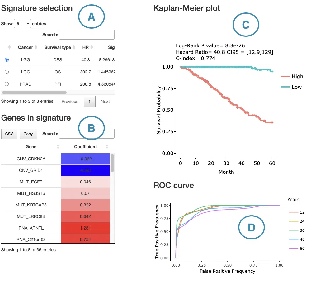
- Significant LASSO results are shown in the signature selection table. The table includes cancer type, survival endpoint, significance, and the number of genes included in the signature. Selecting a specific result from the table displays the corresponding selected gene table, Kaplan–Meier survival plot, and ROC curves.
- The selected gene table lists the genes included in the LASSO signature and their coefficients. A positive coefficient indicates that higher expression of that gene is associated with worse survival (higher risk), shown in red. A negative coefficient indicates that higher expression is associated with better survival (lower risk), shown in blue. The interpretation of feature value depends on the selected data type — for example, expression level in RNA data, mutation presence versus wild-type in mutation data, copy number level in CNV data, or methylation level in methylation data. Users can reorder the table by clicking on any column name.
- The Kaplan–Meier plot displays survival differences between patient groups stratified by their composite LASSO signature score, which is computed as a weighted sum of all selected feature values using their LASSO coefficients. Patients are divided into two groups based on the median signature score of the cohort:
- High: patients with a signature score above the median, indicating higher overall risk
- Low: patients with a signature score below the median, indicating lower overall riskLow: patients with a signature score below the median, indicating lower overall risk
Note that this grouping reflects the combined behavior of all features in the signature, not the value of any single feature. The survival statistics are shown above the plot. The x-axis represents survival time from initial cancer diagnosis, and the y-axis represents survival probability. Users can hover over the curves to view detailed survival information, and curves can be shown or hidden by clicking the corresponding legend labels.
- The ROC curves evaluate the predictive performance of the LASSO signature at different survival times. The x-axis represents the false-positive rate, and the y-axis represents the true-positive rate. Users can hover over the curves to view false-positive rate, true-positive rate, and cutoff value information. ROC curves for different survival times can be shown or hidden by clicking the corresponding labels in the legend.
For figure and table manipulation, please refer to FAQ3. For detailed algorithm descriptions and reference links, please refer to FAQ4.
Random Forest
The Random Forest results section displays significant survival signatures involving the user-selected gene across 33 cancer types. Random Forest is a machine learning method that uses many decision trees to identify molecular features that help distinguish different survival outcomes. Features are ranked based on their contribution to prediction performance.
Full cancer type names are available in the Dataset subsection of the Help page. Please note that survival analysis is performed only on TCGA datasets. In the visualizations, the -TCGA suffix is omitted from cancer type labels; therefore, when looking up full cancer type names in the Help section, please add the -TCGA suffix to the displayed cancer type abbreviation.
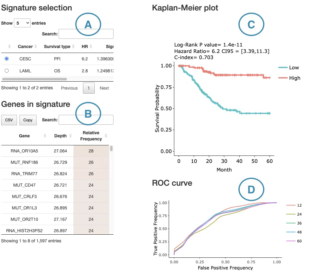
- Significant Random Forest results are shown in the signature selection table. The table includes cancer type, survival endpoint, significance, and the number of genes included in the signature. Selecting a specific result from the table displays the corresponding selected gene table, Kaplan–Meier survival plot, and ROC curves.
- The selected gene table lists the molecular features included in the Random Forest signature, along with their depth and relative frequency within the forest:
- Depth refers to how early a gene tends to appear in the decision trees. Gene at shallower depths (lower values) are used earlier in the trees, indicating stronger discriminative power for survival outcomes.
- Relative frequency reflects how often a gene is used as a splitting variable across all trees in the forest, expressed as a proportion. Higher values indicate that the gene contributes more consistently to survival prediction across the model.
- The Kaplan–Meier plot displays survival differences between patient groups stratified by their composite Random Forest signature score, derived from the combined predictive output of all selected genes in the model. Patients are divided into two groups based on the median signature score of the cohort:
- High: patients with a signature score above the median, indicating higher overall risk
- Low: patients with a signature score below the median, indicating lower overall risk
- The ROC curves evaluate the predictive performance of the Random Forest signature at different survival time points. The x-axis represents the false-positive rate and the y-axis represents the true-positive rate. Users can hover over the curves to view the false-positive rate, true-positive rate, and cutoff value at each point. ROC curves for different survival times can be shown or hidden by clicking the corresponding legend labels.
For figure and table manipulation, please refer to FAQ3. For detailed algorithm descriptions and reference links, please refer to FAQ4.
I-BoostThe I-Boost results section displays significant survival signatures involving the user-selected gene across 33 cancer types. I-Boost is a boosting-based machine learning method that builds a survival prediction model by combining multiple weak predictors into a stronger signature. Features are selected and assigned coefficients based on their cumulative contribution to survival prediction boosting iterations.
Full cancer type names are available in the Dataset subsection of the Help page. Please note that survival analysis is performed only on TCGA datasets. In the visualizations, the -TCGA suffix is omitted from cancer type labels; therefore, when looking up full cancer type names in the Help section, please add the -TCGA suffix to the displayed cancer type abbreviation.
- Significant I-Boost results are shown in the signature selection table. The table includes cancer type, survival endpoint, significance, and the number of genes included in the signature. Selecting a specific result from the table displays the corresponding selected gene table, Kaplan–Meier survival plot, and cumulative hazard plot.
- The selected feature table lists the molecular features included in the I-Boost signature along with their coefficients. A positive coefficient indicates that a higher feature value is associated with worse survival (higher risk), shown in red; a negative coefficient indicates that a higher feature value is associated with better survival (lower risk), shown in blue. The interpretation of feature value depends on the selected data type — for example, expression level in RNA data, mutation presence versus wild-type in mutation data, copy number level in CNV data, or methylation level in methylation data. Users can reorder the table by clicking on any column name.
- The Kaplan–Meier plot displays survival differences between patient groups stratified by their composite I-Boost signature score, computed from the combined weighted contributions of all selected features in the model. Patients are divided into two groups based on the median signature score of the cohort:
- High: patients with a signature score above the median, indicating higher overall risk
- Low: patients with a signature score below the median, indicating lower overall risk
Note that this grouping reflects the combined behavior of all features in the signature, not the value of any single feature. The survival statistics are shown above the plot. The x-axis represents survival time from initial cancer diagnosis, and the y-axis represents survival probability. Users can hover over the curves to view detailed survival information, and curves can be shown or hidden by clicking the corresponding legend labels.
- The cumulative hazard plot displays the cumulative hazard over time for patients in the high and low signature score groups. Higher cumulative hazard values indicate a greater accumulated risk of the survival event occurring up to that time point. The survival statistics are shown above the plot. The x-axis represents survival time from initial cancer diagnosis, and the y-axis represents cumulative hazard. Users can hover over the curves to view detailed information, and curves can be shown or hidden by clicking the corresponding legend labels.
For figure and table manipulation, please refer to FAQ3. For detailed algorithm descriptions and reference links, please refer to FAQ4.
Synergistic survival analysis
The Synergistic Survival Analysis section evaluates whether the selected gene shows combined survival effects with related genes or molecular features from other omics layers. The analysis supports cross-omics interactions among RNA expression, mutation, copy number variation (CNV), and methylation, depending on the selected omics type and available data. Currently, synergistic survival analysis is available for overall survival (OS) only.
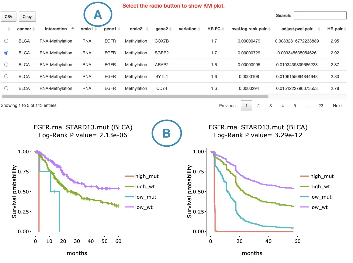
- Synergistic interaction table
The result table lists detailed information for each synergistic survival interaction, including cancer type, interaction type, gene symbols, omics levels, hazard ratio, and p-value. Users can reorder the table by clicking on any column name. Clicking a gene–omics pair in the table generates the corresponding Kaplan–Meier survival plots below; clicking the same row again hides the plots.
Full cancer type names are available in the Dataset subsection of the Help page. Please note that survival analysis is performed only on TCGA datasets. In the visualizations, the -TCGA suffix is omitted from cancer type labels; therefore, when looking up full cancer type names in the Help section, please add the -TCGA suffix to the displayed cancer type abbreviation.
- Kaplan–Meier survival plots
The Kaplan–Meier plots display survival differences among patient groups defined by the selected cross-omics interaction. The left plot shows the unadjusted survival curves, while the right plot shows covariate-adjusted survival curves generated from the corresponding survival model; the right plot is displayed only when sufficient clinical covariate data are available for the selected cancer type and endpoint. The gene symbols, omics layers, and survival analysis values are shown above each plot. The x-axis represents survival time from the initial cancer diagnosis, with survival curves displayed for the first 5 years of follow-up, and the y-axis represents survival probability. Users can hover over the curves to view detailed survival information and click the legend to show or hide individual curves.
Patient groups are defined according to the combined omics states of the two paired features. The grouping method depends on the omics type:
- RNA expression: patients are grouped into high- and low-expression groups using the median cutoff.
- Mutation: patients are grouped by mutation status: mutated or wild-type.
- CNV: patients are grouped by copy number status — gain, loss, or neutral (no copy number variation) — based on iGC.
- Methylation: patients are grouped using beta-value median stratification.
Abbreviation definitions
The group labels in the Kaplan–Meier plots represent the combined omics states of two genes or molecular features. The order of gene 1 and gene 2 follows the interaction type shown in the table.
- high_mut: high RNA expression in gene 1; mutated in gene 2
- high_wt: high RNA expression in gene 1; wild-type in gene 2
- low_mut: low RNA expression in gene 1; mutated in gene 2
- low_wt: low RNA expression in gene 1; wild-type in gene 2
- high_gain: high RNA expression in gene 1; copy number gain in gene 2
- high_loss: high RNA expression in gene 1; copy number loss in gene 2
- high_none: high RNA expression in gene 1; neutral copy number in gene 2
- low_gain: low RNA expression in gene 1; copy number gain in gene 2
- low_loss: low RNA expression in gene 1; copy number loss in gene 2
- low_none: low RNA expression in gene 1; neutral copy number in gene 2
- high_meth: high RNA expression in gene 1; methylation detected in gene 2
- high_unmeth: high RNA expression in gene 1; no methylation detected in gene 2
- low_meth: low RNA expression in gene 1; methylation detected in gene 2
- low_unmeth: low RNA expression in gene 1; no methylation detected in gene 2
- mut_gain: mutated in gene 1; copy number gain in gene 2
- mut_loss: mutated in gene 1; copy number loss in gene 2
- mut_none: mutated in gene 1; neutral copy number in gene 2
- wt_gain: wild-type in gene 1; copy number gain in gene 2
- wt_loss: wild-type in gene 1; copy number loss in gene 2
- wt_none: wild-type in gene 1; neutral copy number in gene 2
- mut_meth: mutated in gene 1; methylation level in gene 2
- mut_unmeth: mutated in gene 1; no methylation detected in gene 2
- wt_meth: wild-type in gene 1; methylation detected in gene 2
- wt_unmeth: wild-type in gene 1; no methylation detected in gene 2
- gain_meth: copy number gain in gene 1; methylation detected in gene 2
- gain_unmeth: copy number gain in gene 1; no methylation detected in gene 2
- none_meth: neutral copy number in gene 1; methylation detected in gene 2
- none_unmeth: neutral copy number in gene 1; no methylation detected in gene 2
- loss_meth: copy number loss in gene 1; methylation detected in gene 2
- loss_unmeth: copy number loss in gene 1; no methylation detected in gene 2
For figure and table manipulation, please refer to FAQ3.
3. Customized Analysis
3.1 Overview
The Customized Analysis module enables researchers to perform user-defined analyses using clinical subgroups, gene features, and survival outcomes.
Unlike the Cancer and Gene modules—which summarize fixed results—Customized Analysis allows flexible, interactive, and hypothesis-driven exploration.
- Subgroup Comparison Analyses
- Survival Analyses
- Multi-Omics Driver Analysis
- Prognostic Signature Identification
- Multivariate Survival Analysis
Below is detailed help for the Subgroup Comparison Analyses section.
3.2 Subgroup Comparison Analyses
Subgroup Comparison Analyses evaluate how gene-level molecular features differ across clinically defined patient subgroups.
Users define subgroups using any combination of clinical parameters (e.g., stage, grade, receptor status), and analyses are performed per selected gene and dataset.
- Expression
- Mutation
- CNV
- Methylation
Each analysis helps uncover biology associated with disease progression, risk groups, treatment response, or other clinically important factors.
3.2.1 Expression Subgroup Comparison
This analysis assesses whether gene expression varies across clinically defined patient subgroups within a cancer dataset.
Workflow
- Select a gene of interest.
- Choose a dataset.
- Define the analysis cohort by selecting one or more clinical criteria (e.g., Stage I+II, ER−, Grade 3).
- Users may select multiple criteria simultaneously; sample counts update automatically.
- Choose a subgroup factor (e.g., stage, grade, receptor status), which determines the x-axis grouping in plots.
Output: Expression Comparison Across Clinical Subgroups
Violin Plot (log₁₀ TPM)- Displays expression distributions after log transformation.
- Log scale reduces extreme variance and highlights differences between subgroup distributions.
- Hover for summary statistics (median, quartiles, fences) or sample-level data.
- Shows raw expression values without transformation.
- Useful for interpreting absolute expression magnitude.
- Hover to view sample-level details.
Pairwise comparisons are automatically generated across subgroup levels.
Columns include:
- Group1 / Group2
- p-value
- Significance
- ns (≥0.05)
- * (<0.05)
- ** (<0.01)
- *** (<0.001)
- **** (<0.0001, optional)
- Sample counts
Interpretation
Together, the violin plots and comparison table help determine whether gene expression differs meaningfully across clinical categories such as:- Tumor stage
- Histologic grade
- Receptor/HER2 status
- Molecular subtype
- Treatment response groups
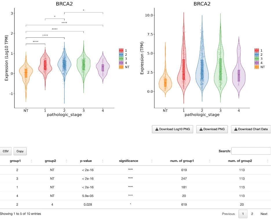
3.2.2 Mutation Subgroup Comparison
This analysis evaluates whether mutation frequency of the selected gene differs between two clinically defined patient groups.
Workflow
- Select a gene and dataset.
- Define Group 1 and Group 2 using one or more clinical criteria (e.g., Stage I vs Stage III–IV, ER+ vs ER−).
- Each group must contain ≥20 samples to ensure statistical validity.
- Run the analysis to generate contingency and statistical results.
Output
Mutation Contingency TableDisplays mutation counts for each group:
- Group 1 Mutated / Wild-type
- Group 2 Mutated / Wild-type
- Total sample counts
This table summarizes how mutation events are distributed across the two subpopulations.
Fisher’s Exact Test StatisticsComputed to determine whether mutation frequencies differ significantly.
Outputs include:
- Odds Ratio (OR)
- OR > 1 → mutations more common in Group 1
- OR < 1 → mutations more common in Group 2
- 95% Confidence Interval (CI)
- p-value (Fisher’s Exact Test)
Use this analysis to determine whether clinical subgroups differ in mutation burden for the selected gene.
Biological questions supported include:
- Are late-stage tumors more mutated?
- Do ER− patients have higher mutation frequency?
- Are responders and non-responders genetically distinct?
3.2.3 CNV Subgroup Comparison
The CNV Subgroup Comparison evaluates whether copy number variation (CNV) patterns differ between two clinically defined patient groups.
Events are categorized as Gain, Loss, or None (neutral).
Workflow
- Select a gene and dataset.
- Define Group 1 and Group 2 using one or more clinical criteria (e.g., Stage I vs Stage III–IV).
- Each group must include ≥20 samples.
- Run the analysis to generate CNV contingency tables and Fisher’s Exact Test results.
Output
CNV Contingency Tables (Four Comparisons)- All CNV Categories Combined
- Shows counts of Gain, Loss, and None in both groups.
- Provides an overall view of CNV distribution.
- Gain vs. Loss
- Excludes neutral samples.
- Tests whether amplification vs. deletion trends differ.
- Gain vs. None
- Compares Gain against neutral CNV states.
- Loss vs. None
- Compares Loss against neutral states.
- Odds Ratio (OR):
- OR > 1 → CNV event more common in Group 1
- OR < 1 → CNV event more common in Group 2
- 95% CI
- p-value (Fisher’s Exact Test)
Interpretation
This analysis reveals whether the selected gene exhibits different CNV profiles across clinical subpopulations—for example:- Amplification enriched in late-stage cancers
- Deletion enriched in a specific molecular subtype
- Neutral copy number predominance in certain risk groups
3.2.4 Methylation Subgroup Comparison
The Methylation Subgroup Comparison evaluates whether DNA methylation levels (β-values) differ across clinically defined patient subgroups.
Workflow
- Choose a gene and dataset.
- Filter the cohort by selecting clinical criteria.
- Select a subgroup factor (e.g., stage, grade, receptor status).
- This determines the x-axis grouping.
- Run the analysis to generate violin plots and statistical comparisons.
Output
Methylation Violin Plot (β-values)- Y-axis: β-value (0–1)
- 0 = unmethylated
- 1 = fully methylated
- X-axis: subgroup factor categories
- Each violin shows the methylation distribution within each subgroup.
- Hover for summary statistics (median, quartiles, fences) or sample-level details.
Includes pairwise subgroup comparisons:
- Group 1 / Group 2
- p-value
- Significance (ns, *, **, ***, ****)
- Sample counts per subgroup
Interpretation
This analysis helps determine whether epigenetic regulation of the gene differs across patient groups—for example:- Hypermethylation enriched in high-grade tumors
- Hypomethylation associated with specific receptor status
- Stage-dependent methylation differences
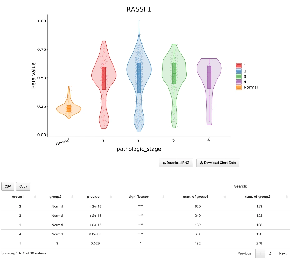
3.3 Survival Analyses
Survival Analyses evaluate how mutations, gene expression levels, or miRNA expression levels influence patient outcomes within a user-defined subpopulation. Users define the patient cohort via clinical criteria and select stratification methods. This section begins with Mutation-Based Survival Analysis, followed by Expression-Based Survival Analysis and miRNA-Based Survival Analysis.
3.3.1 Mutation-Based Survival Analysis
The Mutation-Based Survival Analysis assesses whether mutations in the selected gene list are associated with survival differences in a clinically defined subpopulation.
Workflow
- Input a gene list.
- Select a dataset.
- Use clinical criteria to filter the patient cohort (e.g., Stage II only, ER+ only).
- This determines which patients will be evaluated.
- The results tab then allows you to dynamically select:
- Stratification method (Mutation vs. Wild type or Number of mutated genes)
- Time interval (All follow-up or 5-year)
These two options control both the survival table and the Kaplan–Meier plots below.
Output
A. Mutation Oncoprint
This visualization provides a visual summary of mutation patterns across patients, with rows representing genes from the input list, columns representing individual patients, and cells color-coded by mutation impact where red indicates high impact, blue indicates moderate impact, and additional colors are used as applicable. Side panels provide complementary information: the left panel displays the percentage of mutated samples for each gene, while the top panel shows mutation burden or impact summary, often displayed as a combination impact score (e.g., 0–2). This visualization quickly shows which genes are frequently mutated and how mutation profiles vary across patients within the selected cohort.
B. Survival Control Panel
Located directly above the survival table and Kaplan–Meier plots, this panel includes dropdown menus for selecting the stratification method (Mutation vs. Wild type or By number of mutated genes) and time interval (All follow-up or 5-year survival). Changing these settings immediately updates the KM curves to reflect the selected analysis parameters.
C. Survival Statistics Table
This comprehensive table summarizes survival analysis results for each cancer type, gene or gene set, and survival endpoint combination. Key information includes the cancer type abbreviation, the gene(s) evaluated under the selected stratification, the outcome analyzed (OS for Overall Survival, PFI for Progression-Free Interval, DFI for Disease-Free Interval, DSS for Disease-Specific Survival), the stratification method used, which groups serve as the comparison factor versus reference, log-rank and Cox p-values for both all follow-up time and the 5-year interval, hazard ratios and their log2 transforms for both time periods, and sample counts for mutated and wild-type groups. HR values greater than 1 indicate the mutated group has worse prognosis, HR values less than 1 indicate the mutated group has better prognosis, and p-values less than 0.05 indicate significant survival differences between groups.
D. Kaplan–Meier (KM) Survival Plots
For every analysis, four Kaplan–Meier plots are generated—one for each survival endpoint: OS (Overall Survival), PFI (Progression-Free Interval), DFI (Disease-Free Interval), and DSS (Disease-Specific Survival). The KM curves automatically update based on the selected stratification method (Mutation vs. Wild type or Number of mutated genes) and time interval (All follow-up or 5-year survival). Each KM plot includes color-coded survival curves for the selected groups, survival probability over time in months, log-rank test p-value, and hover interaction to view timepoint-specific survival values. These four KM plots allow users to visually compare survival differences across mutation-defined groups for all major survival outcomes, with the multi-endpoint output being particularly useful for identifying consistent trends or endpoint-specific associations across different measures of patient prognosis.
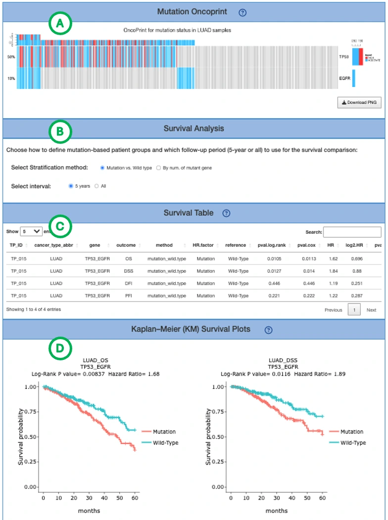
3.3.2 Expression-based Survival Analysis
The Expression-Based Survival Analysis evaluates whether gene expression levels are associated with survival outcomes (OS, PFI, DSS, DFI) in a user-defined patient subpopulation, allowing users to stratify patients based on gene expression and examine survival differences across clinical groups.
Workflow
- Select gene(s)
Enter one or multiple genes whose expression will be used for group stratification. - Select dataset
Choose the cancer dataset on which survival analysis will be performed. - Define patient subpopulation
Use clinical criteria (e.g., stage, grade, ER/PR/HER2 status, molecular subtype) to filter the cohort.
These filters determine which patients will be included in the analysis. - Submit
The system loads the analysis interface.
Output
A. Stratification Control Panel
B. Survival Table
This table summarizes survival statistics for each gene, cancer type, and survival endpoint. Key metrics include hazard ratios (HR) and p-values for both all follow-up and 5-year intervals, expression cutoff thresholds, stratification methods, and sample counts for high and low-expression groups. HR > 1 indicates high expression is associated with worse prognosis, HR < 1 indicates better prognosis, and p < 0.05 indicates significant survival differences.
C. Kaplan-Meier (KM) Survival Plots
For each survival outcome, KM curves visualize survival differences between expression-defined groups, with one curve per group (High vs Low, All-high vs Others, etc.), log-rank p-value and HR displayed on the plot, and curves automatically updating based on cutoff method, grouping method, and time interval (5-year vs all follow-up). These plots show whether expression differences translate into clinically meaningful survival divergence and help users assess the prognostic value of the selected gene(s) in the filtered patient cohort.
D. Boxplots of Gene Expression
These boxplots summarize the expression distributions of the selected gene(s) within the filtered cohort, displaying TPM or log10(TPM) values with hover functionality to view sample-level values and summary statistics including median, Q1, Q3, fences, minimum, and maximum. This visualization helps confirm that expression-defined patient groups are meaningfully different in terms of gene expression levels before analyzing survival outcomes, ensuring that stratification produces biologically distinct groups for comparison.
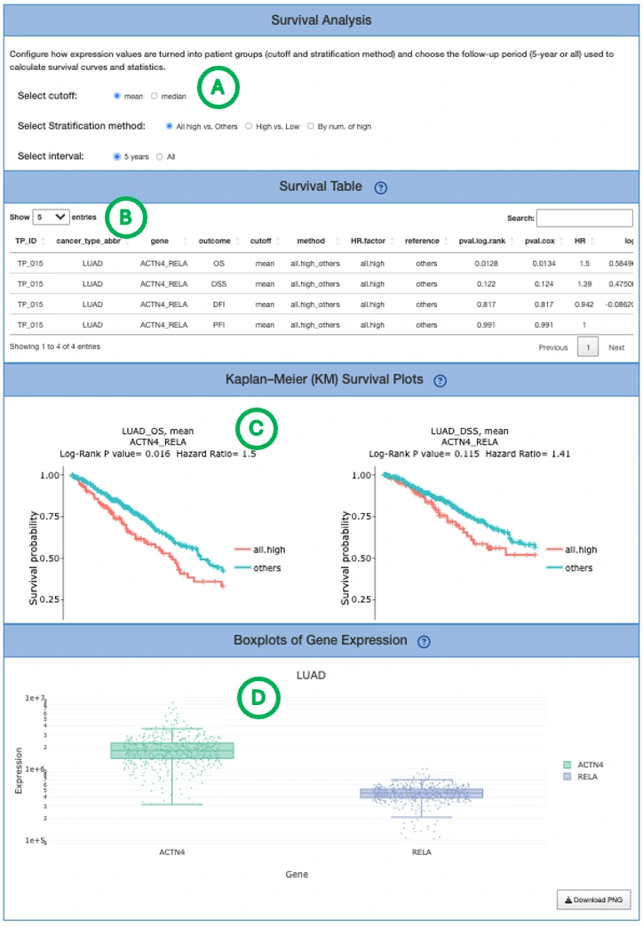
3.3.3 miRNA-based Survival Analysis
Workflow
- Input a miRNA (e.g., hsa-miR-21-5p) to define the expression feature.
- Select an analysis framework: Cox Uni, Cox Multi, or Cure Model.
- After choosing the framework, configure the analysis using dropdown menus:
- Cancer type – choose the cohort to analyze
- Survival endpoint – select the outcome type
- Survival time – follow-up time scale on the x-axis (months)
- Stratification method – split patients into groups based on miRNA expression (e.g., High vs Low)
- View results as survival/hazard curves and (when applicable) risk estimates.
Output
A. Cox Uni Results (Univariate Cox Analysis)This analysis displays two complementary visualizations when Cox Uni is selected and dropdown menus are configured. The Kaplan–Meier (KM) survival plot shows survival probability (y-axis) over time in months (x-axis) for miRNA-defined groups (e.g., High vs Low), allowing users to compare curve separation between groups to assess outcome differences and use the reported log-rank p-value to evaluate whether the group difference is statistically supported. The cumulative hazard plot shows cumulative hazard (accumulated risk of the event) over months for the same stratified groups, where steeper curves indicate risk accumulating more quickly and can be used alongside the KM plot to view group differences in terms of risk accumulation rather than survival probability. Clear separation between High versus Low groups suggests the miRNA is associated with prognosis without clinical adjustment, indicating a univariate association between miRNA expression and patient outcomes.
B. Cox Multi (Multivariate Cox Analysis with Clinical Adjustment)This analysis displays two complementary visualizations when Cox Multi is selected and dropdown menus are configured. The adjusted survival curve shows model-predicted survival probability (y-axis) over months (x-axis) for miRNA-defined groups after adjusting for available clinical covariates in that cohort, allowing users to assess whether group separation persists after clinical adjustment and provides evidence that the miRNA offers prognostic information beyond standard clinical variables within the available covariates. The forest plot displays hazard ratios (HRs) with 95% confidence intervals for the miRNA group term (e.g., High vs Low) and each included clinical covariate that was automatically selected based on cohort availability, where HR > 1 indicates higher risk (worse outcome), HR < 1 indicates lower risk (better outcome), a dashed vertical line at HR = 1 indicates no effect, and wider confidence intervals indicate greater uncertainty. A significant miRNA-group HR after adjustment suggests the miRNA is an independent prognostic factor given the included covariates, providing evidence that miRNA expression contributes prognostic value beyond traditional clinical variables.
C. Cure ModelThis analysis displays a cure-model survival curve when Cure Model is selected and dropdown menus are configured, showing cure-model–estimated survival probability (y-axis) over months (x-axis) for miRNA-defined groups. Users can compare curves to evaluate group-specific outcome differences under a model designed to capture long-term survival patterns and look for late-time plateaus that can reflect sustained survival behavior. Group separation indicates prognostic differences in a framework designed for long-term survival dynamics, which can be particularly informative when standard proportional hazards assumptions may not fully reflect the data and when a subset of patients may experience extended disease-free survival.
3.4 Multi-omics Driver Analysis
Overview
The Multi-omics Driver Analysis identifies driver events that differ between two clinically defined patient groups, integrating:- Gene expression
- Mutation
- Copy number variation (CNV)
- Methylation
It highlights which genes and pathways are most likely driving group differences (e.g., responders vs non-responders, early vs late stage) and how consistently they are supported across omics types and tools.
Use this analysis when you want to understand which genomic and epigenomic alterations underlie clinical subgroup differences.
Workflow
- Select dataset
Choose the cancer dataset to analyze. - Define Group 1 and Group 2
Use clinical criteria (e.g., stage, grade, response status, receptor subtype) to define two patient groups.- Each group should contain ≥ 20 samples for robust statistical analysis.
- Choose gene set option (Gene Dataset)
- All – analyze all eligible genes in the dataset
- CGC – restrict to genes listed in Cancer Gene Census (CGC)
- NCG – restrict to genes listed in Network of Cancer Genes (NCG 6.0)
- Run analysis
The results page will display driver events and multiple integrated visualizations.
Output
A. Multi-layer Driver-Function Relationship Diagram & Driver Summary TableMulti-layer Driver-Function Relationship Diagram
This network-like diagram connects the selected cancer dataset, omics layers (mRNA, Mutation, CNV, Methylation), driver genes, and functional/pathway terms such as GO terms to illustrate the relationships between molecular alterations and biological functions. The structure flows hierarchically: the cancer node connects to each omics node (mRNA, Mutation, CNV, Methylation), each omics node connects to driver genes identified in that layer, and driver genes connect to GO term or function nodes representing enriched pathways or processes. Users can trace paths from clinical groups through omics alterations to driver genes and finally to biological functions, identifying which omics layers contribute most to observed group differences, which driver genes are shared across omics layers, and which biological functions and pathways are most impacted by these alterations.
Driver Summary TableThis table lists all identified drivers with their cancer type/dataset, omics layer (mRNA, Mutation, CNV, Methylation), driver gene symbol, Cancer Gene Census (CGC) status, Network of Cancer Genes (NCG) status, integration method that detected the driver, number of tools supporting this driver event (nTools), and associated Gene Ontology terms indicating pathways or functions. Higher nTools values indicate stronger cross-tool evidence for a driver event, CGC/NCG = Yes provides additional external support as a known cancer gene, and GO_term entries reveal potential biological roles and affected pathways. Together, the diagram and table summarize how multi-omics drivers are identified and what functional roles they may play in cancer biology.
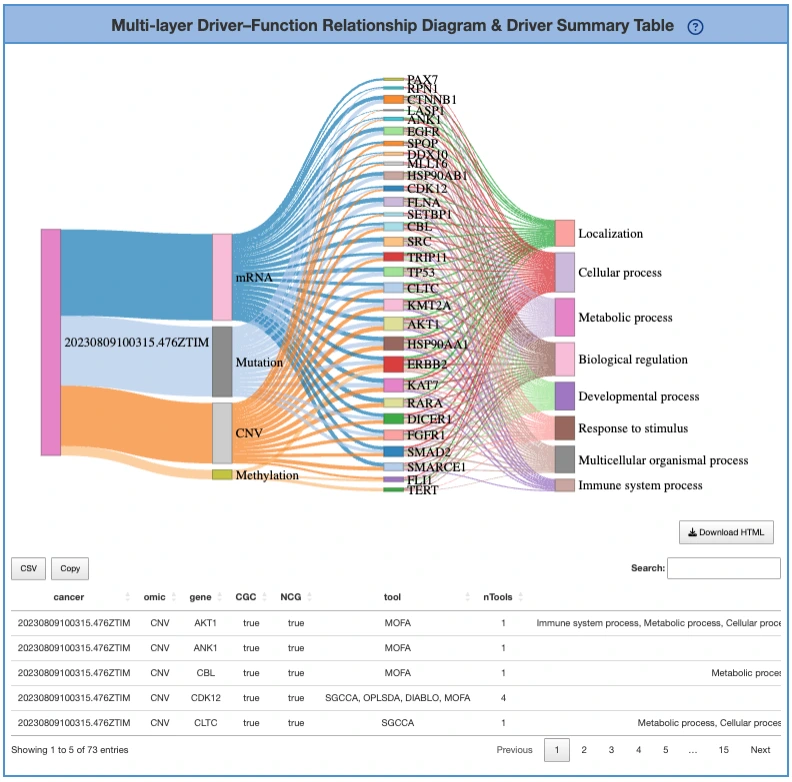
B. Distribution of Drivers Across Omics Types and Tools
This section helps evaluate how strongly each driver is supported across omics layers and computational methods through two complementary visualizations.
Omics-by-Gene Tool Support Heatmap (Left)This heatmap displays genes as rows and omics types (mRNA, Mutation, CNV, Methylation) as columns, with each cell value representing the number of tools that identified that gene as a driver in that specific omic layer. Users can hover on cells to see the exact tool count for each gene-omic combination, enabling identification of robust multi-omics drivers including genes with high support across multiple omics layers and genes supported by many tools in at least one omic category. This visualization helps prioritize genes based on the breadth and depth of computational evidence supporting their driver status.
Tools per Gene by Omics Bar Plot (Right)This bar plot displays each driver gene with bar height representing the total number of tools that support that gene as a driver, with color coding indicating the contributions from different omics layers (mRNA, Mutation, CNV, Methylation). Users can compare tool support between genes to identify the most robustly detected drivers and use the legend to toggle specific omics types on or off, allowing focused examination of particular molecular layers. Genes with high tool support across several omics types are high-confidence multi-omics drivers, as convergent evidence from multiple computational methods and molecular mechanisms strengthens the reliability of their identification as functionally important cancer genes.
C. Coverage and Consistency of Multi-omics Identification Tools
This section focuses on tools rather than genes, evaluating how comprehensively tools cover omics layers and how consistent their driver identifications are across methods.
Omics-by-Tool Coverage Heatmap (Left)This heatmap displays tools as rows and omics types as columns, with each cell showing the proportion of drivers in each omic layer detected by each specific tool. Users can examine which tools have broad coverage across multiple omics types versus those with more selective detection patterns focused on particular molecular layers, and identify tools that contribute most substantially to driver identification within a specific omics type. This visualization reveals the complementary nature of different computational approaches and helps users understand which tools are most effective for detecting drivers in each molecular context.
Tool Overlap Distribution Plot (Right)This bar chart displays the number of tools (x-axis) versus the number of genes detected by that many tools (y-axis), revealing the degree of consensus among computational methods in driver identification. Genes detected by multiple tools are generally more reliable as convergent evidence from independent methods strengthens confidence in their driver status, while a right-shifted distribution with more genes supported by many tools suggests strong cross-tool consistency in the analytical pipeline. This plot helps users assess the overall reproducibility of driver detection and identify which genes have the most robust computational support across the integrated multi-omics framework.
3.5 Prognostic Signature Identification
3.5.1 Overview
The Prognostic Signature Identification analysis constructs a survival-predictive gene signature from a user-provided gene list. Using LASSO (Least Absolute Shrinkage and Selection Operator) and Random Forest models, the analysis identifies survival-associated genes, builds a multigene risk-score model, and evaluates its predictive performance through survival statistics, ROC curves, risk stratification plots, and feature-selection diagnostics.
Use this analysis if you already have a candidate gene list and want to determine:- Which genes are most predictive of survival
- How these genes can be combined into a prognostic signature
- How well the signature stratifies patients into risk groups
- What biological functions are enriched among signature genes
3.5.2 Workflow
1. Input a Gene List
Users may provide a list of candidate genes using either method:- Type or paste genes directly into the text box
- Upload a .txt file containing one gene symbol per line
These genes will be used to identify survival-related markers and construct the prognostic signature.
2. Select Dataset Settings
After submitting the gene list, users configure all analysis settings on the results page.
Select a TissueChoose a broad tissue category (e.g., Breast, Lung, Colon).
This filters the available cancer datasets.
Select Cancer Type
From the filtered list, select a TCGA (or other) cancer dataset for training the prognostic signature model.
3. Select Data Type(s) for Model Construction
Users may choose one or multiple omics types used for signature construction:- RNA expression
- Copy Number Variation (CNV)
- Mutation
- Methylation
Selected data types define which molecular features contribute to the LASSO and Random Forest survival models.
4. Select a Survival Endpoint
Choose the patient outcome to be modeled:- Overall Survival (OS)
- Progression-Free Interval (PFI)
- Disease-Free Interval (DFI)
- Disease-Specific Survival (DSS)
The endpoint determines how prognostic performance is evaluated.
5. Define Patient Subpopulation (Clinical Criteria Filter)
Filter the dataset to analyze a specific patient subpopulation by applying one or more clinical criteria.
Each criterion includes multiple groups with sample counts.
Users may combine multiple criteria to define a precise analysis cohort.
3.5.3 Results Overview
- Statistical Summary Table
- Kaplan-Meier Plot
- Time-Dependent ROC Curves
- Prognostic Risk Score Model
- Risk Heatmap
- Lambda Screening Plot
- Functional Annotation Barplots
- Shrinkage Gene List
3.6 Multivariate Survival Analysis
3.6.1 Overview
In the Multivariate Survival Analysis, over one hundred clinical factors are available for selection to construct a comprehensive prognostic model. If you are interested in comparing specific candidate gene(s) with well-known clinical prognostic biomarkers, this analysis will construct a multivariate model with customized clinical factors in the CoxPH framework. The generated report includes corresponding statistical results, Kaplan–Meier plots, and point-estimated values of all factors displayed in a forest plot.
3.6.2 Workflow
1. Input a Gene List or Signature list
Users choose the input type—either gene name or signature—and provide their list of candidate genes by typing or pasting gene symbols directly into the text box. These genes will be used to identify survival-related markers and construct the prognostic signature for the selected cancer cohort.
2. Select Dataset Settings
After submitting the gene list, users configure all analysis settings on the results page.
Select a TissueChoose a broad tissue category (e.g., Breast, Lung, Colon).
This filters the available cancer datasets.
From the filtered list, select a TCGA (or other) cancer dataset for training the prognostic signature model.
3. Select Confounding Factors
This section determines how clinical variables are handled in the survival model.Users:
- Select clinical factors (e.g., Age, Stage, Gender, Grade) to adjust for.
- Optionally enable: “Confounding factors selected by LASSO”
- Unchecked:
All selected confounding factors are forced into the Cox model—always included. - Checked:
Selected confounders are also subjected to LASSO.
LASSO selects only the clinical factors that meaningfully contribute to prognosis, shrinking others to zero.
- Full adjustment (all selected confounders included)
- Sparse adjustment (LASSO optimizes both genes and clinical variables)
4. Select Data Type(s) for Model Construction
Users may choose one or multiple omics types used for signature construction:- RNA expression
- Copy Number Variation (CNV)
- Mutation
- Methylation
Selected data types define which molecular features contribute to the LASSO and Random Forest survival models.
5. Select a Survival Endpoint
Choose the patient outcome to be modeled:- Overall Survival (OS)
- Progression-Free Interval (PFI)
- Disease-Free Interval (DFI)
- Disease-Specific Survival (DSS)
The endpoint determines how prognostic performance is evaluated.
6. Define Patient Subpopulation (Clinical Criteria Filter)
Filter the dataset to analyze a specific patient subpopulation by applying one or more clinical criteria.
Each criterion includes multiple groups with sample counts.
Users may combine multiple criteria to define a precise analysis cohort.
3.6.3 Results Overview
The analysis generates comprehensive results for each selected data type, including a summary table with statistical metrics, Kaplan–Meier plots showing survival curves for risk-stratified groups, and forest plots displaying hazard ratios with confidence intervals for all genes and clinical factors included in the final multivariate model.
Download
DriverDBv5 provides four summaries of driver genes for users to download: mutation drivers defined by 9 mutation tools in various cancers, CNV drivers defined by 2 tools in various cancers, methylation drivers defined by 2 tools in various cancers, and multi-omics drivers defined by 8 tools.
Dataset
Copyright© 2010-2025. All Rights Reserved. ©版權所有. Ver. 1.00.003未經允許請勿任意轉載、複製或做商業用途